


How to Create a Stunning Gallery Wall: A Step-by-Step Guide for Elegant, Personal Spaces
A gallery wall has a rare power in interior design. It can soften the formality of a room, introduce memory and meaning, and transform an overlooked blank wall into a richly composed focal point. More than decoration, it is a visual narrative, one that gathers art, photographs, treasured objects, and fragments of personal history into a single thoughtful arrangement. When done well, a gallery wall feels both curated and intimate, polished yet alive.
Table Of Content
- Why Gallery Walls Continue to Feel Timeless
- Step 1: Start with the Story You Want the Wall to Tell
- Choose a Unifying Thread
- Step 2: Study the Wall and the Room Around It
- How Furniture Changes the Placement
- Step 3: Gather Everything Before You Hang Anything
- What to Include in a Gallery Wall
- Step 4: Measure the Wall and Plan the Composition
- Popular Layout Types
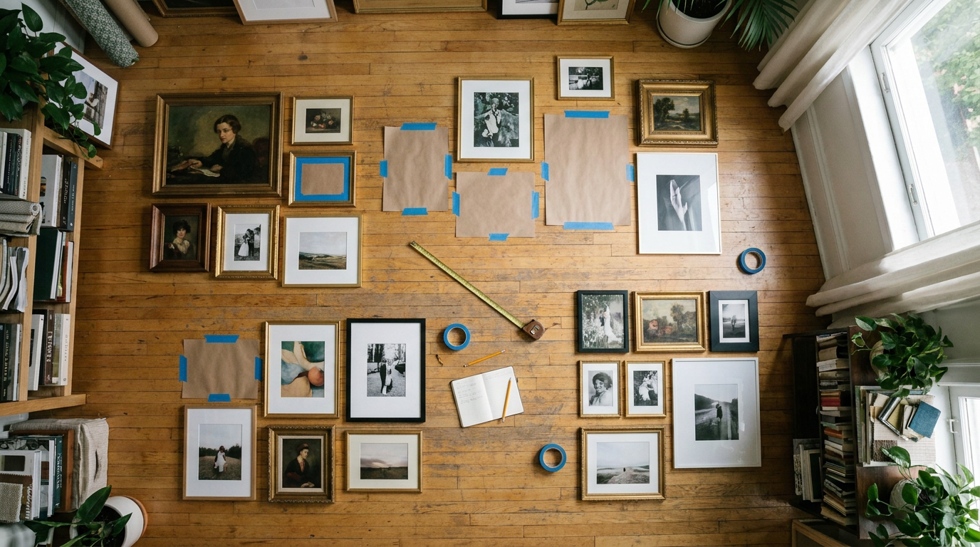
- Step 5: Build the Layout on the Floor First
- Use Paper Templates and Painter’s Tape
- Step 6: Hang with Precision, but Keep the Result Human
- Step 7: Refine the Styling Around the Gallery Wall
- Gallery Wall Ideas for Different Rooms
- Living Room Gallery Wall
- Hallway or Entry Gallery Wall
- Staircase Gallery Wall
- Bedroom Gallery Wall
- Common Gallery Wall Mistakes to Avoid
- Renter Friendly Ways to Create a Gallery Wall
- How to Keep a Gallery Wall Feeling Fresh Over Time
- Final Thoughts: A Gallery Wall as an Expression of Home
The most memorable gallery walls are never just about filling space. They create rhythm, proportion, and emotional depth within a room. In contemporary homes across North America, they remain relevant because they are remarkably flexible. A gallery wall may be strict and symmetrical with matching frames and measured spacing, or it may take on a looser salon style that mixes prints, paintings, mirrors, baskets, plates, and found objects. That versatility allows the idea to adapt to many interiors, from minimal apartments to layered family homes.
This guide is designed to help you create a gallery wall that is as practical as it is beautiful. You will learn how to evaluate your wall, select pieces with intention, compose a layout that feels balanced, and hang everything with confidence. Along the way, we will focus on the details that matter most, including scale, eye level, spacing, furniture relationships, and the subtle personal touches that make a display feel meaningful rather than manufactured.
If you have ever wondered how to create a gallery wall that looks elegant instead of chaotic, cohesive instead of random, this step by step approach will give you a clear path. The goal is not perfection in a rigid sense. The goal is harmony, character, and a room that tells your story with grace.
Why Gallery Walls Continue to Feel Timeless
Some design ideas rise and fade with the decade, but gallery walls have endured because they satisfy both practical and emotional needs. Practically, they solve the challenge of a large blank wall better than a single small frame ever could. Emotionally, they allow a home to feel collected over time. A gallery wall introduces texture, memory, authorship, and personality. It can hold a child’s drawing beside a vintage print, a travel photograph beside an abstract canvas, and still feel elevated if the composition is well considered.
Another reason gallery walls remain so compelling is their ability to bridge formality and warmth. A rigidly minimal room can sometimes feel distant. A layered wall of art brings softness and humanity. At the same time, a chaotic space can be calmed by a gallery wall with a strong structure, repeated frame finishes, or a disciplined color story. In this way, gallery walls are not simply decorative flourishes. They are tools for shaping atmosphere.
Recent design trends have also expanded what qualifies as a gallery wall. Framed art is no longer the only option. Mirrors, woven pieces, macramé, antique plates, sculptural wall objects, and small shelves can all become part of the composition. This broader definition makes the gallery wall more accessible and more personal. It also means that homeowners and renters alike can create something layered and custom without needing a large fine art collection.
A successful gallery wall is part design exercise and part storytelling device. The strongest arrangements do not merely fill a surface. They create a focal point, establish visual rhythm, and make a room feel collected rather than staged.
Step 1: Start with the Story You Want the Wall to Tell
Before measuring anything, begin with a quieter question. What do you want this wall to say about the room and about you? The answer does not need to be dramatic, but it should be clear enough to guide your choices. Perhaps you want the wall to express travel memories, celebrate family history, introduce a refined black and white palette, or simply bring warmth to a space that feels too spare. This story becomes the invisible thread that holds the composition together.
Many people assume a gallery wall must match perfectly in order to look elegant. In truth, cohesion often comes from subtler forms of consistency. A similar palette, a repeated frame tone, recurring natural textures, or a shared subject matter can create enough unity. You might combine sepia family photographs with line drawings and vintage maps, or pair contemporary abstracts with soft landscape photography in oak and brass frames. The pieces do not need to be identical. They need to converse.
It is wise to start with what you genuinely love rather than shopping for filler. The most beautiful gallery walls usually grow from meaningful pieces. Original art, inherited sketches, postcards collected abroad, exhibition posters, children’s artwork, and printed photographs can all belong in the same arrangement if they contribute to the atmosphere you are building. When the collection begins with affection rather than obligation, the final result feels more authentic and lasting.
Choose a Unifying Thread
A unifying thread does not limit creativity. It gives it shape. This thread may be one of several elements: color palette, frame finish, artistic genre, travel memories, botanical subjects, portraiture, or even material texture. In a serene bedroom, for example, you might lean into washed neutrals, ivory mats, and delicate charcoal drawings. In a lively family room, a mix of saturated artwork and candid photographs can feel vibrant, especially when connected by black frames or repeated proportions.
If you are drawn to eclectic styling, remember that elegance comes from deliberate contrast rather than visual noise. A small antique mirror beside a modern print can look sophisticated when their scales feel related and their tones harmonize. The more varied your objects, the more important your editing becomes. The wall should feel layered, not crowded. It should suggest a cultivated eye, not indecision.
Step 2: Study the Wall and the Room Around It
Every great gallery wall begins with an honest reading of the architecture around it. The shape of the wall matters. So does ceiling height, nearby windows, sightlines, and the furniture that may sit below the arrangement. A tall narrow wall often benefits from a vertical composition that gently lifts the eye. A broad living room wall generally asks for a wider arrangement that anchors the room. Matching the shape of the display to the shape of the wall is one of the simplest ways to make the design feel intentional.
It is equally important to consider the room as a whole. A gallery wall above a sofa should feel related to the sofa, not suspended in isolation. A hallway arrangement should suit the pace at which people move through the space. A staircase wall may call for a composition that follows the rise of the stairs rather than ignoring it. These adjustments are what separate a beautifully tailored installation from one that feels generic.
The most common mistake designers cite is hanging art too high. This instantly disconnects the arrangement from the room and can make even lovely pieces feel awkward. The often repeated guideline is to center the artwork or the visual center of the gallery wall at about 57 inches from the floor, sometimes called museum height or eye level. This is a useful starting point, but it is not an unbreakable law. Above furniture, in rooms with unusually high ceilings, or along staircases, visual relationships matter more than rigid obedience.
How Furniture Changes the Placement
When hanging a gallery wall above a console, bed, bench, or sofa, the bottom of the arrangement should sit low enough to feel connected to the furniture below. Many people instinctively leave too much space, which makes the wall seem to float away from the room. A modest gap usually creates a far stronger relationship. The exact distance can vary with the scale of the furniture and the size of the frames, but the key idea is visual conversation. The two elements should feel like part of one composed vignette.
Large rooms generally require larger gestures. A tiny cluster of frames on a substantial wall can look lost unless it is intentionally minimal. If your room has generous proportions, use pieces with enough visual weight to meet the architecture. This does not always mean buying enormous art. It may mean designing a larger overall composition, introducing a statement piece near the center, or using stronger matting and frame width to give the collection more presence.
Step 3: Gather Everything Before You Hang Anything
One of the most practical principles in gallery wall design is also one of the most overlooked. Assemble all of your candidate pieces before making holes in the wall. This allows you to compare scale, color, and style in one place. It also helps you notice what is missing. You may discover that your collection needs one larger anchor piece, a few smaller accents, or a quieter image to balance stronger works.
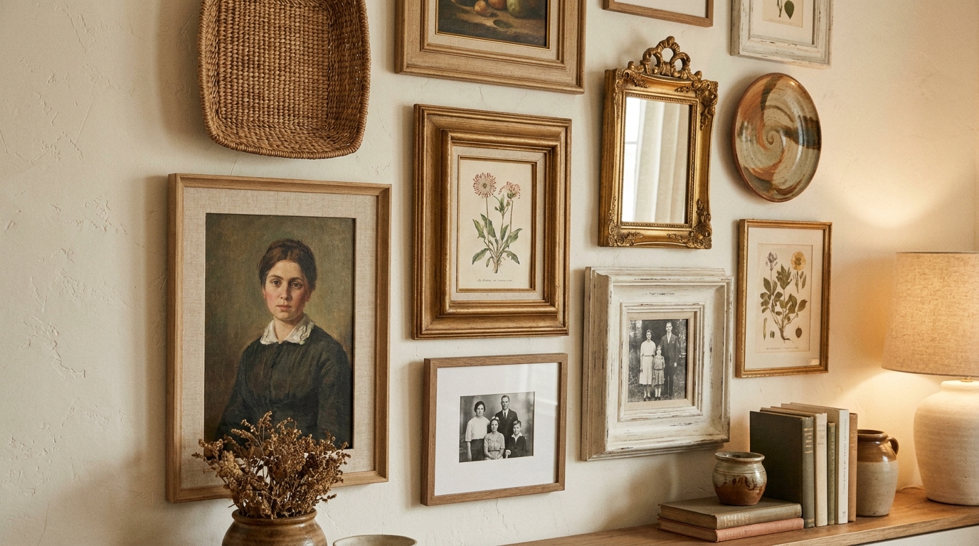
Lay everything out together and examine each item closely. Remove anything that feels repetitive without purpose or visually weak beside stronger pieces. Add pieces that contribute contrast, depth, or emotional value. If you are including nontraditional elements such as baskets or mirrors, place them among the frames at this stage so you can begin to understand how the materials interact.
This is also the moment to think about frames. Consistent framing can create serenity and discipline, while eclectic framing can introduce character and collected charm. Neither approach is inherently better. What matters is that your choice supports the room. If the space is already richly layered with texture, a more restrained framing strategy may feel elegant. If the room is simple, varied frames can bring personality without overwhelming the architecture.
What to Include in a Gallery Wall
A compelling arrangement often includes a mixture of visual rhythms rather than one note repeated endlessly. Consider blending a few larger pieces with several medium works and some smaller accents. Use portrait and landscape orientations to create movement. If everything is the same size, the wall may feel flat unless you are intentionally creating a formal grid. Variation, when thoughtfully controlled, gives the eye places to rest and places to travel.
- Framed art prints and original artworks
- Family photographs and travel imagery
- Vintage documents, maps, or book plates
- Small mirrors to reflect light and add depth
- Woven baskets, plates, or other wall objects
- Personal mementos that support the overall story
Even a highly personal wall benefits from editing. Keep asking whether each piece supports the composition and the mood you want to create. If the answer is no, save it for another room or rotate it in later. A gallery wall does not need to display everything you own in one moment.
Step 4: Measure the Wall and Plan the Composition
Once you know your pieces, measure the wall carefully. Record the full width and height of the area available, then subtract architectural constraints such as trim, switches, sconces, and nearby furniture. If the gallery wall will sit above a piece of furniture, measure the furniture as well. The arrangement should usually relate to that width rather than extending too far beyond it. This stage may sound technical, but it is where elegance begins. Good proportion is never accidental.
Treat the display as one unified composition rather than a series of isolated frames. This principle is essential. Instead of asking where each individual frame should go, first determine the invisible outer shape of the entire arrangement. Will it be rectangular, organic, horizontal, vertical, or stair stepped? Once that overall shape is clear, the placement of individual pieces becomes much easier.
Spacing is often misunderstood. There is no single mandatory rule that every gap must match perfectly. In fact, slightly adjusted spacing can create better balance and breathing room. The goal is visual coherence, not mechanical sameness. Smaller works may sit a little closer together, while larger pieces often need a touch more air around them. Step back frequently and assess the arrangement with your eyes, not only with your tape measure.
Popular Layout Types
- Symmetrical grid: Ideal for similarly sized frames, especially in formal or minimal spaces. This layout feels orderly, crisp, and architectural.
- Salon style: A layered and collected look with varied sizes and objects. This works beautifully when you want personality and story to lead.
- Linear arrangement: Frames follow a horizontal or vertical line, often above furniture or in narrow spaces. The result is calm and structured.
- Organic cluster: A freeform grouping built around a central anchor piece. This style can feel relaxed and artistic when carefully edited.
- Stair step composition: Especially useful along staircases, where the arrangement follows the diagonal movement of the architecture.
Choose the layout type that supports both the wall and the room. A dining room with classic moldings may welcome a more formal grid, while an eclectic hallway might come alive with a salon wall. There is no universal best format. The right layout is the one that makes the architecture feel more complete.
Step 5: Build the Layout on the Floor First
Before lifting a hammer, arrange the full composition on the floor. This is one of the most recommended professional techniques because it allows experimentation without damage or pressure. Use painter’s tape to mark the approximate width and height of your wall on the floor, then place the frames within that boundary. Move them until the layout feels balanced. Try several versions, photograph each one, and compare them with fresh eyes.
As you refine the arrangement, begin with the anchor pieces. These are usually the largest or visually strongest works. Once they are placed, fill around them with medium and smaller elements. Think of the display like a piece of music. You need variation in tempo, repetition in motif, and pauses where the eye can rest. Too many similar shapes grouped together can feel static, while too much contrast can feel unsettled.
Pay attention to visual weight, not just physical size. A dark photograph in a slim black frame may carry as much presence as a larger pale drawing. Likewise, a mirror or woven object can interrupt a field of rectangles in a very useful way. Trust what feels balanced from a standing distance, and remember that the arrangement should read as one composition long before a viewer notices individual items.
Use Paper Templates and Painter’s Tape
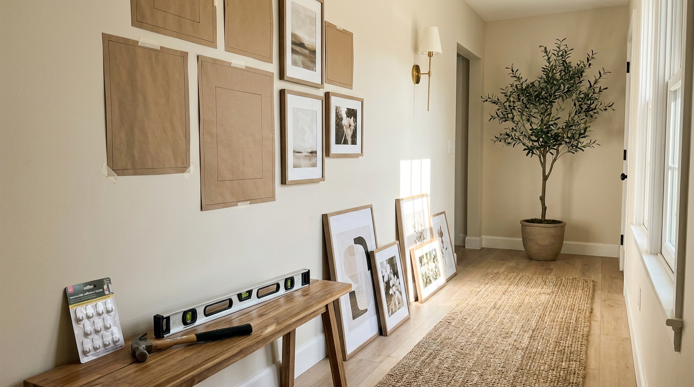
Once you are happy with the floor arrangement, trace each frame or object onto kraft paper or plain paper and cut out the shapes. Label every template so you know which piece it corresponds to and where the hanging hardware sits. Then tape the templates to the wall. This step takes a little patience, but it dramatically reduces mistakes. It also gives you the chance to see how the composition interacts with light, furniture, and movement in the room.
Stand back from multiple angles. Sit on the sofa if the wall is in the living room. Walk past if it is in a hallway. Adjust anything that feels too high, too compressed, or too heavy on one side. This is the stage where instincts sharpen and confidence grows. Once the paper version feels right, the actual hanging becomes much less stressful.
Step 6: Hang with Precision, but Keep the Result Human
Now comes the practical installation. Mark hardware points carefully on each template or directly from the frame measurements. Use the appropriate hanging method for the weight of each piece, whether that means nails, picture hooks, anchors, or removable renter friendly systems. If you are renting or simply prefer low damage solutions, many modern hanging products can support lightweight and medium weight frames successfully. Always check the load ratings and wall type before proceeding.
Begin with the central or anchor piece, then build outward. Hanging from the middle helps maintain the integrity of the composition and reduces the chance of drift. Use a level often, but do not become obsessive to the point that the process loses ease. A gallery wall should feel composed, not clinical. Tiny variations are sometimes imperceptible and can even contribute to a more natural atmosphere, especially in eclectic arrangements.
If your wall includes a mix of objects beyond framed art, pay attention to depth as well as outline. Plates, mirrors, and woven objects may cast slightly different shadows, which adds richness. This can be lovely, especially in soft daylight or lamplight. The goal is a wall that feels dimensional and alive, with each piece supporting a larger rhythm.
The best gallery walls are disciplined in structure and generous in feeling. They respect alignment, scale, and spacing, but they also allow memory, texture, and personality to enter the room.
Step 7: Refine the Styling Around the Gallery Wall
Once the arrangement is hung, styling the area below or around it helps the wall feel integrated into the room. If the display is above a console, style the console with restraint. A lamp, a stack of books, a ceramic vessel, or a small branch arrangement may be enough. Too many decorative objects below a layered wall can make the composition feel crowded. Instead, think in terms of dialogue. The furniture and styling should support the wall, not compete with it.
Lighting also plays a quiet but powerful role. Natural light can reveal texture in matting, frame finishes, and mixed materials. In the evening, a table lamp, picture light, or nearby sconce can give the gallery wall an intimate glow. This is especially effective when the display includes both art and tactile objects. Shadows and highlights lend depth, making the wall feel almost architectural.
Take a final pass to check alignment, spacing, and visual weight. If something feels slightly off, trust that instinct. Often a small adjustment of one or two inches can transform the entire composition. The wall should feel grounded, proportionate, and easy on the eye. It should draw attention without shouting for it.
Gallery Wall Ideas for Different Rooms
Living Room Gallery Wall
In the living room, a gallery wall often becomes the primary focal point, especially above a sofa or mantel. Here, scale is crucial. The arrangement should feel large enough to hold the wall and connected enough to the furniture below. This is an ideal place for a blend of art and personal imagery because the room is social, layered, and often the heart of the home. A living room gallery wall can balance elegance with intimacy more easily than almost anywhere else.
Hallway or Entry Gallery Wall
Hallways and entries are wonderful places to tell a more personal story. Because people move through them, these spaces invite a sense of discovery. Family photographs, small landscapes, travel prints, and collected objects can feel especially charming here. Keep in mind that narrower spaces benefit from thoughtful restraint. The arrangement should enrich the passage, not visually tighten it.
Staircase Gallery Wall
A staircase gallery wall asks for careful planning because the eye moves diagonally. The 57 inch rule becomes less literal here, and the overall line of the composition matters more. Follow the rise of the stairs so the wall feels connected to the architecture. This is one of the few places where a growing, collected over time arrangement can be particularly poetic, since the movement of ascent already suggests narrative and progression.
Bedroom Gallery Wall
In a bedroom, softness tends to matter more than spectacle. Choose pieces that encourage calm and emotional ease. A quieter palette, gentler imagery, and more breathing room between frames can all contribute to a restful effect. Above the bed, make sure the arrangement feels anchored to the headboard and not too high. In this setting, elegance is often found in restraint.
Common Gallery Wall Mistakes to Avoid
Even beautiful pieces can lose their impact when installation mistakes undermine the composition. The first and most frequent mistake is hanging the arrangement too high. This creates a disconnect from the room and makes the gallery wall feel more like an afterthought than a designed focal point. Always assess the relationship to eye level, furniture, and overall architecture before committing.
The second mistake is ignoring scale. A wide wall usually needs a broader horizontal composition or more substantial pieces. A narrow wall calls for vertical logic. When scale and wall shape are mismatched, the room can feel unresolved. Another common issue is filling a large area with too many small pieces without a clear structure. This often reads as clutter rather than collection.
Overmatching can also be a problem. A gallery wall with identical frames, identical spacing, and identical art styles can feel flat if there is no variation in rhythm or texture. On the other hand, too much eclecticism without a unifying thread can feel chaotic. The sweet spot lies between these extremes. Aim for cohesion with life in it.
- Do not hang the whole arrangement too high above furniture
- Do not treat each frame as separate from the overall composition
- Do not ignore the shape and scale of the wall
- Do not force perfectly identical spacing if balance looks better with small adjustments
- Do not assume a gallery wall must contain only framed art
- Do not rush installation without testing the layout first
Renter Friendly Ways to Create a Gallery Wall
Creating a refined gallery wall is entirely possible in a rental home. The key is to choose lightweight pieces when possible and explore removable hanging systems designed for your wall type and frame weight. Adhesive hooks, low damage strips, and temporary picture ledges can all make installation easier while minimizing repairs later. This practical shift has made gallery walls far more accessible to people who want beauty without permanence.
Another excellent renter friendly strategy is the picture rail or gallery rail. With one installed element, often near the ceiling or integrated into existing architecture, you can suspend frames from cords or rods and rearrange them over time. This creates an elegant, slightly European sensibility and works especially well in character filled interiors. It also allows your collection to evolve naturally, which suits the collected over time aesthetic many people now prefer.
If making even small holes is not ideal, consider leaning framed works on shallow shelves or ledges in a layered manner. This approach can still feel sophisticated if edited carefully. Use variation in height, overlap lightly, and keep the palette cohesive. While different from a traditional gallery wall, it offers a similarly expressive effect with greater flexibility.
How to Keep a Gallery Wall Feeling Fresh Over Time
A gallery wall does not have to be static. In fact, some of the most charming arrangements evolve gradually. Add a new photograph after a meaningful trip. Replace a print with a child’s artwork that deserves a season in the spotlight. Introduce a vintage find from a market or a small mirror that catches the afternoon light beautifully. These subtle edits allow the wall to grow with your life, which is precisely what makes it feel genuine.
Seasonal shifts can also refresh the display without requiring a total redesign. Lighter textiles and brighter imagery may feel welcome in spring and summer, while richer tones and more tactile materials can warm the colder months. If your gallery wall includes a few interchangeable frames or ledges, updating it becomes especially simple. The goal is not constant change for its own sake, but a sense that the wall remains alive and responsive to the life of the home.
As your taste matures, do not be afraid to edit boldly. Remove pieces that no longer resonate and keep only those that still contribute beauty, memory, or meaning. A gallery wall should never feel like a storage system for old frames. It is a living composition, and like any elegant room, it benefits from curation.
Final Thoughts: A Gallery Wall as an Expression of Home
To create a stunning gallery wall is to do more than arrange objects on plaster or drywall. It is to compose a moment of identity within the home. Through careful scale, balanced spacing, eye level awareness, and a thoughtful mix of pieces, an empty wall becomes an atmosphere. It becomes a place where memory and design meet.
The most beautiful gallery walls are not built from formulas alone. They respect practical guidelines such as planning the wall as one composition, using 57 inches as a useful starting point, and testing layouts before hanging. Yet they also make room for emotion. They hold the things you love and set them in a structure that gives them dignity. That is what turns decoration into expression.
If you begin with a story, respond to the architecture, and install with patience, your gallery wall will feel timeless from the very first day. More importantly, it will feel yours. And in design, that is often the deepest form of elegance.



No Comment! Be the first one.