



AI visualization is changing the way people work with data. For years, dashboards and reporting tools were often designed around technical users who understood databases, formulas, and chart logic well enough to build answers from scratch. Today, a new generation of tools uses artificial intelligence to reduce that friction. Instead of forcing users to learn the mechanics first, AI visualization platforms help them ask better questions, surface patterns faster, and translate data into decisions that feel practical and immediate.
Table Of Content
- What AI visualization means in real life
- Why AI visualization feels more accessible than traditional analytics
- The core technologies behind AI visualization
- From static dashboards to augmented and agentic analytics
- Practical uses of AI visualization in everyday decision making
- AI visualization for small businesses and non technical teams
- Common misconceptions about AI visualization
- Trust, explainability, and risk management
- What makes an AI visualization tool genuinely user friendly
- How organizations can adopt AI visualization responsibly
- Questions to ask before choosing a platform
- The future of AI visualization
- Conclusion: making data easier to use, not harder to trust
That shift matters because data is no longer scarce. Most organizations already have more numbers than they know what to do with. The real challenge is interpretation. Sales teams want to know why conversion dropped in one region. Operations leaders want to see where delays are forming before service levels slip. Households, entrepreneurs, and public sector teams all need ways to turn raw information into something readable, relevant, and trustworthy. AI visualization sits at that intersection. It combines automation, machine learning, natural language processing, and design logic to make data more usable for people without deep technical knowledge.
In practical terms, AI visualization refers to the use of artificial intelligence and machine learning to help people explore, explain, and act on data through charts, dashboards, natural language queries, automated insight generation, and recommendations. This is why the category has become central to modern business intelligence. Platforms such as Tableau, Microsoft Power BI, and Google Looker increasingly position these capabilities as part of augmented analytics or agentic analytics. The idea is not that AI replaces human judgment. The idea is that AI expands human ability to work with data at speed and with more context.
The timing is important. Statistics Canada found that 19.2% of Canadian businesses reported using AI to produce goods or deliver services in the 12 months preceding Q2 2026, up from 6.1% in Q2 2024. Among AI using businesses, the most common application was data analytics at 36.6%. Statistics Canada also found that 22% of Canadian workers reported using generative AI at work in the previous 12 months. Those numbers tell a simple story. AI assisted work is no longer experimental. It is becoming part of mainstream workplace behavior, and visualization is one of the most accessible entry points.
This article explores what AI visualization actually is, how it works, where it adds value, and what users should watch carefully as adoption grows. The most useful perspective is a balanced one. AI can make charts easier to create and insights easier to understand, but it cannot fix weak data foundations or replace thoughtful oversight. When used well, however, AI visualization becomes the intelligence layer that helps people move from data overload to confident action.
What AI visualization means in real life
At a basic level, data visualization has always been about turning numbers into shapes people can read more easily. A line chart can make change over time clear in seconds. A map can reveal a geographic pattern that would stay hidden in a spreadsheet. A dashboard can give leaders a common view of performance across teams. AI visualization builds on this tradition, but adds a layer of intelligence that can guide users through the process rather than expecting them to manually assemble every step.
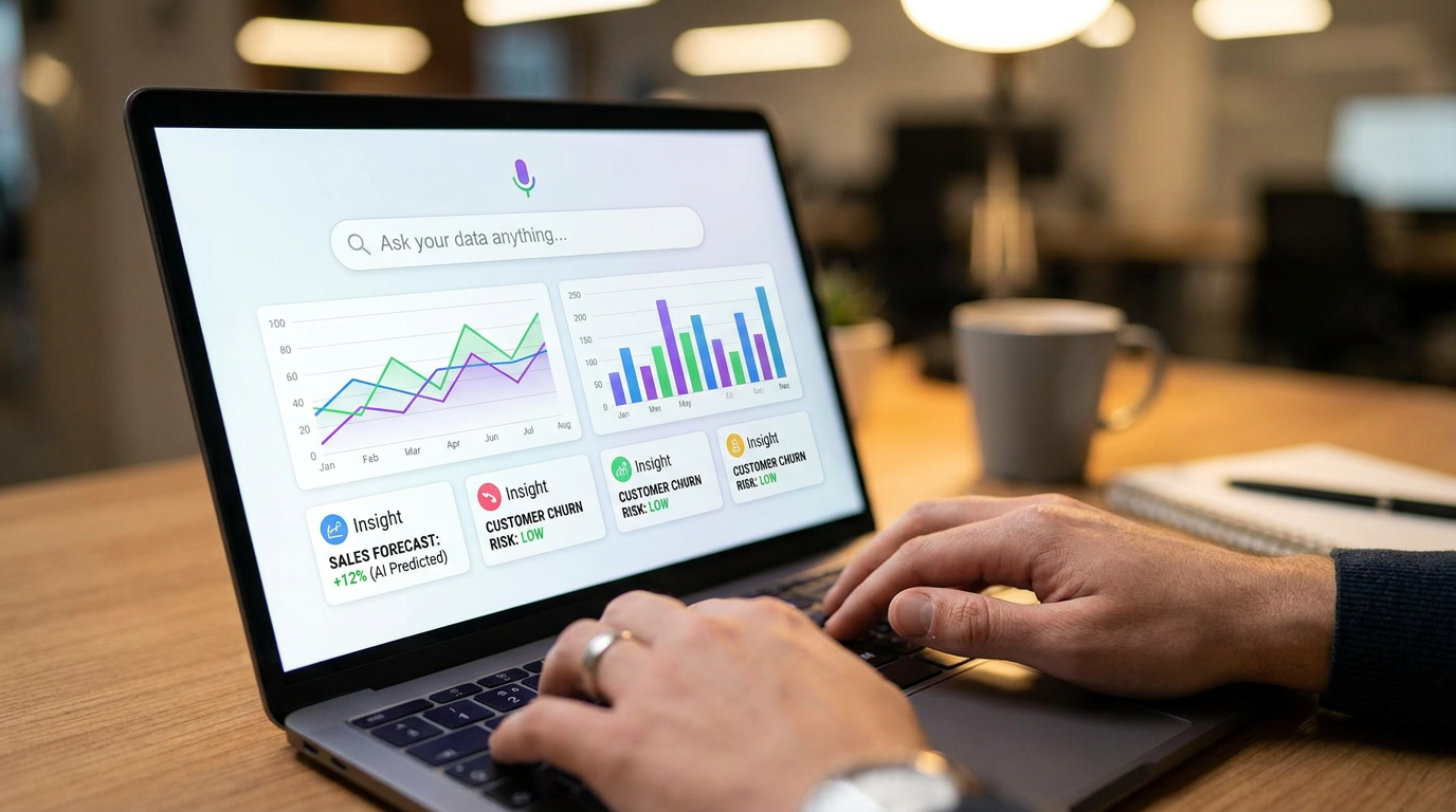
That guidance takes several forms. A user might type a question such as, Which products grew fastest in the last quarter among first time buyers? The platform can parse the request, find the relevant fields, suggest an appropriate chart, and provide a short written explanation of what stands out. In another case, the software may detect an anomaly on its own, such as an unexpected spike in returns from one warehouse, and surface that as an alert before anyone asks. This makes visualization feel less like static reporting and more like an interactive conversation with data.
Tableau describes augmented analytics as AI and machine learning powered analytics that expand human ability to interact with data at a contextual level, including automated modeling, guided natural language queries, and AI driven explanations. That framing is useful because it emphasizes support rather than substitution. The system is there to help users get further, faster. It suggests. It summarizes. It reveals possible relationships. But the person remains responsible for deciding what matters and what action is appropriate.
Google Cloud makes a similar point through Looker, where its AI assistant can help with visualization creation, formula creation, data modeling, report creation, and natural language analysis. This signals a broader market direction. AI visualization is no longer a separate niche product layered awkwardly on top of analytics. It is increasingly embedded inside the business intelligence tools people already use. That integration matters because it lowers the adoption barrier. Users do not have to leave their reporting workflow to gain AI assistance.
Why AI visualization feels more accessible than traditional analytics
The most powerful feature of AI visualization is not always predictive modeling or advanced forecasting. Often, it is simple accessibility. Traditional analytics can be intimidating because it assumes familiarity with datasets, chart types, metrics definitions, and query logic. Even when tools are technically drag and drop, people still need a mental model of how the data is structured and what visual format will answer the question well. That requirement excludes many everyday users who understand the business problem but not the mechanics of the system.
AI lowers that barrier by making the first interaction more natural. Instead of selecting tables and writing calculations, users can ask questions in plain language. Instead of wondering whether they should choose a bar chart or a heat map, they can review suggestions generated by the tool. Instead of staring at a dashboard and trying to infer meaning, they can receive automated summaries that describe trends, outliers, and possible drivers in clear language. This does not eliminate learning, but it changes the experience from technical construction to guided exploration.
For individuals, this means data can become part of everyday decision making rather than a specialist task. A small business owner can ask why cash flow tightened last month. A school administrator can compare attendance patterns by term without relying entirely on an external analyst. A property manager can identify buildings with rising maintenance costs before budget pressure escalates. In each case, the value comes from making insight retrieval faster and more intuitive for people who are domain experts but not analytics professionals.
For organizations, accessibility also creates scale. Self service analytics becomes more realistic when more employees can explore data responsibly on their own. That reduces the bottleneck where every simple question must pass through a data team. Analysts are then freed to focus on harder work such as methodology, governance, forecasting, and strategic interpretation. In other words, AI visualization can improve not only speed for end users but also the overall operating model for analytics inside a business.
The core technologies behind AI visualization
Although the user experience may feel simple, several technologies work together behind the scenes. One of the most visible is natural language querying. This allows users to ask questions in everyday language rather than in structured database syntax. The system interprets the request, maps terms to available data fields, and returns charts or summaries that match the intent as closely as possible. The better the semantic layer and metadata, the more useful this experience becomes.
Another key capability is automated insight generation. Here, machine learning models and statistical routines scan datasets for patterns such as trends, seasonality, outliers, correlations, and changes over time. The system then turns those patterns into short narrative explanations. For example, it may tell a retail user that a decline in margin was concentrated in one category and was driven by discounting in a specific week. The user still needs to verify the context, but the software dramatically reduces the time required to find a plausible answer.
Recommendation engines also play an important role. These systems suggest chart types, filters, related questions, or even next actions. A dashboard might recommend drilling into regional performance after identifying strong divergence between markets. It might suggest adding a time comparison because a trend is volatile. Recommendations improve usability because many people struggle not with reading a chart but with knowing what to ask after the first answer appears.
Predictive analytics and machine learning forecasting extend the value beyond descriptive reporting. Rather than only visualizing what happened, AI can help visualize what may happen next based on historical patterns and current signals. This is especially useful in planning contexts such as staffing, inventory, pricing, customer service, and property operations. Forecasts are never guarantees, but visualizing likely scenarios can improve preparedness and reduce reactive decision making.
Finally, explainable AI and transparency features are becoming more important. As AI generated explanations and recommendations enter dashboards, users need to understand how the conclusion was reached. Strong tools increasingly provide traceability, confidence signals, data lineage, and model context. That matters because adoption rises when users can inspect the logic rather than treating the output as a black box.
From static dashboards to augmented and agentic analytics
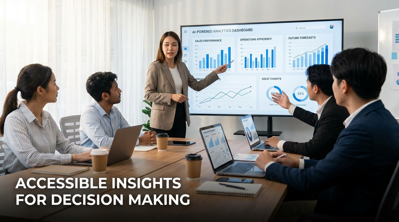
One of the clearest trends in the market is the move away from static dashboards toward more dynamic analytics experiences. A static dashboard presents preselected metrics in a fixed layout. It can be useful for monitoring recurring indicators, but it does not adapt well when the user wants to ask a new question or investigate an unusual result. In that model, the dashboard is the product. In AI visualization, the dashboard becomes the starting point for a conversation.
Augmented analytics expands the interface by embedding AI support directly into the workflow. Users can ask follow up questions, request a different comparison, or generate a short explanation without switching tools. Agentic analytics goes a step further by making AI more active in the workflow. The system may suggest next steps, proactively detect issues, or help assemble reports and formulas. This feels closer to a digital assistant than a reporting layer.
That evolution is important because real decision making rarely happens in a single view. Leaders move from summary to exception, from exception to cause, and from cause to action. AI visualization tools increasingly support that motion. Instead of waiting for an analyst to redesign a dashboard for each new question, users can remain in the same environment and explore. This makes data work more iterative, more responsive, and more aligned with how people naturally reason through problems.
The result is not the end of dashboards but their reinvention. Dashboards still matter because they organize metrics, define common views, and create operational rhythm. What changes is that the experience no longer ends with seeing the numbers. It continues through explanation, recommendation, and guided discovery. That is why the language around BI has shifted. The industry is moving from reporting systems to intelligence systems.
Practical uses of AI visualization in everyday decision making
The easiest way to understand the value of AI visualization is to look at ordinary decisions. Consider a retail manager trying to understand why one store is underperforming. In a traditional workflow, they may need a specialist to assemble sales, staffing, inventory, and customer traffic data into a usable report. With AI visualization, the manager can ask a direct question, review an automatically generated comparison, and receive a concise explanation of likely contributing factors. The speed advantage alone can change how quickly corrective action happens.
In finance teams, AI visualization helps users move from monthly reporting to continuous awareness. A team can monitor budget variance, cash flow, and receivables while receiving automated alerts when patterns break expected ranges. Instead of waiting for an end of month review, managers can investigate anomalies earlier. This does not eliminate accountants or financial analysts. It gives them a more responsive lens and helps non specialists understand performance without reading dense tables.
Healthcare, education, logistics, and local government are also seeing practical uses. A hospital administrator can visualize patient flow issues and identify time periods where bottlenecks repeat. A school system can compare resource allocation with attendance and performance indicators. A logistics operation can see whether delays cluster around routes, carriers, or warehouses. In each setting, the key benefit is not novelty. It is that AI visualization helps people connect operational questions to evidence more quickly.
In property and housing contexts, the value is especially clear. Owners and managers deal with rent rolls, vacancy, maintenance requests, energy use, tenant turnover, and neighborhood market signals. AI visualization can bring these streams together in dashboards that highlight where costs are rising, where occupancy risk is developing, or which asset types are outperforming. For investors and operators, this creates a more intelligent view of housing decisions. It is easier to spot patterns that spreadsheets often hide.
AI visualization for small businesses and non technical teams
Small businesses often assume advanced analytics is something only large enterprises can afford. AI visualization is helping change that assumption. Because many capabilities are now embedded in common BI platforms and cloud tools, smaller teams can access natural language querying, automated chart suggestions, and guided reporting without building a full data science function. This makes analytics adoption more realistic for firms that have limited time and technical resources.
Non technical teams benefit when the interface respects how they already think about work. Marketing teams think in campaigns, audiences, and conversion. Operations teams think in delays, throughput, and cost. HR teams think in retention, hiring, and performance. AI visualization tools increasingly meet users in that language and context. The result is not just faster reporting, but stronger data literacy because people learn by interacting with explanations tied to familiar concepts.
AI visualization is most useful when it reduces the distance between a business question and a trustworthy answer.
Common misconceptions about AI visualization
One of the most persistent misconceptions is that AI visualization means AI generated data. In reality, these tools usually work with existing data sources and help interpret, summarize, or present the data more effectively. The AI layer assists with chart creation, pattern detection, language generation, and recommendations. It does not replace the need for source systems, measurement definitions, or careful data collection. If the underlying data is incomplete or inconsistent, the visuals can still mislead.
Another misconception is that AI visualization removes the need for human judgment. It does not. A platform may suggest that one variable is associated with another, but context still determines whether the relationship is meaningful. A seasonal pattern may reflect a one time policy change. A decline in performance may be influenced by an external event not represented in the data. The user still needs to ask whether the explanation makes sense and whether the action proposed is appropriate.
There is also a belief that these tools are only for data scientists. The opposite is often true in product design. Many current BI products are specifically built to help business users query and explore data in plain language. Data teams remain crucial, especially for governance, modeling, semantic definitions, and quality control. But the front end experience is increasingly designed for managers, operators, and general knowledge workers. That is one reason self service analytics is gaining momentum.
A final misconception is that a chart created by AI is automatically accurate or unbiased. Visual polish can create false confidence. A clean dashboard with a strong narrative may still rest on flawed assumptions, weak joins, or skewed inputs. This is why validation, explainability, and oversight matter. AI visualization improves accessibility, not infallibility. Users should treat outputs as informed guidance rather than unquestionable truth.
Trust, explainability, and risk management
As AI becomes more embedded in dashboards and reporting, trust becomes a design requirement rather than a nice extra. People will not rely on AI generated insights if they cannot understand where they came from, what data was used, or how much confidence they should place in the result. This is particularly important when analytics influence hiring, lending, public services, healthcare, housing, or compliance related decisions. The more consequential the use case, the more careful the governance must be.
The NIST AI Risk Management Framework offers a useful reference point here. It is a voluntary framework intended to improve trustworthiness in AI systems, emphasizing valid and reliable performance, safety, security, privacy, transparency, explainability, and fairness. These principles translate directly into AI visualization. Dashboards should not only be attractive and fast. They should be supported by reliable data pipelines, clear definitions, privacy safeguards, and understandable logic about how insights were generated.
For organizations, this means AI visualization should be introduced as part of a broader analytics discipline. Teams need data governance, role based access, metric definitions, model documentation, and review processes for high impact outputs. If a dashboard recommends an action, users should be able to inspect why. If an anomaly is detected, they should know what threshold or model logic triggered it. Transparency reduces both operational risk and user skepticism.
There is also a human side to trust. People are more likely to adopt AI enhanced dashboards when they feel the tools help them think rather than replace them. Explainability supports that feeling. A user who sees the assumptions, filters, and drivers behind a recommendation can engage critically and confidently. That is a much healthier relationship than passive acceptance. In analytics, trust grows when systems are inspectable, understandable, and accountable.

What makes an AI visualization tool genuinely user friendly
Not every tool that adds an AI button becomes easier to use. Genuine user friendliness depends on design choices that respect how people ask questions and make decisions. The best platforms reduce technical friction without hiding essential context. They help users move quickly, but also show the assumptions behind the results. That balance is what separates useful augmentation from shallow automation.
A strong user friendly AI visualization tool usually includes a clear natural language interface, well organized suggested questions, relevant chart recommendations, and concise explanations written in plain language. It should also support drill downs, comparison views, and easy filtering so that users can test whether a first answer holds up. When explanation and exploration live together, users can learn as they go rather than simply consuming an answer.
Semantic layers are another major factor. If the system understands what business terms actually mean, the experience improves dramatically. For example, if net revenue, active customer, or occupancy rate are consistently defined in the model, non technical users do not need to interpret raw fields on their own. AI becomes much more useful when it operates on a trustworthy business vocabulary rather than only on raw database structures.
Good tools also know when to be modest. They signal uncertainty, allow users to inspect formulas, and show source connections. They do not present every generated insight as equally important. In practice, user friendliness is partly about restraint. The tool should help users focus on what matters, not overwhelm them with automated observations that create more noise than clarity.
How organizations can adopt AI visualization responsibly
The most successful adoption efforts usually begin with a narrow set of high value questions rather than a broad technology rollout. Organizations should identify where insight delays are costly and where non technical teams repeatedly depend on analysts for straightforward reporting. Common starting points include sales performance, customer support trends, financial variance, operational bottlenecks, and property portfolio monitoring. Beginning with a clear use case helps teams measure value early.
Data readiness matters just as much as software selection. AI visualization tools can accelerate analysis, but poor inputs still produce poor outputs. Before deployment, organizations should review data quality, metric definitions, access controls, and ownership. If different departments use conflicting definitions for the same metric, adding AI will amplify confusion rather than solve it. Clean foundations make the user friendly layer genuinely useful.
Training should focus on judgment as much as on features. Users need to know how to ask better questions, interpret automated summaries, and validate surprising outputs. They should understand that a recommended chart is a starting point, not a final conclusion. Teams that build these habits tend to get more value from AI visualization because they use the tools actively rather than passively. Data literacy and AI literacy increasingly belong together.
Leadership should also define where human review is mandatory. Low risk dashboards for internal monitoring may allow more automation. High stakes uses such as credit, staffing, healthcare, or public policy may require explicit validation steps. Responsible adoption is not about slowing everything down. It is about matching the level of oversight to the level of consequence.
Questions to ask before choosing a platform
Organizations evaluating AI visualization tools should look beyond the demo. It helps to ask whether the platform supports natural language querying in a way that aligns with internal terminology, whether explanations are traceable, and whether governance features are mature enough for the intended use case. Integration also matters. A great interface is less valuable if it cannot connect reliably to the systems where the business actually lives.
- How well does the tool understand our business language and metric definitions?
- Can users inspect the source data, formulas, and logic behind generated insights?
- What governance, privacy, and role based access controls are included?
- How easily does it integrate with current BI, reporting, and cloud data systems?
- Does it help non technical users without oversimplifying high stakes decisions?
The future of AI visualization
AI visualization is likely to become less visible as a separate category over time because its capabilities will be absorbed into the default experience of analytics products. Asking questions in natural language, receiving chart suggestions, generating narrative summaries, and exploring drivers will increasingly feel normal rather than advanced. As this happens, the competitive difference between tools may shift toward trust, semantic quality, workflow integration, and the ability to support action instead of only explanation.
We can also expect stronger links between visualization and operational systems. Instead of stopping at insight, platforms will increasingly connect users to next steps such as adjusting a forecast, assigning a task, updating a report, or triggering an alert. That is where agentic analytics becomes especially relevant. The dashboard becomes part of a broader decision workflow rather than a passive display panel.
At the same time, expectations around transparency will rise. Users and regulators alike are becoming more sensitive to how AI is used in workplaces and institutions. As adoption expands, explainability, fairness, and privacy will become part of standard evaluation criteria. The tools that win trust will be the ones that combine intelligent assistance with clear governance and human accountability.
For the general audience, the most important takeaway is simple. AI visualization is not about making data more complicated. It is about making insight more reachable. When done well, it gives more people the ability to understand what is happening, why it may be happening, and what to do next. That is a meaningful shift in how intelligence moves through a business and through everyday decisions.
Conclusion: making data easier to use, not harder to trust
Understanding AI visualization begins with recognizing its real promise. It does not promise perfect answers and it does not remove the need for sound data practices. What it offers is a more human path into analytics. Through plain language interfaces, automated insight generation, smart chart recommendations, and embedded explanations, AI helps people work with information in a way that feels less technical and more decision oriented.
That accessibility is why the category matters now. As Canadian businesses and workers continue to adopt AI, and as data analytics remains a leading use case, the ability to interact with information without deep technical expertise becomes strategically important. Modern BI platforms are responding by embedding AI directly into dashboards and reporting workflows. The result is a more inclusive analytics environment where insight is not reserved for specialists.
Still, good decisions require more than convenience. They require reliable data, clear definitions, explainable systems, and users willing to question what they see. The strongest approach is to combine AI speed with human judgment. When organizations do that well, AI visualization becomes more than a feature set. It becomes a practical intelligence layer that turns data into compelling, usable insight for everyday action.


No Comment! Be the first one.