

Light to Dark: The Quiet Choreography of Colour in Toronto’s New Townhomes
Some of the most compelling design decisions in a streetscape are the ones that never announce themselves. At Toronto’s Crosstown Community, a new row of townhomes uses something as simple as colour to shape how a passerby feels standing among them. The cladding moves in a deliberate progression, from pale, sunlit tones at one end toward deeper, shadowed hues at the other, weaving in earthy notes alongside the greys rather than settling for a flat monochrome.
This is not decoration for its own sake. It is spatial storytelling. Behind the townhomes, a line of black-clad condo towers has been positioned so the gaps between them nearly disappear, forming a quiet, almost graphic backdrop. Against that darker canvas, the gradual lightening of the townhome facades does something clever to the eye: it reinforces an instinctive human read of depth, where brightness feels close and shadow feels distant. The architects and planners behind this composition understood that colour is not only a finish. It is a tool for choreographing perception itself.
I have long believed that the most memorable spaces speak quietly but with complete confidence, and this is a fine example of that principle applied at the scale of a community rather than a single interior. A single home can use a gradient wall or a tonal palette to draw the eye toward a window or a fireplace. Here, the same logic is stretched across an entire block, guiding the way residents and visitors experience arrival, procession, and enclosure as they move through the site.
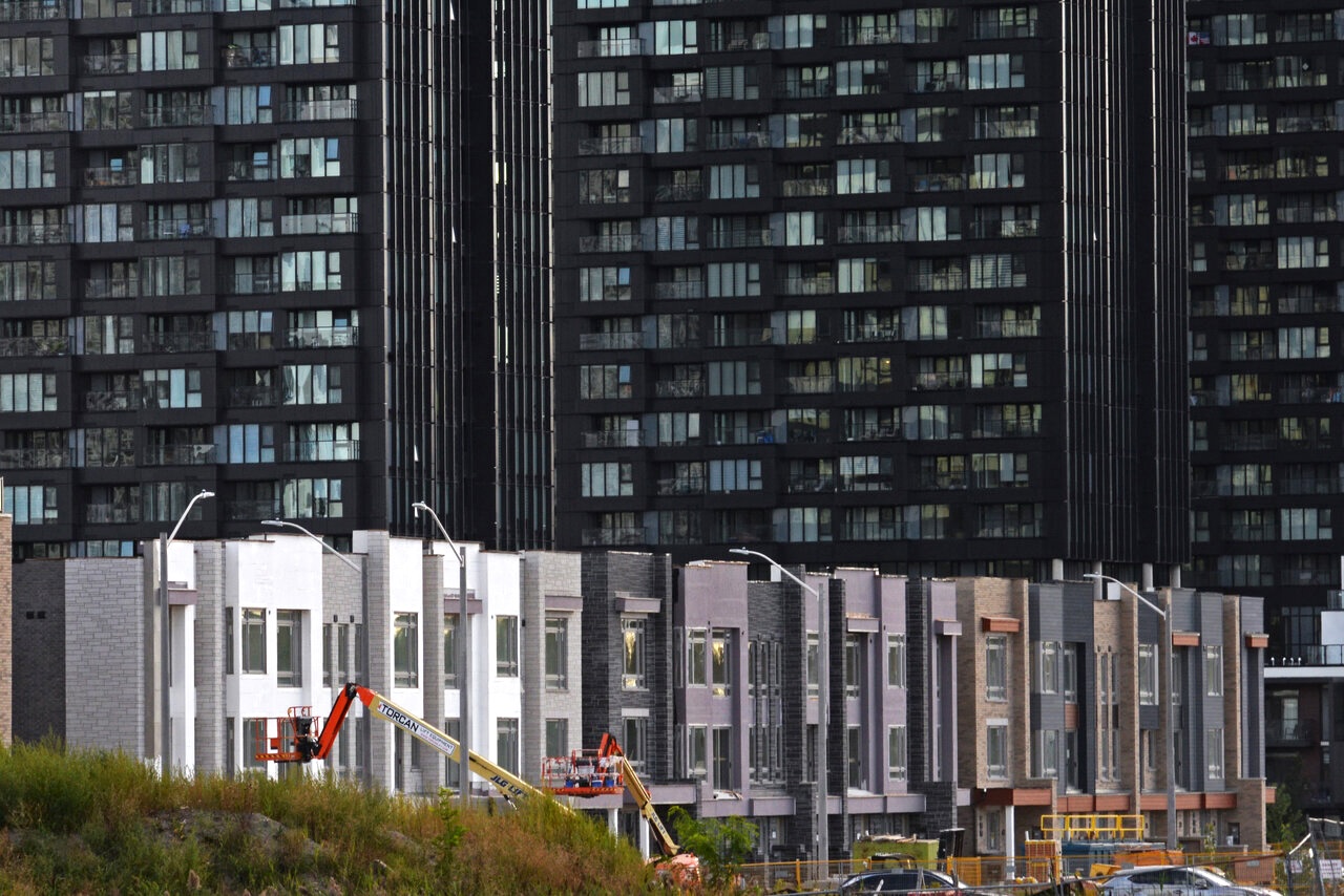
There is also a lesson here for anyone shaping a smaller renovation. You do not need a full city block to borrow this idea. A run of exterior cladding, a sequence of interior wall colours, or even the layering of flooring tones from a bright entry into a cosier living space can create the same subtle sense of movement and depth. The trick, as this Toronto project demonstrates so well, is restraint paired with intention. Too many tones fight each other. A carefully considered progression, on the other hand, feels inevitable, as though it could not have been arranged any other way.
The most memorable spaces often speak quietly, but with complete confidence.
What strikes me most is how this gradient of light and earth tones softens what could otherwise be a fairly severe urban condition, dense towers rising close behind low-rise homes. Colour, used with a designer’s discipline rather than a decorator’s impulse, has the power to reconcile scale, mood, and material in a way that few other tools can. It is a reminder that architecture’s emotional register is often set not by grand gestures, but by the patient, quiet decisions made in the choice of a facade’s palette.
Source: UrbanToronto, “Progression”