



There is a particular kind of beauty that does not need to announce itself loudly. It arrives through proportion, restraint, texture, and atmosphere. In the language of interiors, monochrome luxury speaks exactly this way. It is not dependent on excess or visual noise, but on refinement. A room shaped through one color family can feel serene, cultivated, and deeply expensive, not because it is filled with more, but because every element has been considered with care.
Table Of Content
- What Monochrome Luxury Really Means
- Why Monochrome Design Feels Timeless
- The Essential Ingredients of a Monochrome Luxury Interior
- Variation in Shade and Tone
- Texture as the Source of Drama
- Sheen and Finish
- Layered Lighting
- Choosing the Right Monochrome Palette for Your Home
- How to Apply Monochrome Luxury Room by Room
- Living Room
- Kitchen
- Bedroom
- Dining Room
- Bathroom
- Common Misconceptions About Monochrome Luxury
- A Practical System for Designing a Monochrome Room
- The Role of Materials in Defining Luxury
- How Monochrome Supports Modern Luxury Living
- Final Thoughts: Elegance Through Restraint
Monochrome design is often misunderstood as a strict black and white concept or as a minimalist formula that risks feeling cold. In reality, the most successful monochrome interiors are layered, tactile, and emotionally rich. They draw from a single hue family and then build complexity through lighter and darker values, natural materials, matte and polished finishes, and subtle shifts in light throughout the day. What emerges is a space that feels cohesive without feeling flat, dramatic without becoming theatrical, and timeless without appearing static.
This is precisely why monochrome luxury continues to resonate in contemporary interiors. Design authorities such as Benjamin Moore describe monochromatic color schemes as a way to create drama, dimension, and elegance through varying shades of the same hue. Architectural Digest notes that monochromatic rooms are less likely to go out of style, making them especially appealing for those who want their homes to feel relevant for years rather than seasons. In luxury living, where longevity, craftsmanship, and visual calm matter as much as immediate impact, monochrome remains one of the most intelligent design choices available.
Today, the look is evolving beyond minimalist cliché. Rich plaster walls, veined marble, warm oak, velvet upholstery, brushed metals, and cocooning textiles have given monochrome design a more tactile and soulful identity. Recent trend reporting from Houzz suggests homeowners are still strongly drawn to monochromatic and analogous schemes, while newer luxury spaces are embracing material richness and softness. In other words, monochrome is not disappearing. It is maturing.
Whether you live in a city condominium, a contemporary townhouse, or a larger family home, monochrome luxury can be translated beautifully across scales and styles. The key is understanding that monochrome is not sameness. It is orchestration. It is the art of allowing one palette to unfold through many surfaces, moods, and textures until the room feels complete.
What Monochrome Luxury Really Means
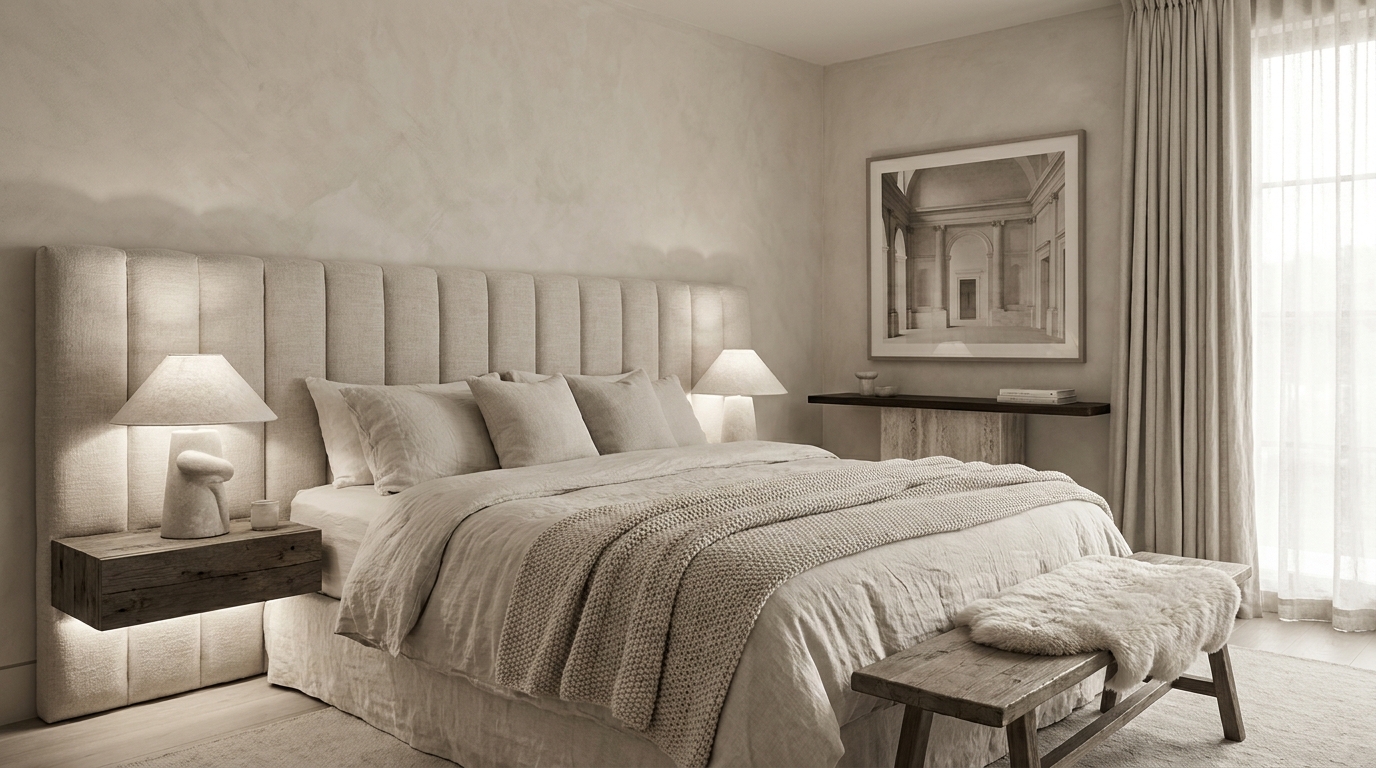
Monochrome luxury is a tone-on-tone approach to interior design built around a single color family, such as ivory, taupe, charcoal, sage, sand, mushroom, or ink blue, rather than one exact repeated shade. Instead of matching every surface precisely, a designer layers lighter and darker tints, tones, and shadows of that same hue across walls, upholstery, cabinetry, flooring, and accessories, so the room feels unified yet visibly dimensional. Benjamin Moore has emphasized that monochromatic schemes work best when they introduce this kind of variation rather than exact matching: a pale limestone wall might sit beside a cream boucle chair, a taupe wool rug, and a darker greige marble table. The eye reads harmony, but it also reads movement, and that movement is what turns a simple room into a genuinely luxurious one.
Luxury, after all, is not just about expense. It is about sensory quality. A monochrome interior feels elevated when the palette is supported by beautiful materials, careful balance, and a complete absence of visual clutter. The result is a home that feels composed and restorative. It slows the eye and allows the architecture, the craftsmanship, and the atmosphere to take center stage.
This is also why monochrome works so well in homes that aim for quiet luxury. Instead of relying on contrast for excitement, it uses nuance. Instead of creating tension through many colors, it builds pleasure through touch, reflection, shadow, and silhouette. It is an aesthetic that rewards attention. The longer you remain in the space, the more details reveal themselves.
Why Monochrome Design Feels Timeless
One of the strongest arguments for monochrome luxury is that it ages beautifully. According to Architectural Digest, monochromatic rooms are often considered less likely to go out of style. This matters in premium interiors because luxury is rarely about chasing novelty. It is about creating spaces with permanence, spaces that remain compelling after the trend cycle shifts elsewhere.
When a home is designed around a tightly edited palette, it gains a kind of visual discipline. There is less risk of clashing tones, less dependence on fashionable accent colors, and more room for natural materials to carry the design. Marble, wood, linen, wool, plaster, leather, and metal all feel more enduring when they are not competing with an overly busy chromatic story. The restraint of monochrome allows these elements to feel architectural rather than decorative.
Timelessness is also a matter of emotional experience. Monochrome interiors tend to feel calming and grounded, especially when they are built from warm neutrals or softened earth tones. Benjamin Moore’s color guidance has long associated white and subtle tonal variation with serenity and spaciousness. In practical terms, this means a monochrome room often feels larger, softer, and more breathable than a room broken into many unrelated color blocks. That emotional spaciousness is part of what makes it so luxurious.
In Canadian design contexts, this quality is especially relevant. Refined urban residences, luxury showrooms, and tailored contemporary homes often favor understated elegance over overt ornament. Monochrome palettes align naturally with that sensibility. They suit winter light, they support year round livability, and they complement the architectural clarity often found in premium North American interiors. The effect is polished, but never distant.
Monochrome luxury is timeless because it relies on balance, materiality, and proportion rather than novelty.
The Essential Ingredients of a Monochrome Luxury Interior
Variation in Shade and Tone
The first principle is simple. Choose one hue family and then expand it. A monochrome room should never depend on a single flat note. Instead, it should move from lighter to darker values with confidence. In a beige room, for instance, the ceiling may be soft cream, the walls warm sand, the sofa mushroom, and the accent chair a deep tobacco toned neutral that still belongs to the same family. That range creates depth while preserving cohesion.
This tonal layering is particularly useful in smaller spaces. Benjamin Moore notes that monochromatic color schemes can soften a room while helping it feel larger. Because there are fewer abrupt visual breaks, the eye travels more smoothly across the room. The result feels seamless and serene, which is especially valuable in bedrooms, entryways, powder rooms, and compact urban living spaces.
Texture as the Source of Drama
If color is restrained, texture must become expressive. This is where monochrome luxury truly comes alive. Velvet, boucle, brushed oak, honed stone, ribbed glass, linen, leather, limewash, silk, wool, and plaster all offer different ways to catch light and create tactile contrast. When these surfaces share a common color family, their individual personalities become even more apparent.
Texture also prevents monochrome rooms from feeling sterile. A white room with glossy paint, a linen sofa, a sculpted wool rug, and a raw stone side table feels infinitely richer than a white room where every surface is smooth and uniform. Houzz’s trend reporting has highlighted tactility and richness as central to sophisticated monochromatic interiors, reinforcing what designers have known for years. Luxury is felt as much through the hand as through the eye.
Sheen and Finish
One of the most overlooked tools in monochrome design is sheen variation. Matte walls absorb light and create softness. Satin cabinetry reflects a little more brightness and appears tailored. Polished stone introduces clarity, while brushed metal offers warmth and gentle luster. Even within one color family, shifting the finish can completely change the mood of a room.
This is an elegant way to build hierarchy without introducing more color. A dining room in charcoal, for example, may feature matte painted walls, a silk or velvet upholstered chair, a dark stained wood table, and a subtly reflective stone surface. Each material amplifies the others. The room remains tonal, but never monotonous.
Layered Lighting
No monochrome room can succeed without thoughtful lighting. Because the palette is more restrained, illumination becomes a design material in its own right. Daylight reveals undertones and textures, while evening lighting shapes intimacy and depth. Wall sconces can soften plaster finishes, table lamps can warm pale neutrals, and pendant lighting can spotlight stone and metal surfaces with sculptural precision.
Layered lighting is especially important if you are working with darker monochrome palettes such as graphite, olive, espresso, or midnight blue. These schemes can be breathtaking, but only if they are given dimensional light. Otherwise the richness of the surfaces may disappear. The goal is to let every tonal shift remain visible and sensual.
Choosing the Right Monochrome Palette for Your Home
The most successful monochrome palette is the one that matches both your architecture and your way of living. Before selecting a hue family, consider the amount of natural light your home receives, the mood you want to create, and the permanence of the materials you plan to invest in. A monochrome room should feel intimate with the home itself, not imposed upon it.
Warm whites and ivories remain the most classic choice for luxury interiors. They feel timeless, expansive, and luminous. These palettes work beautifully in homes where soft daylight is abundant, and they pair effortlessly with stone, pale woods, and woven textiles. They are also forgiving, which makes them ideal for those just beginning to explore monochrome design.
Layered neutrals such as taupe, mushroom, greige, camel, and sand offer a slightly moodier and more enveloping alternative. They feel sophisticated, urbane, and deeply livable. In many contemporary homes, these tones create the ideal bridge between elegance and comfort. They are also especially effective in open plan spaces where visual continuity matters.
For those who want more drama, charcoal, deep brown, olive, and navy can produce extraordinary monochrome interiors. These darker palettes are best balanced with tactile materials and strategic lighting. They work especially well in living rooms, dining rooms, and studies, where a sense of cocooning enhances the experience of the space. A dark monochrome interior can feel intimate and cinematic, yet still timeless if the materials are noble and restrained.
How to Apply Monochrome Luxury Room by Room
Living Room
The living room is often the ideal place to introduce monochrome luxury because it allows for the fullest expression of layering. Begin with the largest surfaces. Walls, rugs, and upholstery should establish the main tonal world of the room. From there, add depth through varied materials such as boucle seating, leather accents, stone tables, silk cushions, and drapery that either diffuses or frames natural light.
A monochrome living room does not need many accessories to feel complete. In fact, fewer pieces usually create a stronger effect. Focus on sculptural forms, a beautiful lamp base, a stack of art books in the same tonal family, or a ceramic vessel with an organic silhouette. When the palette is restrained, shape becomes more noticeable. This gives the room quiet confidence.
Charcoal, soft taupe, warm ivory, and dusty clay all work beautifully in living spaces. If the room is small, stay closer to the lighter half of the tonal spectrum. If the room is generous and well lit, deepen the palette with richer shades to add gravitas. The final effect should feel composed and welcoming, never overworked.
Kitchen
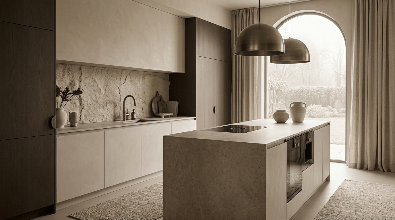
Monochrome kitchens are especially powerful because they bring clarity to a highly functional room. Layered neutrals such as stone, putty, sand, and taupe create a refined backdrop that feels clean without being clinical. Matte cabinetry can be paired with subtly veined countertops, tonal backsplash tile, and brushed fixtures in metal finishes that support the same color mood.
The secret to luxury in a monochrome kitchen lies in material contrast. A smooth cabinet front beside tactile stone immediately creates interest. So does a honed island surface under reflective pendant lighting. Open shelving, if used at all, should remain curated and quiet. The kitchen should feel architectural, as though every surface was selected to contribute to the whole rather than to stand apart from it.
Monochrome is also practical here because it promotes visual calm. In open concept homes, a kitchen in a single tonal language integrates more gracefully with adjacent dining and living spaces. Rather than breaking the home into separate color stories, it extends one refined atmosphere throughout.
Bedroom
The bedroom may be the most natural setting for monochrome luxury because rest and restraint belong beautifully together. A limited palette creates immediate softness, especially when it is expressed through layered bedding, upholstered surfaces, drapery, and tactile rugs. Warm whites, creams, pale taupes, and dusty greys are ideal choices for a room intended to soothe.
To keep the space from feeling washed out, use a full spectrum of textures. Crisp cotton sheets, quilted coverlets, linen curtains, boucle benches, and plastered walls all contribute different sensations. Lighting should be warm and gentle, ideally through table lamps, sconces, and dimmable overhead fixtures. The room should invite exhale, not stimulation.
A monochrome bedroom also gains elegance when furniture lines remain clean and sculptural. A softly curved headboard, a simple stone or timber bedside table, and a tonal bench at the foot of the bed can be enough. The luxury comes from calm composition, not accumulation.
Dining Room
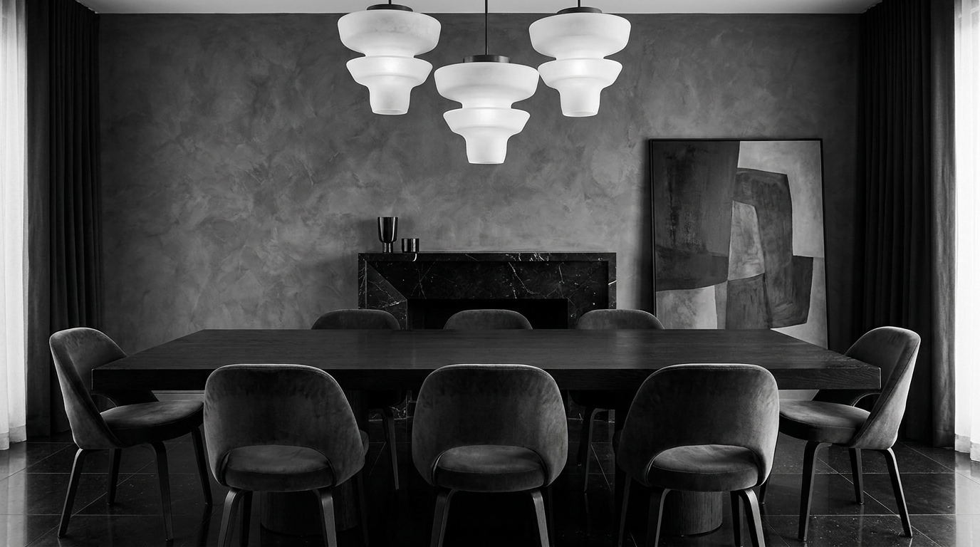
The dining room offers an opportunity to explore monochrome in a more dramatic register. Deeper tones such as espresso, slate, ink, or soft black can create a remarkable sense of intimacy. Velvet or leather dining chairs, dark wood, textured walls, and low ambient lighting make the room feel immersive and elevated.
Because dining rooms are often used in the evening, they benefit from richer tonal schemes that interact beautifully with artificial light. A polished stone tabletop or a subtle metallic detail can introduce a glow that keeps the room from feeling heavy. The atmosphere should feel almost cinematic, but still controlled and elegant.
Bathroom
In bathrooms, monochrome luxury often feels spa like. A single palette allows stone, tile, glass, and metal to read as a harmonious set rather than as competing finishes. Layered whites and soft greys remain perennial favorites, but warm beige and pale mushroom tones can make the room feel more residential and less clinical.
Kingsgate Luxury Homes took this approach in the ensuites at 216 Duncan Rd in Richmond Hill, carrying the same gold-veined white stone across floors and walls so the room reads as one continuous surface.
Luxury here depends heavily on continuity. Extending the same tile or stone across floor and wall surfaces creates calm and visual expansion. Towels, accessories, and vanity finishes should remain within the same family. Introduce variation through veining, texture, and sheen rather than through abrupt color changes. The result is restorative and polished.
Common Misconceptions About Monochrome Luxury
Perhaps the most common misunderstanding is that monochrome means black and white. In truth, monochrome can be built from any color family. Soft green, mineral blue, cocoa brown, sandy beige, and layered ivory all qualify. What defines the approach is not the specific hue, but the commitment to staying within its tonal world.
Another misconception is that monochrome interiors are cold. They can be, if they rely only on smooth surfaces and harsh lighting. Yet when they are layered with natural materials, warm undertones, and tactile textiles, they often feel more welcoming than highly colorful spaces. A room wrapped in creamy plaster, wool, oak, and linen is not sterile. It is sensorial.
Some people also assume monochrome means every element must match exactly. This is precisely the opposite of good design practice. Benjamin Moore’s guidance is clear that varying shades, tones, tints, and sheens creates interest and depth. Exact matching tends to make a room feel staged. Variation makes it feel designed.
Finally, monochrome is sometimes dismissed as merely a minimalist trend. Current design coverage suggests otherwise. Today it intersects with warm minimalism, cocooning interiors, quiet luxury, and tactile design. It can be modern, classic, romantic, architectural, or organic depending on how the materials are selected and composed.
A Practical System for Designing a Monochrome Room
If you are ready to bring monochrome luxury into your own home, it helps to think of the process as a system rather than a spontaneous styling exercise. The palette should be developed deliberately, with each decision reinforcing the atmosphere you want to create.
-
Start with a base hue. Choose the color family that best suits the room and the mood. Warm white, taupe, charcoal, olive, and soft blue are all strong foundations depending on the architecture and light.
-
Select three to five tonal variations. Include a light value, a mid tone, and a darker anchor. This ensures the room has rhythm and depth instead of reading as one flat wash.
-
Build the room through materials. Pair soft textiles with harder surfaces, matte finishes with reflective ones, and natural grain with smoother planes. Let materiality do the expressive work.
-
Use lighting intentionally. Include ambient, task, and accent lighting so textures remain visible and the room can shift mood from day to evening.
-
Edit accessories carefully. In a monochrome room, every object matters. Choose fewer pieces with stronger form, better craftsmanship, and tonal relevance.
-
Test under real conditions. Paint and fabric samples should be viewed in natural light, evening light, and against existing finishes before final decisions are made.
This method keeps the design cohesive while leaving room for personality. Monochrome does not erase individuality. It refines it. Through this approach, a room becomes not only beautiful, but also easier to live in and easier to evolve over time.
The Role of Materials in Defining Luxury
No monochrome interior can feel truly luxurious if the materials are weak. Because the palette is restrained, every finish becomes more visible. Poor quality stands out immediately. Beautiful quality does too. This is why monochrome design pairs so naturally with premium interiors. It encourages investment in the things that matter most: solid surfaces, tailored upholstery, elegant joinery, and finishes that age with grace.
Stone is particularly powerful in monochrome spaces because it introduces natural variation within a controlled palette. Veining, movement, and subtle tonal shifts provide built in complexity. Wood, too, is invaluable. Whether pale oak, smoked walnut, or dark stained ash, it contributes warmth and grain that keep the room grounded. Textiles then soften the picture, adding comfort and quiet rhythm.
Metals should be chosen with equal care. In warm monochrome interiors, brushed brass, bronze, or muted champagne finishes can be exquisite. In cooler palettes, nickel, pewter, or blackened steel may feel more aligned. The goal is not sparkle for its own sake, but finish as atmosphere. A luxury room should glimmer softly, never glare.
How Monochrome Supports Modern Luxury Living
Luxury today is increasingly defined by calm, quality, and intentionality. Many homeowners are moving away from rooms that feel performative and toward spaces that feel restorative. Monochrome design supports this shift beautifully. It offers visual quiet, but not visual emptiness. It creates coherence, but not rigidity. It allows daily life to unfold in a setting that feels elevated yet deeply livable.
This is part of the reason monochrome continues to show strength in trend reporting. Houzz has noted rising consumer interest in monochromatic and analogous schemes, while broader design conversations point toward tactility, richness, and softness rather than stark minimalism. In many ways, monochrome has become more human. It now embraces warmth, imperfection, and touch.
For urban homes, monochrome can also solve practical challenges. It makes compact spaces feel larger, connects open plan rooms, and reduces visual clutter. For larger homes, it offers continuity and ease, especially when moving from one room to another. The palette can deepen or lighten by function while still maintaining a clear identity throughout the home.
Final Thoughts: Elegance Through Restraint
Monochrome luxury endures because it understands a truth that the best interiors always know. Beauty does not need to be loud to be unforgettable. A home can be deeply expressive while speaking in a restrained voice. Through layered shades, tactile materials, thoughtful lighting, and careful editing, monochrome transforms a simple palette into an atmosphere of genuine sophistication.
Its appeal is not based on trend alone, even if the design world continues to celebrate it. Its power lies in its longevity. A monochrome room can evolve with new art, new textiles, or a different sculptural object, yet still retain its essential calm. It remains elegant because it was never built on novelty in the first place.
If you are seeking a home that feels polished, timeless, and emotionally restorative, monochrome luxury offers a beautiful path forward. Choose one hue family. Let it expand through tone, texture, material, and light. Then allow restraint to do what excess never can. Let it reveal the quiet grandeur of a room designed with confidence.



No Comment! Be the first one.