



Investment dashboards promise clarity, but many deliver the opposite. A screen packed with numbers, watchlists, technical indicators, and flashing colors may look advanced, yet it often leaves beginners less certain about what they should do next. The real value of an investment dashboard is not how much data it can display. It is how well it turns a complicated portfolio into a small set of signals that support better decisions.
Table Of Content
- Why investment dashboards matter more than raw portfolio data
- The core sections every effective investment dashboard should include
- 1. A top-level portfolio summary
- 2. Goal progress and contribution tracking
- 3. Asset allocation and diversification
- 4. Risk indicators that people can actually understand
- 5. Costs, fees, and tax visibility
- How to design a dashboard around decisions, not data tables
- A beginner-friendly dashboard workflow
- Choosing the right visuals for the right question
- Line charts for performance over time
- Bar charts for comparisons
- Heat maps for concentration and risk clusters
- Pie charts only when the slice count is low
- Tooltips and definitions for explainability
- Best practices for color, layout, and signal hierarchy
- A practical layout model
- Common mistakes that make investment dashboards less useful
- How to customize dashboards for different investor needs
- Example 1: A beginner saving for retirement
- Example 2: A DIY investor managing multiple accounts
- Example 3: An advisor serving many clients
- Practical tips for building a dashboard beginners can trust
- A simple blueprint you can apply right away
- The future of investment dashboards
- Conclusion: build a dashboard that makes the next decision easier
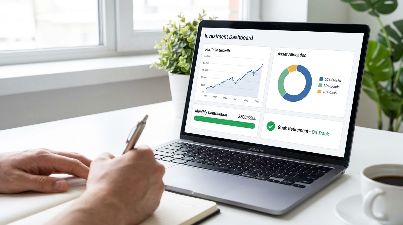
An effective investment dashboard is one that turns a complicated portfolio into a small set of clear signals instead of a wall of raw data. It directly answers the questions that matter most: Am I on track? What changed since last month? Where is my risk concentrated? How much am I paying in fees? How are my contributions affecting progress? A dashboard that answers these questions without forcing the user to decode jargon or hunt through tabs becomes more than a reporting tool — it becomes a decision system. This matters because confidence in personal finance remains uneven. CIRO’s 2024 investor survey found that only 21% of Canadians reported feeling very confident about meeting their financial objectives, which is exactly the kind of gap a well-designed dashboard is meant to close by feeling clear, reassuring, and explainable rather than merely polished.
Many investors now rely on digital tools, apps, websites, and self-serve platforms to understand their money, which makes the design of that first screen more consequential than it might seem.
This article explains how to create effective investment dashboards for beginners and everyday investors. We will cover the essential components, the best visual formats, common mistakes, and practical ways to customize dashboards for personal and professional use. Along the way, we will use real-life design patterns from major investment platforms and connect them to a simple idea: the best dashboard is the one that makes the next good decision easier.
Why investment dashboards matter more than raw portfolio data
Most investors do not suffer from a lack of data. They suffer from a lack of structure. Brokerages, apps, banks, and reporting tools can show balances, holdings, trade history, dividends, unrealized gains, realized gains, percentages, benchmark lines, and transaction logs in almost endless combinations. Without a clear hierarchy, that information can create noise instead of insight. A dashboard solves this by organizing the portfolio around decisions rather than around database fields.
That is especially important for beginners. New investors often focus on the most visible number on the screen, which is usually current portfolio value or daily gain and loss. Those figures are useful, but they can also be misleading when viewed in isolation. Vanguard has long emphasized that portfolio performance should be understood through total return, which includes both price changes and income such as dividends or interest. Personal performance can also differ from simple portfolio growth when investors add or withdraw money over time. A dashboard should make these distinctions obvious.
The psychology of dashboard design matters too. If every movement is highlighted in red or green, users may feel pressure to react to short-term market moves that are not relevant to long-term goals. Most investor education from major firms and regulators points in the same direction: better outcomes usually come from maintaining a long-term view, understanding risk, and keeping fees visible. In other words, the job of a dashboard is not to stimulate activity. It is to improve judgment.
An investment dashboard should reduce decision fatigue, not amplify it. If the screen makes users feel rushed, confused, or alarmed, the design is working against the portfolio.
There is also a practical reason to prioritize clarity. CIRO reported that 64% of Canadians use banks or advisors for financial information and advice, while 38% use friends and family. DIY investors and higher-risk-tolerance investors are also more likely to use social media, websites, blogs, and investment apps. That mix means many users are piecing together information from multiple sources of varying quality. A strong dashboard can act as an anchor by presenting verified, consistent, and explainable signals in one place.
The core sections every effective investment dashboard should include
The easiest way to design a dashboard is to think in layers. The first layer should answer the most important questions in under a minute. The second layer should explain why the top-level numbers look the way they do. The third layer should offer detail for users who want to drill down. This structure keeps the home view simple while still supporting deeper analysis when needed.
1. A top-level portfolio summary
The summary section is the dashboard’s front door. It should include portfolio value, total return, net contributions, available cash, and a simple status signal for goal progress. This is the area that most users will look at first, so it needs to be unmistakably clear. Labels such as portfolio value, money you contributed, investment growth, and cash available are easier to understand than shorthand finance terms.
For beginners, this section should also frame the time horizon. A return number without context can be deceptive. Showing one-month, one-year, and since-inception views side by side can help users see whether a recent decline is part of normal market movement or part of a more serious trend. The key is to make the comparison intuitive rather than crowded.
2. Goal progress and contribution tracking
Goal-based design is one of the strongest trends in investment platforms because it reflects how real people think. Most investors are not investing to beat an abstract chart. They are investing for retirement, education, a down payment, or financial independence. A dashboard should connect portfolio activity to those goals with projected ranges, progress bars, and status labels such as on track, watch, or off track.
Schwab’s Goal Tracker reflects a useful best practice here. Instead of presenting a single precise future number, it uses projected ranges and status labels. That makes the uncertainty visible without making the dashboard feel vague. For beginners, this is much better than showing a forecast that looks guaranteed. Projections are hypothetical, and the interface should say that clearly.
Contribution tracking is just as important. CIRO found that among Canadians who continued investing in the previous 12 months, 45% said they invested the same amount as the year before. That suggests consistency is a major behavior worth reinforcing. A good dashboard should celebrate steady contributions because habit often matters more than one month of market performance.
3. Asset allocation and diversification
Allocation tells users where their money is working. A dashboard should show exposure by asset class, such as stocks, bonds, cash, and alternatives, and it can also display breakdowns by region, sector, or account type. This is where many investors discover that what looked diversified at a high level is actually concentrated in one industry, one geography, or one style of investment.
For a beginner home screen, a simple allocation chart is usually enough. If there are only a few categories, a pie chart or donut chart can work. If there are many holdings, a bar chart is often easier to compare accurately. The dashboard should also indicate whether the current allocation is close to the target allocation, because that turns a passive graphic into an actionable comparison.
4. Risk indicators that people can actually understand
Risk is often the most poorly communicated part of an investment dashboard. Too many tools either hide it in advanced tabs or present it with technical ratios that mean little to new investors. A stronger approach is to show a small set of understandable measures such as historical volatility, maximum drawdown, concentration risk, and stress test scenarios. These are not perfect predictors, but they give users a more realistic sense of what the portfolio can feel like under pressure.
Risk indicators should be framed in plain language. Instead of only displaying a volatility percentage, the dashboard might explain that the portfolio has historically experienced moderate swings and may fall within a certain range during difficult periods. This makes the data more meaningful. It also supports better behavior because investors are less likely to panic when they understand that fluctuations were expected.
5. Costs, fees, and tax visibility
Fees are one of the few investment variables users can partly control, yet many dashboards bury them. An effective design surfaces expense ratios, advisory fees, trading costs where relevant, and the estimated annual dollar impact on returns. This is often more intuitive than showing percentages alone. A simple line such as estimated annual fees paid this year: $620 can be more powerful than a tiny ratio in a details panel.
Tax awareness is also becoming more common in modern dashboards. Tools may show realized gains, unrealized gains, tax lots, dividend income, and the possible tax effects of a sale. For beginners, the home dashboard does not need to become a tax workstation, but it should at least distinguish between taxable and tax-advantaged accounts and flag events with tax consequences. This is especially useful in North American markets where account type and timing can materially affect net results.
How to design a dashboard around decisions, not data tables
The best dashboards are built around user workflow. That means the interface should follow the sequence of questions a person naturally asks, rather than mirroring the structure of a financial database. A beginner investor typically wants to know whether the plan is working, whether the portfolio still matches the intended risk level, and whether any action is needed this month. An advisor or advanced user may need performance attribution, client alerts, tax overlays, and concentration reports. These are different workflows, so they should lead to different dashboard designs.
BlackRock’s Advisor Center 360 and Vanguard’s portfolio analysis tools offer examples of this broader trend. Modern dashboards increasingly combine performance, risk, costs, scenario analysis, and reporting in a unified view. What makes these platforms useful is not just the amount of information they contain. It is the way they package related signals so the user can move from observation to explanation without jumping through several disconnected tools.
When designing your own dashboard, start with the decisions you expect to make regularly. Those might include increasing monthly contributions, rebalancing to target allocation, reducing fees, reviewing income generation, or checking retirement readiness. Once the decision list is clear, the metrics become easier to prioritize. Data that does not support a decision probably does not belong on the main screen.
A beginner-friendly dashboard workflow
For a personal investing dashboard aimed at a newer investor, a clean sequence works well. First, show current portfolio value and total return. Second, show goal progress and whether the investor is on track based on contributions and assumptions. Third, show where the money is allocated and whether the allocation still matches the intended mix. Fourth, show a simple risk panel and fee summary. Fifth, offer one or two suggested review actions such as consider increasing contributions by 5% or allocation is drifting above target in US large cap stocks.
This sequence reflects how many people think in practice. They want reassurance first, then explanation, then a manageable next step. That is much more helpful than opening with dozens of ratios or security-level details that most beginners will not use. Simplicity is not a lack of sophistication. In dashboard design, simplicity is often evidence of discipline.
Choosing the right visuals for the right question
Not every chart type is equally effective. Good investment dashboards match the visual format to the question being asked. This sounds obvious, but many dashboards still choose charts for style rather than comprehension. If the purpose of a visual is unclear, the chart becomes decoration instead of analysis.
Line charts for performance over time
Line charts are usually the best choice for showing portfolio performance across time periods. They help users see trend, direction, drawdowns, and recovery paths without clutter. If a benchmark is included, it should be clearly labeled and easy to toggle on or off. A line chart can also show multiple time horizons, but the default view should be simple enough that a beginner can understand it immediately.
Annotations improve line charts dramatically. For example, if the portfolio dipped during a broad market decline and recovered after continued contributions, a short note can explain what happened. Annotated charts help users interpret movement instead of projecting meaning onto every change. That is an important guardrail against emotional investing.
Bar charts for comparisons
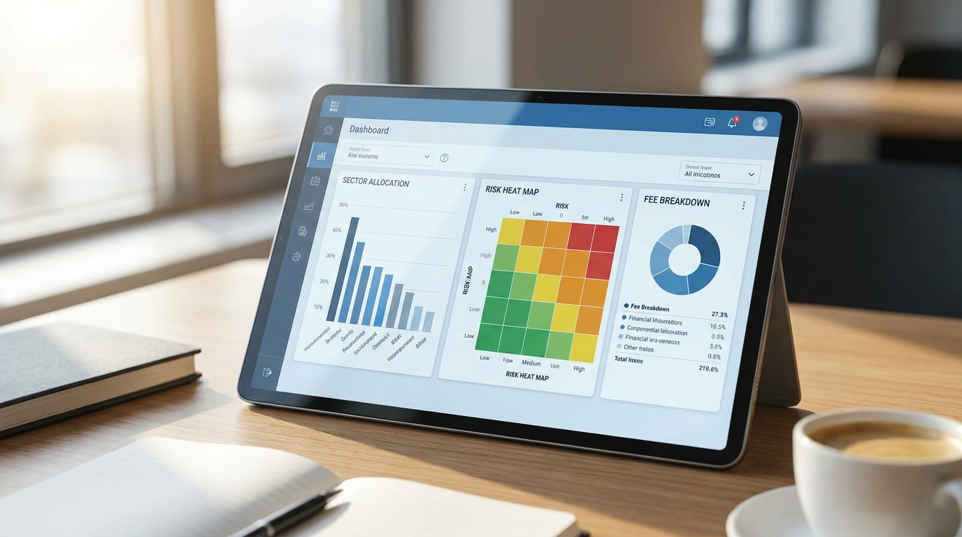
Bar charts are ideal when the user needs to compare categories. Asset class weights, sector exposures, regional allocations, income by source, and fee categories all work well in bar format. The eye reads bar length more accurately than pie slices, especially when there are several categories close in size. This is why bar charts often outperform pie charts in practical dashboards, even if pie charts look more familiar.
Heat maps for concentration and risk clusters
Heat maps can be extremely useful when they are used sparingly. They help users identify concentration by sector, region, account, or risk factor. A heat map is especially good at revealing clusters that are hard to see in a traditional table. For instance, an investor may not realize how much of the portfolio is indirectly tied to large technology stocks until a heat map shows repeated exposure across several funds and accounts.
That said, heat maps require careful labeling. A beginner should not have to guess whether darker color means higher risk, larger size, or stronger performance. Legends and tooltips should be explicit. Without that support, a heat map can become visually impressive but conceptually opaque.
Pie charts only when the slice count is low
Pie charts have a place, but only under the right conditions. They are useful for simple allocation snapshots where there are three to five categories with clearly different weights. Beyond that, they become difficult to compare. One of the most common dashboard misconceptions is that allocation always belongs in a pie chart. In reality, if the portfolio includes many holdings or subcategories, a sorted bar chart is usually superior.
Tooltips and definitions for explainability
One of the easiest ways to improve a dashboard is to add plain-language tooltips for terms such as benchmark, annualized return, realized gain, drawdown, and total return. This small feature increases trust because it signals that the platform is not trying to hide behind jargon. Explainability is particularly important for digital-first investors who may be learning as they go and comparing dashboard information with advice from apps, blogs, or social media.
Best practices for color, layout, and signal hierarchy
Visual hierarchy determines whether a dashboard feels calming or chaotic. The user should know where to look first without thinking about it. This means the most important information should occupy the most prominent space and use the clearest labels. Secondary detail can sit lower on the page or inside expandable panels. The layout should guide attention in a predictable order, not force scanning.
Color needs discipline. In investment dashboards, too much color can create emotional distortion. A better system uses a limited palette with consistent rules. Green can indicate on track or within target range. Amber can indicate a watch condition or mild drift. Red can indicate off target or a meaningful issue that needs attention. The key is to reserve stronger colors for true exceptions rather than for routine market movement.
Typography and spacing also matter more than many designers expect. Labels should be short, unambiguous, and large enough to read on mobile screens. White space is not wasted space. It improves comprehension by separating concepts. A cluttered dashboard can make even accurate data feel unreliable because the user struggles to decode what belongs together.
A practical layout model
A dependable dashboard layout often follows this pattern:
- Top strip: portfolio value, total return, cash, contributions, and goal status.
- Upper middle: performance chart with benchmark and time horizon controls.
- Lower middle left: asset allocation and diversification view.
- Lower middle right: risk panel, concentration alerts, and scenario summary.
- Bottom section: fees, taxes, income, recent changes, and recommended review actions.
This structure works because it leads from summary to explanation to action. It also scales well. A beginner dashboard can keep each module simple, while a more advanced version can add drill-down links without disrupting the overall logic.
Common mistakes that make investment dashboards less useful
Many dashboards fail for predictable reasons. The first is overloading the screen with too many metrics. More data does not automatically improve decisions. In fact, it often increases noise and reduces understanding. Beginners rarely need Sharpe ratios, tracking error, factor tilts, and options Greeks on the home page. If a metric is not actionable for the user, it should probably live in an advanced section.
The second mistake is confusing portfolio value with performance. If a user contributes $10,000 during the year, the account balance may rise even if investment returns were weak. Likewise, a flat balance does not always mean the portfolio underperformed if there were withdrawals. Effective dashboards separate money movement from investment return so users can understand what actually changed.
The third mistake is emphasizing one-period returns without benchmark or time horizon context. A one-month gain can look impressive and still lag the market. A short-term loss can feel alarming and still be completely normal within a long-term plan. Dashboards should place recent performance beside broader periods and relevant benchmarks so users can interpret movement accurately.
The fourth mistake is treating projections like forecasts carved in stone. Scenario analysis and Monte Carlo ranges are useful, but they are not promises. Dashboards should present these outputs as probability-based estimates and explain the assumptions behind them. The point of a projection is to support planning, not to manufacture certainty.
The fifth mistake is using visuals that are fashionable but hard to read. A glossy interface filled with tiny gauges, dense gradients, and abstract icons may impress in a product demo, but it often performs poorly in real use. Clear charts, simple labels, and transparent logic almost always beat design gimmicks in financial tools.
How to customize dashboards for different investor needs
Customization is where an investment dashboard becomes genuinely powerful. Two people can hold similar portfolios and still need completely different views. One investor may want a minimalist retirement tracker focused on monthly contributions and long-term probability of success. Another may want active oversight of sector concentration, taxable events, and income stability. The dashboard should adapt to the user’s goals, experience level, and decision style.
Example 1: A beginner saving for retirement
Imagine a 32-year-old investor contributing monthly to a retirement account and a taxable brokerage account. This person is not trying to trade frequently. They want to know whether they are saving enough and whether the portfolio is reasonably diversified. For this user, the ideal dashboard home screen would feature current portfolio value, total contributions, estimated retirement progress, monthly contribution consistency, and a straightforward allocation chart.
The risk section could stay simple, using language such as moderate portfolio swings are expected and showing how the portfolio behaved during recent market stress periods. The fee section could summarize annual costs in dollars and percentages. A small prompt might suggest increasing monthly contributions if the goal projection shifts from on track to watch. This is a dashboard designed to support discipline rather than activity.
Example 2: A DIY investor managing multiple accounts
Now consider a self-directed investor with a registered account, a taxable account, and a dividend-focused strategy on the side. This user may need a dashboard that consolidates holdings across institutions, shows sector and geographic overlaps, tracks dividend income, and highlights tax-related events. The home view can still be simple, but it should include tabs or drill-down modules for income trends, realized gains, and concentration risk.
This is where unified dashboards become especially valuable. Instead of checking separate apps for performance, risk, and tax position, the investor sees the whole picture in one interface. Modern platforms increasingly move in this direction because fragmented reporting creates blind spots. A user can think they are diversified until all accounts are combined in a single dashboard.
Example 3: An advisor serving many clients
Professional users need another layer of customization. An advisor dashboard may emphasize alerts, account drift, upcoming reviews, client risk mismatches, and cash needs rather than personal goal progress alone. It might flag households that have not contributed recently, accounts with concentrated positions, or clients whose allocations have moved outside policy ranges. BlackRock-style unified reporting patterns are helpful here because they connect portfolio analytics with workflow.
Even in professional settings, the same design principle applies. The dashboard should support the next decision. A dashboard that helps an advisor identify which accounts need attention this week is more useful than one that merely displays every available metric.

Practical tips for building a dashboard beginners can trust
If you are creating or customizing an investment dashboard, start by limiting the main view to the few questions that matter most. For most users, that means progress, performance, allocation, risk, and costs. Every additional element should earn its place. If it does not change how the user thinks or acts, it probably belongs in a secondary layer.
Use plain English for labels and descriptions. Replace technical shorthand with language a new investor would immediately understand. For example, instead of showing only YTD and CAGR, include brief definitions or hover explanations. Trust grows when the user feels the system is teaching rather than obscuring.
Always separate account activity from investment outcome. Show contributions, withdrawals, dividends, fees, and market returns in distinct lines or tiles. This helps users understand why their balance changed. It also prevents the common mistake of reading cash inflows as investment skill or short-term declines as failure.
Frame performance inside a time horizon. Daily movement can be interesting, but it should not dominate the experience for long-term investors. A dashboard that defaults to one year and since inception, while still allowing shorter views, usually creates a healthier perspective. Most successful investor education materials emphasize exactly this long-term framing.
Include benchmarks carefully. Benchmarks help users judge performance in context, but they should be relevant to the portfolio’s allocation. Comparing a conservative balanced portfolio to an all-equity index can create confusion rather than insight. The dashboard should explain what the benchmark represents and why it is used.
Keep fees visible and understandable. Show both percentage and dollar impact where possible. The same goes for taxes in taxable accounts. A dashboard that makes cost drag tangible is helping the user focus on variables that matter over time. This is one of the clearest ways a dashboard can support smarter decisions without encouraging unnecessary trading.
Use scenarios to support planning, not prediction. Monte Carlo projections, stress tests, and what-if contribution tools can be excellent educational features. They help users understand trade-offs and prepare for uncertainty. The output should be shown as a range with assumptions clearly stated. That approach is both more honest and more useful.
A simple blueprint you can apply right away
If you want a practical starting point, imagine building your dashboard in three views. The first view is the home dashboard. It includes net worth or portfolio value, total return, contribution summary, goal status, and one simple allocation graphic. The second view is the portfolio health dashboard. It includes benchmark comparison, diversification, concentration alerts, drawdown history, and fee summary. The third view is the planning dashboard. It includes projection ranges, contribution what-if tools, retirement readiness estimates, and scenario stress tests.
This three-view structure is effective because it mirrors how many investors actually review their finances. First they want to see where they stand. Then they want to know whether the portfolio is healthy. Finally they want to explore what could happen next if they change inputs or if markets behave differently. The dashboard becomes a sequence of understanding rather than a wall of disconnected widgets.
For a beginner, each of those views can stay compact. The home dashboard may contain only five tiles and one chart. The portfolio health dashboard may have just three visuals and a short explanation panel. The planning dashboard may show only two scenario sliders, such as monthly contribution amount and retirement age. Simplicity encourages use, and regular use is what makes a dashboard valuable.
The future of investment dashboards
Investment dashboards are becoming more sophisticated, but sophistication alone is not the goal. Current trends include scenario testing, Monte Carlo projections, tax-aware analysis, unified multi-account views, advisor and client reporting, and explainable AI overlays. These developments are promising because they can help investors see beyond basic gain and loss. They can show how choices connect to long-term outcomes.
At the same time, the rise of digital investing puts more pressure on design quality. When people are getting information from apps, blogs, short videos, social feeds, and online communities, the dashboard has to compete with fast-moving, attention-grabbing content. The answer is not to mimic that noise. The answer is to provide something better: grounded, structured, transparent decision support.
That is especially relevant in Canada and across North America, where DIY investing and app-based financial engagement continue to grow. The strongest dashboards in this environment will combine accessibility with rigor. They will help users understand total return, benchmark context, risk, fee drag, taxes, and goal progress without making the experience feel intimidating.
Conclusion: build a dashboard that makes the next decision easier
An effective investment dashboard does not need to be flashy. It needs to be useful. It should translate portfolio complexity into a handful of signals that support long-term thinking and reduce confusion. When done well, it helps the user see not only what happened, but why it happened and what deserves attention next.
For beginners, the priority is clarity. Show portfolio value, total return, contributions, allocation, risk, fees, and goal progress in simple language with clear visual hierarchy. Use line charts for performance, bar charts for comparisons, and scenario ranges instead of false precision. Keep colors consistent, labels human, and short-term noise in perspective.
For more advanced users and professionals, customization adds depth. Drill-down views for taxes, concentration, attribution, and client alerts can make the dashboard more powerful as long as the main screen remains focused. The best dashboards grow with the investor. They start simple, then reveal complexity only when it becomes useful.
In the end, smart decision making rarely comes from seeing more information. It comes from seeing the right information at the right time, in the right form. That is the real purpose of an investment dashboard, and it is why thoughtful design can become an advantage in almost any investing journey.



No Comment! Be the first one.