



5 Simple Steps to Refresh Your Walls with Color and Transform Your Home
There are few home updates as immediate, affordable, and emotionally rewarding as a fresh coat of paint. Walls occupy the largest visual surface in most interiors, so even a subtle shift in color can change the entire mood of a room. A cooler tone can make a small space feel airy and composed, while a warmer shade can wrap a room in softness and intimacy. When chosen with care, color becomes more than decoration. It becomes atmosphere.
Table Of Content
- Why a Wall Color Refresh Matters More Than You Think
- Step 1: Begin with the Mood You Want to Create
- Questions to Ask Before Choosing Your Color
- Step 2: Test Paint Samples Properly Before You Commit
- Step 3: Prepare the Room and the Walls Meticulously
- Preparation Essentials for a Cleaner Finish
- Step 4: Apply Paint with Patience and Good Technique
- Step 5: Style the Room to Let the New Color Shine
- Common Mistakes to Avoid During a Wall Color Refresh
- Best Color Families for an Easy, Timeless Update
- How to Maintain Freshly Painted Walls
- Conclusion: A Fresh Color, A Renewed Home
For many homeowners, repainting walls can feel deceptively simple until the process begins. Questions arise quickly. Which shade works best in morning light. Should you choose a timeless neutral or something more expressive. How do you avoid streaks, patchy coverage, or a result that feels different from the paint chip in the store. The good news is that a beautiful wall refresh does not require professional design training. It requires a practical plan, thoughtful observation, and patience at each stage.
This guide explores five simple steps to refresh your walls with color in a way that feels elegant, manageable, and effective. It is designed for anyone who wants to renew a living room, bedroom, hallway, or dining area without embarking on a complete renovation. Along the way, we will also consider how seasonal inspiration can shape your choices, helping your home feel aligned with the light, textures, and rhythms of the year.
If your space has been feeling tired, flat, or visually heavy, paint offers a graceful solution. Rather than replacing furniture or investing in large decorative changes, you can transform the backdrop itself. A wall color refresh can clarify a room’s identity, elevate your existing pieces, and introduce a calm sense of order. When approached step by step, the result is not only a more beautiful room, but a home that feels cared for and newly alive.
Why a Wall Color Refresh Matters More Than You Think
Color affects how we perceive dimension, temperature, and emotion inside a room. Pale shades can expand a compact area and reflect natural light more generously, while deeper tones can create a cocooning effect that feels intimate and sophisticated. Even when furniture remains unchanged, a new wall color can make upholstery appear richer, art feel more intentional, and architectural details stand out with fresh clarity.
There is also a maintenance element that should not be overlooked. Walls gather the quiet evidence of daily life. Scuff marks, fading, minor stains, and subtle discoloration slowly diminish the crispness of an interior. Repainting restores not only beauty but also neatness. In this sense, a color refresh belongs naturally within interior finish maintenance. It protects your surfaces while renewing the visual language of your home.
Seasonality adds another layer of meaning. During spring and summer, many people are drawn to soft greens, sunlit creams, or washed blues that echo openness and ease. In autumn and winter, warmer neutrals, muted terracottas, and grounded taupes often feel more harmonious with shorter days and layered textures. You do not need to repaint your home every season, of course, but understanding seasonal mood can help you select a color that feels timeless yet responsive to the changing atmosphere around you.
A successful paint refresh is never only about covering a wall. It is about shaping the feeling of the room with intention.
Step 1: Begin with the Mood You Want to Create
The first and most important step is not buying paint. It is identifying how you want the room to feel. Before you compare swatches or finishes, pause to consider the emotional role of the space. Is this a living room that should feel open and social. A bedroom that should feel restful and soft. A hallway that needs more light and elegance. Color decisions become much easier when they are tied to an atmosphere rather than a trend.
Start by observing the room at different times of day. Natural light changes everything. Morning light may reveal cool undertones, while afternoon sun can warm a color dramatically. North facing rooms often feel cooler and flatter, which means warm whites, creamy neutrals, or soft clay tones can bring welcome balance. South facing spaces tend to receive richer light and often handle cooler shades beautifully. The more carefully you study the room before painting, the more confident your final choice will be.
Next, look at the furnishings and materials already present in the space. Flooring, curtains, rugs, artwork, stone finishes, wood tones, and upholstery all influence what wall colors will feel harmonious. A refined refresh does not happen in isolation. It grows out of conversation between surfaces. If your room includes warm oak, linen, brass, and woven textures, a cool bright white may feel too stark. If your decor leans modern with black accents and polished finishes, a muddy beige might feel disconnected. The aim is coherence.
One of the most useful ways to narrow your direction is to create a small mood board. This can be digital or physical. Collect paint swatches alongside fabric snippets, photographs of your room, and images that capture the quality of light or style you admire. Patterns emerge quickly when visual references sit together. You may realize you are consistently drawn to muted sage, warm stone, or dusty blue. That instinct is often more revealing than reading endless color names in a store aisle.
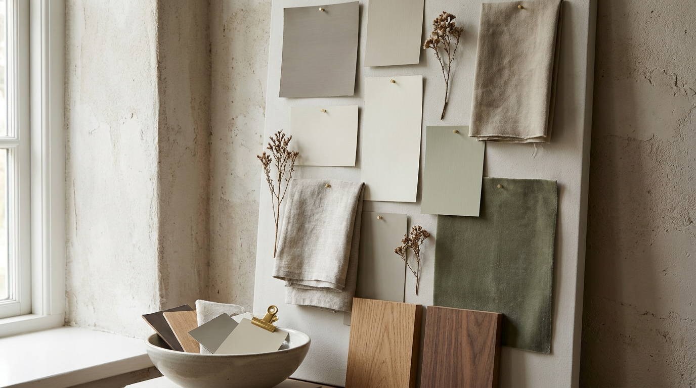
Seasonal inspiration can be especially helpful at this stage. In spring, many interiors respond beautifully to colors that feel washed, botanical, and light touched. Think pale eucalyptus, delicate greige, or soft putty. In summer, sunlit ivory, mineral blue, and sandy beige create an easy sense of airiness. Autumn invites shades with depth, such as muted olive, mushroom, and terracotta undertones. Winter often benefits from cocooning neutrals, smoky blue grays, and warm cream. Rather than chasing a fleeting trend, use the season as a lens to understand what feels emotionally right.
When evaluating possible shades, test restraint. The most beautiful wall colors are often quieter than expected. A refined home rarely needs a color that shouts to feel memorable. Often, the ideal choice is one that gently supports the room, flatters its light, and allows materials and furnishings to glow. If you love color, you can still be expressive through undertones, accent walls, or adjacent decor. The wall itself should create a foundation that feels lasting.
By the end of this step, your goal is simple. You should know the mood you want, understand the room’s light, and have a narrowed range of colors to test. This clarity prevents costly mistakes and makes every later decision feel more intuitive.
Questions to Ask Before Choosing Your Color
- How should this room feel during the time I use it most?
- What undertones already exist in my furniture, flooring, and textiles?
- Does the room need more warmth, more brightness, or more depth?
- Which season or natural setting best reflects the atmosphere I want?
- Will this color still feel beautiful when the light changes throughout the day?
Step 2: Test Paint Samples Properly Before You Commit
Once you have identified a few promising shades, the next step is to test them with care. This stage is often rushed, yet it is one of the most valuable parts of the process. Paint rarely looks on a wall the way it appears on a tiny chip under store lighting. Undertones become more visible at scale, and the room itself influences perception in subtle ways. Testing protects you from disappointment and helps you see which colors truly belong.
Choose two to four paint samples rather than a dozen. Too many options can create confusion. Paint generous sample squares on different walls, especially those that receive different kinds of light. If you prefer not to paint directly onto the wall, use large poster boards or sample boards that can be moved around the room. The larger the sample, the more reliable your impression will be.
Live with the samples for at least one full day, and ideally longer. Observe them in morning light, midday brightness, evening lamp light, and on a cloudy day if possible. A color that feels soft and elegant at noon may appear flat at dusk. Another might seem underwhelming at first, then reveal exactly the right warmth in the evening. This patient looking is where good design decisions mature.
Pay close attention to how each sample works with trim, ceiling color, and adjoining rooms. A wall color does not exist on its own. It is framed by architecture and seen in sequence with other spaces. In open plan homes especially, transitions matter. A fresh wall color should feel connected to the broader palette of the house, even if it introduces a distinct personality in one room.
Finish also deserves consideration. Matte and flat finishes tend to soften imperfections and create a velvety, understated look that suits many living spaces. Eggshell offers a slight luster and is often practical for everyday use because it is easier to wipe clean. Satin can be appropriate in higher traffic areas, though its subtle sheen will reveal wall flaws more readily. If your walls have bumps, old patchwork, or uneven texture, the choice of finish can influence the final elegance as much as the color itself.
Do not forget to test emotional response as well as technical suitability. Ask yourself which sample makes the room feel calmer, brighter, or more grounded. Which one flatters your favorite chair. Which one allows artwork to breathe. Which one feels sophisticated rather than simply fashionable. The right color is often the one that quietly resolves the space rather than dramatically announcing itself.
If you are refreshing walls for resale or broad appeal, timeless neutrals are usually the safest path. Warm whites, soft greiges, muted taupes, and pale stone shades have remarkable versatility. If you are painting for your own pleasure and daily comfort, however, trust a little personality. A dusty green in a study or a blue gray in a bedroom can still feel classic if the undertone is balanced and the finish is refined.
Step 3: Prepare the Room and the Walls Meticulously
Beautiful paint results are built long before the roller touches the wall. Preparation is where an ordinary paint job becomes a polished one. It may not feel glamorous, but it is the difference between a surface that looks crisp and lasting, and one that shows every shortcut. Taking time here will save frustration later and help your new color sit smoothly and evenly.
Begin by clearing as much furniture from the room as possible. Larger pieces can be moved to the center and covered carefully with plastic or fabric drop cloths. Remove wall art, switch plates, curtain hardware if practical, and anything else that interrupts the painting surface. Protect floors thoroughly. Even the most careful painter benefits from preparation that assumes a few drips will happen.
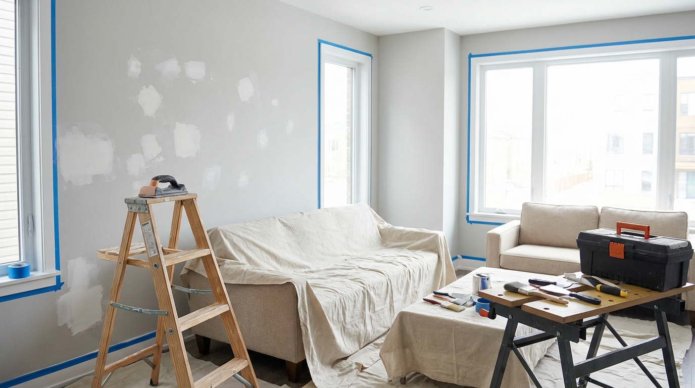
Next, clean the walls. Dust, grease, and residue interfere with paint adhesion more than many people realize. In kitchens, dining spaces, and hallways especially, a gentle wash can dramatically improve the final finish. Allow the walls to dry fully before moving on. Then inspect for imperfections. Nail holes, dents, hairline cracks, and peeling sections should all be addressed before primer or paint begins.
Use spackle or filler where needed and sand the repaired areas smooth once dry. If the walls are glossy, lightly sanding the surface can help the new coat grip properly. Wipe away dust afterward. Tape trim, corners, and any adjoining surfaces with care. Well applied painter’s tape creates clean edges, but sloppy tape can invite seepage. Press it down firmly, especially along baseboards and around window casings.
Primer is not always mandatory, but in many cases it is wise. If you are covering a darker color with a lighter one, painting over fresh repairs, dealing with stains, or shifting between very different undertones, primer improves consistency and coverage. It can also reduce the number of finish coats required. In maintenance terms, primer is often an investment in durability and finish quality rather than an unnecessary extra step.
Tool selection matters as well. High quality rollers and brushes tend to hold paint more evenly and release it more smoothly. This reduces visible streaks and lint. Use an angled brush for cutting in around trim and corners, and a roller with the right nap for your wall texture. Smooth walls generally need a shorter nap, while lightly textured surfaces may benefit from a slightly thicker one. A good tray, extension pole, stir sticks, and clean cloths will also make the work easier and more controlled.
Think of preparation as setting the stage for elegance. A carefully prepped room allows the fresh color to look intentional rather than improvised. Even subtle shades reveal craftsmanship. The smoother the canvas, the more luxurious the result will feel.
Preparation Essentials for a Cleaner Finish
- Remove or cover furniture completely before opening paint cans
- Clean walls to remove dust, oils, and residue
- Patch holes and sand repairs until they disappear into the surface
- Tape trim neatly and protect floors with reliable drop cloths
- Prime when changing color dramatically or painting over repairs and stains
- Choose quality brushes and rollers suited to your wall texture
Step 4: Apply Paint with Patience and Good Technique
With the room prepared and your color confidently chosen, painting becomes the most visible part of the transformation. Yet even here, restraint and rhythm matter more than speed. A calm, methodical approach will give the walls a more even finish and a more professional appearance. Rushing often leads to lap marks, drips, and patchiness that are difficult to disguise after the fact.
Begin by stirring the paint thoroughly. Pigment can settle, and a uniform mix is essential for consistent color. If you are using more than one can, combine them in a larger bucket first, a step often called boxing the paint. This helps ensure subtle batch differences do not appear on the wall. Start with cutting in around ceilings, corners, baseboards, windows, and doors using an angled brush. Work in manageable sections so the brushed edges stay wet when you roll the larger areas.
When rolling, apply paint in a consistent pattern and maintain a wet edge. This means slightly overlapping each section before the previous one dries. It helps prevent streaks and visible lines. Avoid overloading the roller to the point of dripping, but do not use it too dry either. The ideal application is even, fluid, and controlled. Pressing too hard can create texture inconsistencies and thin spots.
Most rooms require two coats for a rich, even result, even if the paint claims one coat coverage. The first coat establishes the field. The second perfects it. Allow appropriate drying time between coats according to the manufacturer’s instructions, and remember that humidity and ventilation influence drying. Patience at this stage yields walls that feel smooth, saturated, and complete rather than rushed.
Ventilation is important both for comfort and finish quality. Open windows when possible, and use fans carefully to support airflow without blowing dust onto wet paint. Good lighting also helps. As you work, step back often and inspect the wall from different angles. Small drips, missed spots, or uneven edges are much easier to correct while still fresh.
If you are painting a bold color, be especially attentive to consistency. Deeper shades reveal missed areas more readily than pale neutrals. If you are working with whites or very soft shades, watch for roller lines and flashing, where certain spots look shinier because of uneven absorption. In both cases, a steady technique and proper drying time make an enormous difference.
There is a quiet satisfaction in seeing color spread across a room with purpose. What was once dull or marked begins to feel composed again. The room takes on new light. Architectural edges sharpen. Decorative objects start to relate to one another differently. This is the moment when a maintenance task becomes a design gesture.
As soon as you finish, remove painter’s tape carefully while the paint is still slightly tacky or according to product guidance. Clean brushes and rollers promptly if you plan to reuse them. Keep a small, labeled amount of leftover paint for future touch ups. This simple habit is invaluable for maintaining your refreshed walls over time.
Step 5: Style the Room to Let the New Color Shine
Once the walls are dry, the refresh is not quite complete. The final step is styling the room so the new color feels integrated and elevated. This does not mean buying all new furniture. In fact, the beauty of a wall color refresh is that it can reframe what you already own. The goal is to edit, rebalance, and allow the fresh backdrop to become fully visible.
Start by returning furniture thoughtfully rather than automatically placing everything exactly as it was before. A newly painted room is an invitation to reconsider spacing, visual weight, and flow. Even shifting a sofa a few inches, removing an unnecessary side table, or creating more breathing room around a window can make the entire space feel more composed. Color and layout are closely connected. When one changes, the other deserves a second look.
Next, evaluate textiles and accessories. Pillows, throws, rugs, and curtains may appear different against the new wall color. This can be a wonderful opportunity. A neutral wall might suddenly reveal the richness of ochre velvet or olive linen. A cooler wall could make warm woods feel more pronounced and elegant. If something now feels discordant, small adjustments such as changing cushion covers, rotating artwork, or adding a natural fiber basket may be all you need.
Lighting deserves fresh attention as well. Paint reflects and absorbs light differently depending on its undertone and finish. A room painted in a soft warm neutral may glow beautifully under layered lamplight in the evening, while a cooler gray might need warmer bulbs or more ambient lighting to avoid feeling austere. The most inviting rooms are those where wall color and illumination work together.
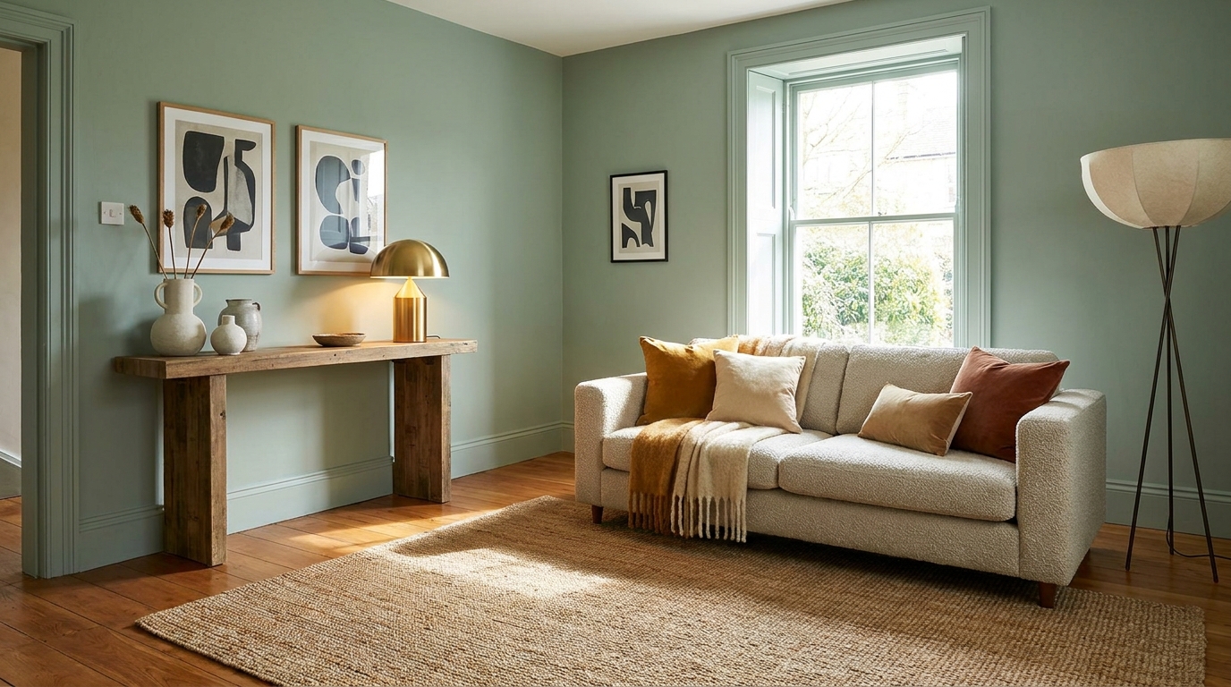
Seasonal styling can help you draw even more beauty from the new walls. In spring, place branches, fresh flowers, or pale ceramics against softer paint shades. In summer, lighter linens and woven textures can emphasize airiness. Autumn welcomes walnut accents, amber glass, and tactile throws. Winter pairs beautifully with candles, boucle textures, and richer tonal layering. The wall color becomes a quiet stage that supports each seasonal variation with grace.
Artwork should also be reconsidered after painting. Pieces that once felt too busy may now feel balanced, while others may need a different frame or placement. Wall color changes the way we read contrast. Black frames become sharper against warm neutrals. Brass and wood frames can feel gentler and more integrated. If you have been meaning to create a small gallery wall or give a single large piece more prominence, this is an ideal time.
Styling after painting is ultimately about letting the room exhale. Do not hurry to fill every surface again. A fresh wall color often looks most luxurious when accompanied by a little visual restraint. Space around objects allows the eye to appreciate the new atmosphere you have created.
Common Mistakes to Avoid During a Wall Color Refresh
Even a simple paint project can go off course when key details are overlooked. One common mistake is choosing color purely from trend images without considering the actual light and materials in your own home. What looks beautiful in one interior may feel entirely wrong in another. Always test with your room, your furnishings, and your natural light.
Another frequent error is underestimating preparation. Painting over dusty walls, skipping repairs, or avoiding primer when it is needed can leave the finish uneven and short lived. Likewise, buying low quality tools in an effort to save money often leads to a more laborious process and a less refined result. Paint is one of the most cost effective updates in a home, but its success still depends on thoughtful execution.
It is also easy to misjudge undertones. A beige with pink undertones may clash with yellow oak floors. A gray with blue undertones may feel cold next to warm stone. This is why side by side sampling matters so much. Compare colors against your permanent finishes, not just in isolation. The most elegant rooms are those where undertones are quietly aligned.
Finally, many people stop at painting and never complete the visual reset. Returning clutter, ignoring lighting, or failing to edit the room can diminish the impact of your hard work. A fresh wall deserves a refreshed presentation. Even small styling adjustments help the color feel intentional and complete.
Best Color Families for an Easy, Timeless Update
If you want a refresh that feels current yet enduring, certain color families are particularly reliable. Warm whites remain one of the most versatile options because they brighten a room without feeling clinical. They flatter natural materials beautifully and adapt well across seasons. Look for shades with creamy or soft stone undertones rather than stark blue based whites if you want a welcoming effect.
Greige and taupe tones offer a balanced neutrality that works in both traditional and modern spaces. They are especially useful when you want walls to feel quietly sophisticated while still supporting a range of textiles and finishes. Depending on the undertone, these shades can lean cooler or warmer, so sampling is essential.
Muted greens are another elegant choice for those who want color without visual noise. Sage, olive gray, and eucalyptus inspired shades connect beautifully to nature and often feel restful in bedrooms, studies, and living areas. Their adaptability across seasons makes them especially appealing for a longer term update.
Dusty blues and blue grays bring calm and subtle depth. In rooms with good natural light, they can feel airy and architectural. In dimmer spaces, they become cocooning and atmospheric. Paired with warm metals, walnut woods, or ivory textiles, they often create a quietly luxurious effect.
Soft earthy tones, including clay, mushroom, and sand, are increasingly loved for their grounded warmth. These shades carry a certain sunlit softness that feels both contemporary and timeless. They work beautifully in homes where texture plays an important role, especially alongside linen, plaster, travertine, and woven accents.
How to Maintain Freshly Painted Walls
After investing time in a color refresh, a few simple maintenance habits will help preserve the result. Allow the paint to cure fully before washing or scrubbing the surface, which may take longer than the wall takes to dry to the touch. Check your product’s guidance so you do not disturb the finish too early. During this first period, avoid leaning furniture tightly against the walls or hanging heavy items immediately unless recommended.
Dust walls gently from time to time, especially in high traffic rooms. In areas prone to fingerprints or minor marks, use a soft cloth or sponge with a mild cleaner suited to your paint finish. Always test in an inconspicuous spot first. Harsh chemicals and abrasive scrubbers can dull the sheen or lift color.
Keep leftover paint sealed and labeled with the room name, brand, color, finish, and date. Small touch ups are much easier when the exact information is readily available. If a touch up is needed, remember that paint can age slightly on the wall over time, so feathering the new paint outward carefully helps the repair blend better.
Thoughtful maintenance protects both aesthetics and longevity. Repainting should feel like a meaningful refresh, not a task repeated too often because the previous finish was not properly cared for. A well chosen color and a well applied paint system can remain beautiful for years.
Conclusion: A Fresh Color, A Renewed Home
Refreshing your walls with color is one of the simplest ways to change the spirit of your home. It is accessible, practical, and wonderfully expressive. With the right mood in mind, carefully tested samples, meticulous preparation, patient application, and thoughtful styling, even a modest paint project can feel transformative. What changes is not only the color of the wall, but the rhythm of the room itself.
These five steps offer a clear path forward for anyone who wants an interior update without the scale or expense of a full redesign. They encourage attention to light, material, season, and the emotional life of a space. That is what turns a basic maintenance task into a design decision with lasting beauty. A well painted room feels cleaner, calmer, and more intentional.
If your home has been asking for renewal, begin with the walls. Choose a shade that reflects the atmosphere you want to live in, and let that fresh color become the backdrop for daily life. Sometimes the most graceful transformations begin with the simplest surface, approached with care.


No Comment! Be the first one.