



There are homes that look beautiful in photos, and then there are homes that feel good the moment you walk in. Often, the difference is texture. It is the quiet layer of design that softens a room, changes how your body responds to a space, and helps everyday life feel calmer and more supported. While color and layout often get the attention, texture is what brings emotional warmth and lived-in comfort to a home.
Table Of Content
- Why texture has such a powerful emotional effect
- Texture as part of comfort engineering
- Why accessible texture matters in real homes
- The best approach is layered, not overloaded
- How to choose textures room by room
- Living room
- Bedroom
- Entryway
- Kitchen and dining area
- Bathroom
- Materials that tend to create tactile warmth
- Texture for sensory-sensitive and neuroinclusive homes
- How texture supports aging in place and multigenerational living
- Simple ways renters can add tactile comfort
- Common mistakes to avoid
- A practical framework for building tactile comfort
- The future of home comfort is multisensory and inclusive
- Final thoughts
Texture matters because our experience of home is never only visual. We notice the softness of a throw blanket, the cool smoothness of a countertop, the reassuring grip of a well-shaped handle, and the grounding feeling of a rug under our feet. Research on tactile perception shows that people strongly link comfort, pleasantness, smoothness, and softness when judging touch. That helps explain why a room with the right mix of materials can feel instantly more restful, even if nothing else has changed.
This also means that creating a cozy home is not simply about adding more fluffy things. Tactile comfort works best when it is layered, balanced, and personal. A space can be visually warm but physically awkward. It can be stylish but overstimulating. It can also be comfortable in a way that supports accessibility, ease, and independence for more people. Texture, when used thoughtfully, can help a home feel not only prettier but kinder.
Creating tactile comfort at home means intentionally layering materials that feel good to touch, move through, and live with every day. The process starts by identifying a few key touch points, such as where you sit, sleep, and pass through a room, then choosing textures that support each need: soft bedding, plush rugs, or upholstered seating for rest; stable flooring, easy-grip hardware, and clear material transitions for movement; and materials that feel warm, familiar, or personally calming for emotional meaning. Rather than adding texture everywhere, the most comfortable homes choose one anchor texture per room, such as a rug or an upholstered piece, and layer two or three complementary materials around it. This keeps a space feeling warm without becoming visually or sensorially overwhelming. Because consistent material changes, grippable surfaces, and reduced glare also help people orient and move safely, tactile comfort supports accessibility as much as style. The result is a home that feels emotionally warm and physically easier to live in, not just one that photographs well.
Good texture is not decoration alone. It is part of how a home communicates warmth, calm, safety, and ease.
Why texture has such a powerful emotional effect
Most of us can identify a comforting space without being able to fully explain why. One room feels welcoming, while another feels cold or tense. Texture is often part of that difference. Studies on active touch have found strong effects of texture on how people rate comfort, pleasantness, smoothness, and softness. In other words, the surfaces around us directly shape whether a space feels soothing or irritating.
That happens because touch has both physical and emotional dimensions. Researchers who study affective touch distinguish basic sensory qualities like roughness or firmness from emotional qualities like comfort and arousal. This is useful for home design because it reminds us that materials do more than perform a practical job. They create a mood. A matte wood dining table can feel grounding. A plush rug can feel protective. A slick, reflective room with hard sound and no softness may read as polished but still leave the body feeling unsettled.
Texture also works through more than the hands. It is multisensory. What we see often shapes what we expect to feel, and what we feel influences our emotional evaluation of a room. Some surfaces look soft and welcoming before we touch them. Others signal coolness, hardness, or distance. Research suggests that texture perception is tied to well-being in ways that are not purely visual, which is why tactile choices can affect the emotional tone of a space so quickly.
There is an important nuance here too. Not every texture is comforting to every person. Some visually dense or irregular textures can create discomfort, especially for those with sensory sensitivities. Research on visual discomfort and certain natural texture patterns shows that for some people, texture-heavy design can be overstimulating rather than cozy. This is why balance matters more than abundance. A comforting home is not packed with texture. It uses texture intentionally.
Texture as part of comfort engineering
When people hear the word comfort, they often think of cushions, throws, and soft bedding. Those things matter, but true comfort at home is broader. It includes how easily you move through a room, whether materials help or hinder your routine, how surfaces sound, how they react to light, and whether the space feels predictable and supportive. This is where texture becomes part of comfort engineering rather than a simple styling choice.
Texture can reduce effort in everyday life. A surface with gentle grip can make a handle easier to use. A rug that clearly marks a seating area can help define function. A change in flooring texture near an entry or bathroom can offer a subtle cue that supports orientation. Matte finishes can reduce glare, which helps create a calmer visual environment. When texture is designed into the home this way, it contributes to physical ease as much as emotional warmth.
Texture also interacts with other forms of comfort. Public health guidance on indoor environments reminds us that thermal comfort, air movement, humidity, and sensory irritation all influence how healthy and comfortable a space feels. A room with beautiful textiles may still feel unpleasant if the air is dry, the upholstery traps heat, or rough fabrics create irritation. That is why the best interiors think of texture as one part of a larger system that includes lighting, acoustics, temperature, and circulation.
Seen this way, texture is not a luxury trend. It is part of the practical design of everyday living. It helps a home work better for rest, focus, gathering, and independence. And because those needs exist in every budget and every type of home, tactile comfort is accessible to more people than many realize.
Why accessible texture matters in real homes
One of the most useful shifts in design right now is the understanding that accessibility does not have to feel clinical or cold. In fact, some of the most beautiful homes are also the easiest to live in because they use materials in thoughtful, clear, and supportive ways. Canadian accessibility guidance increasingly emphasizes tactile cues, material differentiation, glare reduction, acoustic treatment, and barrier-free circulation as part of inclusive environments. That has real relevance at home.
Accessibility Standards Canada’s CSA/ASC B651:23 includes updated guidance related to tactile direction indicators, luminance contrast, and broader support for people with physical, sensory, and cognitive disabilities. In a residential setting, the lesson is not that every home needs institutional signage. It is that texture can help communicate useful information. Consistent material changes can support wayfinding. Easy-to-grip hardware can reduce frustration. Surface contrast can help residents identify zones, edges, and transitions with more confidence.
For people with low vision or sight loss, tactile information and material differentiation can support orientation and independence. CNIB guidance highlights the value of tactile cues and textured distinctions in the built environment. At home, this might mean choosing a different flooring feel at an entry, using a textured stair rail that is easy to grasp, or ensuring that important transitions feel clear and stable underfoot. These are not flashy changes, but they can make daily movement safer and less mentally demanding.
This matters for many households, not only those who identify as needing accessible design. Multigenerational families, aging adults, children, neurodivergent residents, and guests all benefit from homes that feel more intuitive. Texture can help a space communicate gently. It can say, this is where you pause, this is where you rest, this is where the floor changes, this is where your hand naturally reaches. That is design at its most humane.
The best approach is layered, not overloaded
A common misconception is that more texture always means more comfort. In reality, too many competing materials can create visual noise, tactile confusion, and even stress. This is especially true for people who are sensory sensitive or who simply prefer calmer spaces. A more effective approach is to create a few strong texture moments and allow the rest of the room to support them.
Think of tactile comfort as a rhythm. You want softness where the body lands, stability where the body moves, and enough variation to create interest without strain. A high-softness zone might be a bed layered with breathable bedding, a supportive upholstered chair, or a reading corner with a soft throw and foot-friendly rug. These moments invite pause. Around them, smoother or firmer surfaces can provide clarity and ease of maintenance.
Layering works especially well when the materials belong to the same emotional family. Linen, wool, matte wood, woven fibers, soft cotton, brushed ceramic, and stone-like finishes often feel cohesive because they offer gentle variation without harsh contrast. By comparison, too many shiny, noisy, or highly patterned surfaces in one room can make a home feel restless. Texture should create calm conversation, not competition.
Personal preference matters here. Some people find boucle irresistibly cozy, while others experience it as scratchy or too visually busy. Some love thick rugs, while others prefer the cleaner feeling of a flat weave. The most successful home is not built from trend reports. It is built from real lived experience. If a texture looks lovely but irritates your skin, catches on mobility aids, or adds maintenance stress, it is not actually serving comfort.
How to choose textures room by room
Living room
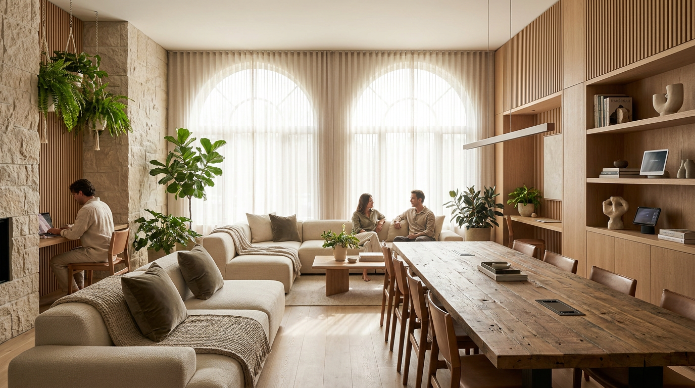
The living room often carries the emotional center of the home. It is where people gather, rest, watch, talk, recover, and sometimes work. Because of that, it benefits from a balanced mix of tactile cues. Start with one anchor texture that sets the mood. This may be a rug with a soft but stable pile, a nubby sofa fabric, or warm wood furniture with a matte finish. Then layer in smaller elements like cushions, a throw, and woven storage to deepen the feeling without crowding the room.
Pay attention to touch points. Armrests, side tables, remotes, lamps, and door handles all affect how the room feels to use. Easy-grip forms and less slippery finishes can make the space more intuitive. If the room has a lot of hard surfaces, adding acoustic softness through curtains, upholstery, or wall textiles can also make it feel emotionally quieter. Often, what we call coziness is partly a reduction in echo and sharpness.
For households with children, pets, or heavy use, comfort should not depend on delicate materials alone. Washable covers, durable wool blends, and woven baskets that hide clutter can maintain tactile warmth while supporting real life. A home feels more comforting when it is easy to keep comfortable.
Bedroom
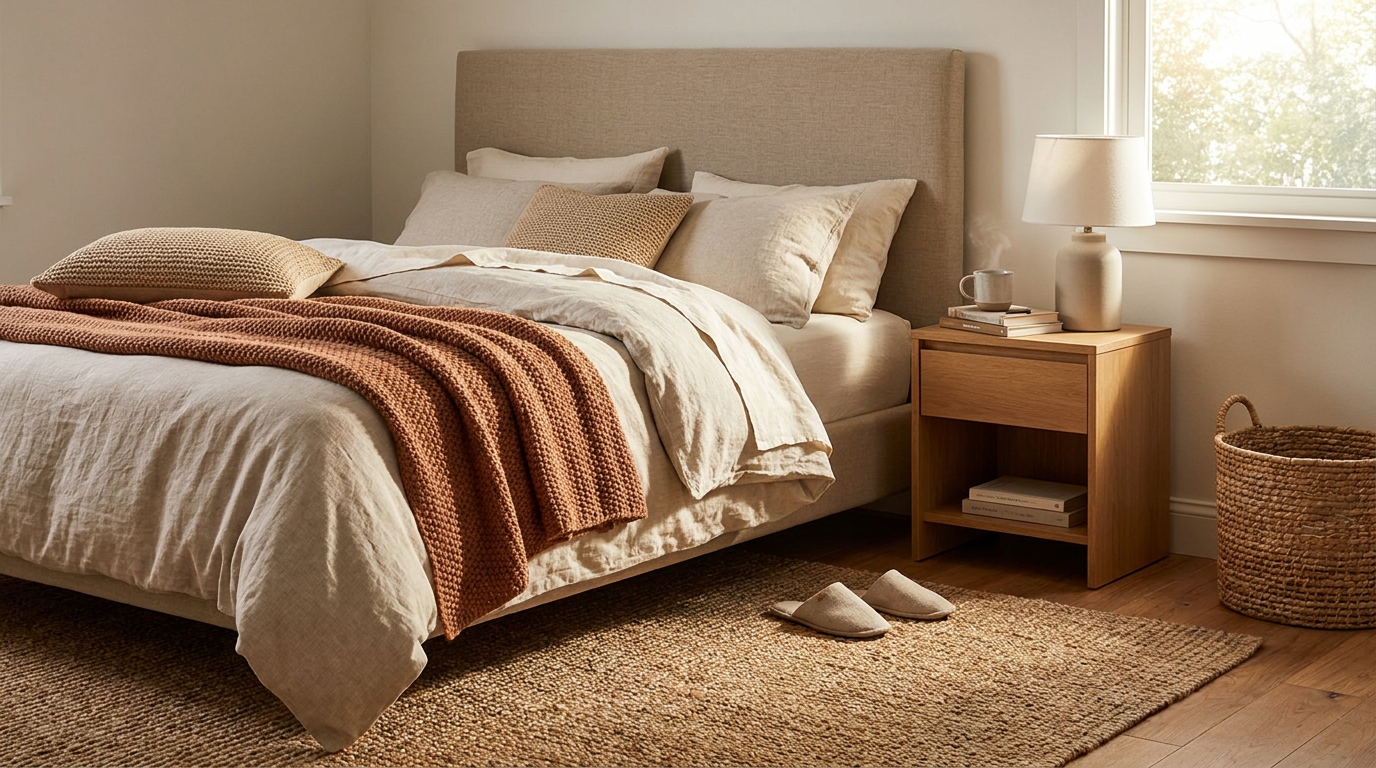
The bedroom is the clearest place to use texture for emotional regulation. Here, the body is preparing to slow down, and tactile signals matter. Layered bedding can be transformative, especially when it mixes breathable softness with a sense of structure. A crisp cotton or linen base, a quilt or blanket with subtle weight, and one soft throw can create a bed that looks inviting and feels adaptable across seasons.
Underfoot texture matters too. A soft rug beside the bed can soften the first and last steps of the day. Window treatments can help with both acoustic and visual comfort, especially if they reduce glare and create a quieter atmosphere. Upholstered headboards, wood nightstands with matte finishes, and soft lampshades all contribute to a room that feels calmer instead of stimulating.
For people with sensory sensitivities, the bedroom is a good place to simplify. Rather than using many textures, choose a few that feel reliably pleasant. Smooth, breathable, low-irritation fabrics can be more restful than heavily textured layers. There is no universal formula. The right texture is the one that helps the body relax.
Entryway
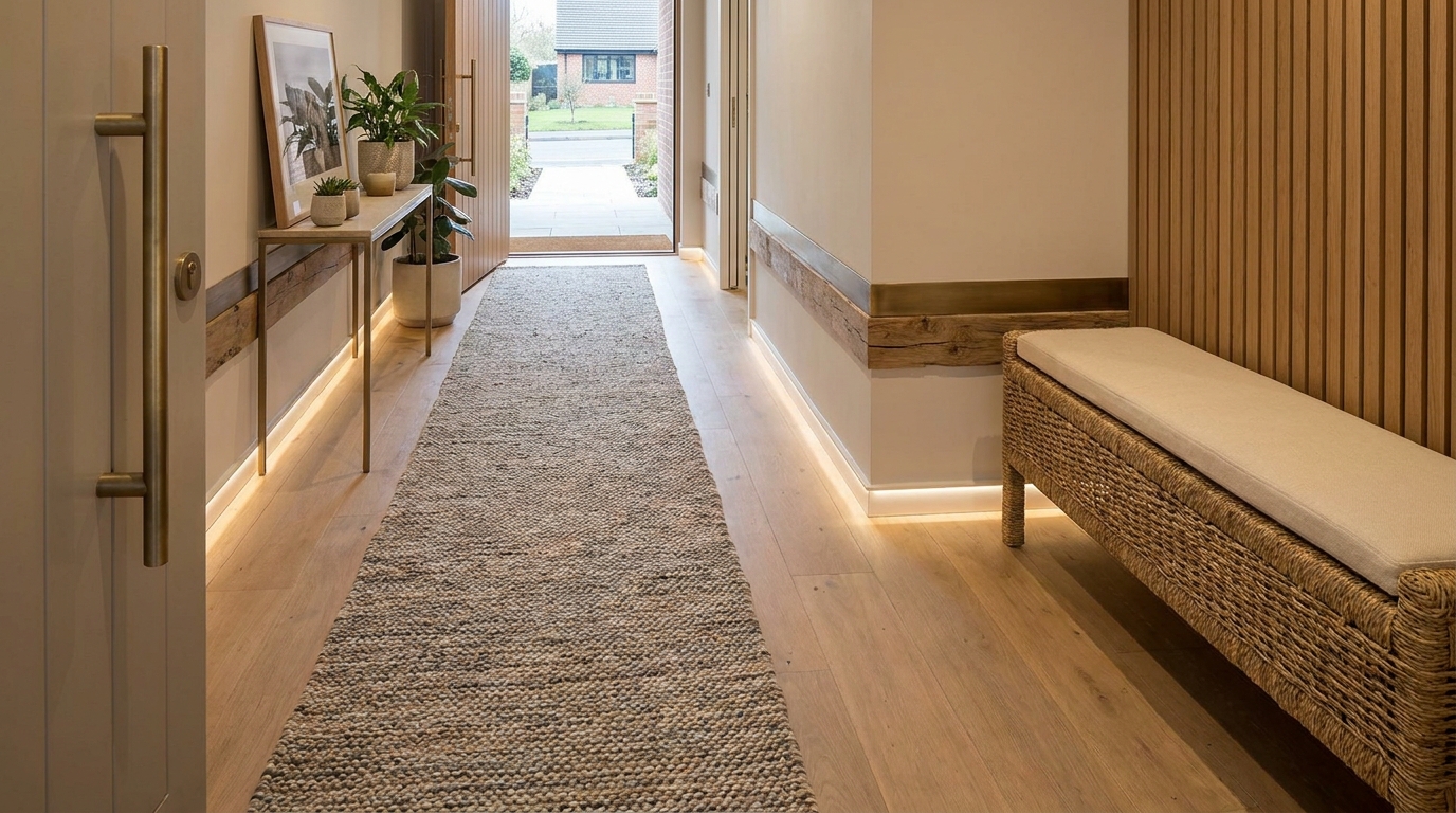
The entryway is where texture can do double duty as both comfort and wayfinding. It is a transition space, so material changes are naturally useful. A runner or mat can signal arrival, catch dirt, and provide a tactile shift that makes the threshold feel defined. A bench in wood or upholstered fabric adds practical comfort while helping the space feel welcoming rather than purely functional.
This is also a smart place to think about accessible circulation. Flooring should feel stable and predictable underfoot. If there is a change in material, it should be clear rather than confusing. Hooks, pulls, and knobs should be easy to grasp. Good texture in an entry says you are home, but it also says you can move through this space with confidence.
Kitchen and dining area
Kitchens need a slightly different tactile strategy because they must balance comfort with cleaning and safety. This is where a home benefits from firmer, smoother, more durable surfaces, but that does not mean the room has to feel cold. Matte cabinetry, wood stools, textured ceramics, linen napkins, and non-glossy finishes can all soften the space while preserving function. A kitchen often feels warmer when it avoids excessive shine and sound.
Dining spaces also respond beautifully to contrast. The solid feel of a table can be balanced by upholstered seating or a woven pendant light overhead. Everyday objects matter here too. Mugs, bowls, serving pieces, and placemats all contribute to tactile experience. These are the materials we hold repeatedly, and their comfort can quietly shape the mood of daily routines.
Bathroom
The bathroom may not be the first room people think of when they think about texture, but it is deeply tactile. Towels, bath mats, handles, shower curtains, and vanity finishes all influence whether the room feels soothing or sterile. Soft towels and a secure mat can instantly improve the sensory experience. Matte tile and cabinetry can reduce glare and create a gentler visual field.
Because bathrooms can be slippery, texture must always support safety. Easy-grip hardware, stable surfaces, and predictable transitions matter here more than decorative layering. Comfort is not separate from safety. In spaces where the body is vulnerable, the two are inseparable.
Materials that tend to create tactile warmth
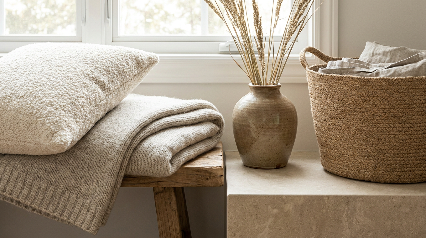
Certain materials consistently read as comforting because they combine touch appeal with visual softness. Natural fibers are often strong candidates. Linen feels breathable and relaxed. Wool adds warmth and depth. Cotton is familiar and easy to live with. Woven materials such as baskets, shades, and flatweave rugs bring a gentle irregularity that many people experience as grounding.
Wood is another essential texture for comfort. Matte or lightly finished wood tends to feel warmer and more natural than highly glossy versions. It reflects less glare, ages gracefully, and works across many styles. Even small additions like a wood tray, bench, or side table can help balance cooler materials in a room.
Upholstery also changes the emotional tone of a home quickly. Boucle, chenille, brushed cotton, velvet, and textured weaves each create a different effect. The key is to choose based on actual use, not only trend appeal. Some households want plush softness that invites sinking in. Others prefer a tighter weave that feels clean, breathable, and easy to maintain. Comfort can mean cushy, but it can also mean dependable.
Stone-like finishes, ceramics, and matte metals are useful because they add structure without harshness. They can create contrast against softer fabrics while still feeling calm. This balance is what keeps a room from tipping into either sterility or clutter. A home needs both softness and steadiness.
Texture for sensory-sensitive and neuroinclusive homes
One of the most generous ways to think about design is to remember that not everyone experiences texture in the same way. Some people seek tactile richness because it helps them feel grounded and secure. Others are overwhelmed by scratchy fibers, busy patterns, or strong contrasts. Neuroinclusive design makes room for this variation instead of assuming one standard of coziness fits everyone.
For lower-sensory homes, start by reducing unpredictability. Choose materials that feel consistent, breathable, and non-irritating. Avoid layering too many bold textures in one sightline. Limit visual density in rugs, wallpapers, and upholstery if they create strain. Research on visual discomfort suggests that some patterns and clustered textures can trigger discomfort in sensitive individuals, so quieter choices are often a relief.
It can also help to create texture zones rather than making every surface equally expressive. A calming living room might include one deeply soft chair or blanket, while other seating remains smoother and simpler. A bedroom might prioritize soft bedding but keep the walls and flooring visually calm. This gives people options. Flexibility is often more supportive than any single design decision.
For families, choice is especially important. One person may love a chunky knit throw while another dislikes it intensely. One child may need tactile stimulation while another needs calm. The answer is not to strip all personality from the home. It is to build in variation gently and intentionally, so each person can find places that help them feel settled.
How texture supports aging in place and multigenerational living
As more households plan for aging in place or share space across generations, texture becomes even more practical. Homes need to communicate clearly and support bodies with different needs. Material contrast can help distinguish zones. Supportive seating with easy-to-feel edges can make sitting and rising easier. Handrails and pulls with comfortable grip can reduce strain while still looking elegant.
For older adults, glare reduction and predictable flooring matter a great deal. Matte surfaces often help spaces feel calmer and easier to read visually. Tactile consistency can reduce uncertainty, especially in pathways, bathrooms, and bedrooms. Texture can also support dignity because it allows accessibility to be integrated beautifully, without making the home feel medicalized.
In multigenerational homes, the challenge is usually balancing many preferences at once. Grandparents may want more cushioning and warmth. Children may need durable and forgiving surfaces. Working adults may crave visual calm after busy days. Texture can bridge these needs when it is thoughtfully zoned. Softness can concentrate where rest happens, while circulation areas remain clear, supportive, and easy to maintain.
Simple ways renters can add tactile comfort
You do not need to renovate to make a home feel more tactile and comforting. Renters can make meaningful changes with portable layers and small material upgrades. A good rug, breathable bedding, washable curtain panels, textured cushions, and baskets for storage can immediately soften a rental that feels flat or impersonal. Even changing lampshades or adding a fabric headboard can shift the mood of a room.
Furniture choices matter too. A slipcovered chair, a wood side table, or a bench with a woven seat can add warmth without permanence. Table linens, bath textiles, and soft entry mats are often affordable places to start. If your lease allows minor hardware swaps, replacing difficult or slippery pulls with easier-grip versions can improve both comfort and function.
The secret is to focus on contact points and daily rituals. What touches your feet in the morning. What your hands reach for at the door. What surrounds you when you rest in the evening. The most effective texture choices are often the ones that quietly improve repeated moments.
Common mistakes to avoid
One of the biggest mistakes is treating texture as a visual trend instead of a lived experience. A room can photograph beautifully and still feel uncomfortable if the fabrics irritate the skin, the finishes are overly reflective, or the materials create too much sensory noise. Touch should guide decisions as much as sight.
Another mistake is assuming that softness equals comfort in every setting. Plushness is lovely in the right place, but too much softness can make some surfaces harder to clean, harder to move across, or less supportive for certain bodies. Real comfort includes stability, practicality, and ease.
It is also important not to rely on texture alone for accessibility. Tactile cues are helpful, but they should work alongside good lighting, clear layouts, visual contrast, safe circulation, and where appropriate, audible cues. Important information should never depend on one sensory channel by itself. Inclusive design is strongest when systems reinforce one another.
Finally, avoid forcing a texture scheme that does not fit your household. If a material creates irritation, maintenance burden, or stress, let it go. The most luxurious thing a home can offer is relief, not performance.
A practical framework for building tactile comfort
If you want a simple way to begin, think in three layers: rest, movement, and meaning. First, identify the places where people rest. These are your highest-softness zones, such as beds, sofas, reading corners, and bath routines. Give these areas the most comforting textures your household enjoys, whether that means washed linen, supportive upholstery, soft rugs, or warm wood nearby.
Second, look at movement. Hallways, entries, kitchens, and bathroom transitions should feel stable, clear, and easy to navigate. Texture here should support grip, orientation, and confidence. Material contrast can be useful, but keep transitions safe and predictable. This is where accessibility and coziness meet in a very practical way.
Third, consider meaning. Which textures make your home feel emotionally yours. Maybe it is the quilt that reminds you of family, the ceramic mug you reach for every morning, the woven basket that makes a room feel relaxed, or the natural wood that connects you to the outdoors. Texture carries memory and identity. That emotional layer is part of comfort too.
- Choose one comfort anchor per room, such as a rug, upholstered piece, or bedding layer that sets the tactile tone.
- Add two or three supporting textures that complement the anchor without competing for attention.
- Evaluate touch points like handles, rails, seating edges, and surfaces used every day.
- Check circulation and accessibility so texture supports movement instead of interrupting it.
- Edit based on real experience after living with the space for a few weeks.
The future of home comfort is multisensory and inclusive
Current design trends are moving in a promising direction. There is growing interest in biophilic materials, layered natural finishes, sensory ergonomics, universal design, and homes that support aging, neurodiversity, and everyday well-being. Texture sits at the center of all of these conversations because it links emotion, function, and identity so naturally. A home that feels good is rarely relying on appearance alone.
Research also continues to explore how tactile, visual, and even olfactory cues interact to shape mood and relaxation. A recent study on plant textures, for example, found that tactile categories such as soft, smooth, stiff, and rough can produce distinct psychological and physiological responses. That reminds us that comfort is dynamic. Our homes affect us constantly, often in subtle ways we only notice after something changes.
The most hopeful part of this shift is that inclusive design and beautiful design are no longer being treated as opposites. A warm, layered, accessible home is not a compromise. It is a more thoughtful expression of what comfort really means. It makes room for different bodies, different sensitivities, and different stages of life while still feeling deeply personal.
Final thoughts
Texture is one of the gentlest but most powerful tools we have for shaping how a home feels. It can calm the nervous system, soften routines, support navigation, reduce effort, and make ordinary moments more pleasurable. It can help a rental feel rooted, a family home feel more livable, and an aging-in-place plan feel more natural. Best of all, it does not require a dramatic renovation to make a difference.
The key is to think beyond decoration. Ask how a room feels in your hands, under your feet, and through the rhythm of your day. Notice where softness helps, where firmness helps, and where clarity matters most. Let texture support rest where you need rest and support confidence where you need movement. This is how a home becomes not only stylish, but truly comforting.
When chosen with care, texture brings a quiet generosity into the home. It makes spaces more welcoming, more human, and more responsive to the people living inside them. That is the kind of comfort that lasts.


No Comment! Be the first one.