



Urban visualization has become one of the most important intelligence layers in modern city planning. What once looked like a polished presentation at the end of a planning process now often shapes the process itself from the beginning. Maps, dashboards, 3D models, and spatial analytics are helping planners, elected officials, developers, and residents see how a city works in real time and how it may change under different decisions. That shift matters because cities are no longer managing only growth. They are also managing affordability pressures, aging infrastructure, climate risk, service inequity, and the increasing demand for public accountability.
Table Of Content
- What Urban Visualization Really Means
- Why the Shift Happened Now
- Canada’s Smart Cities Challenge and the Mainstreaming of Data-Driven Planning
- From Static Plans to Interactive Scenario Planning
- Why Scenario Planning Improves Decision Quality
- Dashboards as Tools for Accountability and Coordination
- The Three-Layer Model of Successful Urban Visualization
- Urban Visualization and Sustainable Development
- Real-World Use Cases That Show the Value Clearly
- Redevelopment and Zoning Decisions
- Transit and Mobility Planning
- Climate Adaptation and Risk Reduction
- Common Misconceptions That Need to Be Corrected
- The Governance Question: Data Quality, Privacy, and Trust
- Where AI and Digital Twins Are Taking the Field Next
- What City Leaders and Planning Teams Should Prioritize
- Conclusion: Making Cities More Legible, Participatory, and Evidence-Driven
The real transformation is not visual style. It is decision quality. When urban visualization is built on strong data, it helps people compare trade-offs before money is spent, before zoning is changed, and before construction begins. A well-designed visualization platform can reveal where transit access is weak, where capital investment is concentrated, where flood exposure overlaps with vulnerable populations, and where redevelopment may improve or worsen neighborhood equity. In practical terms, it turns complexity into something legible enough to act on.
Across Canada and North America, this approach is becoming more visible in public policy and local implementation. The Canadian Smart Cities Challenge gave national legitimacy to outcomes-based urban innovation built around data and connected technology. Major municipalities such as New York City have also shown how dashboards can move beyond reporting into coordination, transparency, and spending justification. Meanwhile, planning teams are increasingly using 3D GIS and digital twin approaches to test scenarios, explain choices, and engage the public with a level of clarity that static reports rarely achieve.
This article explores how urban visualization is transforming city planning, why data matters so much in that transformation, and what successful implementations actually look like in practice. The key idea is simple. The most effective systems connect three layers at once: authoritative data, scenario modeling, and civic communication. When those layers work together, visualization does more than inform. It helps cities make better decisions under pressure.
Urban visualization is no longer just a way to show a plan. It is increasingly the system cities use to understand conditions, test options, and explain consequences before decisions are finalized.
What Urban Visualization Really Means
Urban visualization is often misunderstood as a purely visual exercise, as if its main purpose were to make planning documents more attractive. In reality, it is much broader and far more operational. It combines geospatial data, demographic information, infrastructure records, sensor feeds, policy constraints, and modeling outputs into interfaces that help people analyze urban systems. Those interfaces might be interactive maps, planning dashboards, 3D redevelopment models, mobility trackers, or climate risk tools. The form varies, but the function is consistent: to make urban complexity understandable enough for action.
That distinction matters because modern city planning is a coordination challenge. Decisions about housing affect transport demand. Transit investments change land values. Stormwater systems influence redevelopment feasibility. School access and healthcare access can alter neighborhood desirability. Urban visualization works because it allows multiple layers of the city to be examined together rather than in isolated reports. A planner can move from parcel data to transit coverage to flood vulnerability within a single spatial environment, which creates a much stronger basis for judgment.
It also creates a common language. Technical experts may understand zoning text, infrastructure phasing schedules, or traffic models, but residents usually engage more effectively when those concepts are translated into intuitive visuals. A 3D streetscape, a dashboard comparing project timelines, or a neighborhood access map can reduce the gap between expert planning and public understanding. That does not eliminate disagreement, but it makes the disagreement more informed, which is a major improvement in any democratic planning process.
Another reason the field has grown is that urban systems now produce much more data than they did even a decade ago. Cities collect information through permitting systems, open data portals, mobility reporting tools, environmental monitoring, remote sensing, utility systems, and administrative records. Visualization becomes the practical bridge between raw data and policy use. Without that bridge, large volumes of information often remain technically available but institutionally underused.
Why the Shift Happened Now
Several forces pushed urban visualization from the margins into the center of planning practice. The first is scale. Cities face bigger and more interconnected problems than traditional planning workflows were designed to handle. Climate adaptation, housing shortages, and infrastructure backlogs all require faster comparison of options and clearer communication of trade-offs. Static maps and long PDF reports still have value, but they struggle to support iterative decision making across multiple departments.
The second force is public expectation. Residents increasingly expect transparency in the same way they expect visibility in banking, logistics, and mobility apps. If a city is spending on major capital projects, changing zoning, redesigning streets, or prioritizing transit corridors, people want to see what is happening and why. Visualization platforms meet that expectation by turning opaque administrative data into accessible public interfaces. This is one reason dashboards have become such a visible feature of urban governance.
The third force is technical maturity. GIS platforms, 3D urban modeling tools, cloud infrastructure, and open data standards have all improved significantly. Planning teams can now integrate parcel boundaries, building forms, transport networks, environmental constraints, and census indicators in ways that were once expensive or difficult to maintain. The result is that urban visualization is no longer limited to highly specialized labs. It is increasingly usable by mainstream planning departments and consultancies.
Finally, there is a governance reason. City leaders are under growing pressure to justify spending decisions with evidence. A budget request tied to a capital dashboard, a service gap map, or a modeled redevelopment scenario tends to be more persuasive than a narrative memo alone. Visualization does not replace strategy, but it strengthens the connection between policy goals and measurable urban conditions.
Canada’s Smart Cities Challenge and the Mainstreaming of Data-Driven Planning
Canada offers one of the clearest examples of how urban visualization became part of a broader planning and innovation agenda. The federal Smart Cities Challenge framed urban innovation as an outcomes-based effort supported by data and connected technology. That framing is important because it moved the conversation away from technology for its own sake. The purpose was not to make cities look advanced. The purpose was to solve measurable urban problems more effectively through better information, stronger coordination, and more responsive systems.
The scale of participation showed that this was not a niche interest. The challenge received more than 225 municipal applications from across the country, including major cities, small towns, and Indigenous communities. That number alone signals a structural shift. When hundreds of municipalities engage with a federal program built around data-driven outcomes, it suggests that analytics and visualization are no longer peripheral planning tools. They are becoming core elements of how local governments think about service delivery, infrastructure, mobility, and community development.
The program’s milestones also matter as evidence. The four winners were announced on May 14, 2019, and total prizes reached $75 million. Beyond the headline funding, the applications revealed what cities believed they needed in order to plan and manage better. Common solution types included open data platforms, mobile applications, the Internet of Things, big data analytics, geospatial tools, artificial intelligence, cloud computing, sensors, and environmental monitoring. Taken together, those choices show that data infrastructure and visualization were being treated as operational necessities rather than optional extras.
For urban visualization, the lesson is straightforward. Cities were not just asking for software. They were asking for systems that could connect data collection, analysis, and communication into one planning workflow. A municipality collecting environmental sensor data, for example, still needs a dashboard or map interface to interpret patterns, direct resources, and explain interventions to the public. Visualization is what turns technical capability into practical governance.
From Static Plans to Interactive Scenario Planning
One of the biggest advances in city planning is the move from static master plans to interactive scenario planning. In a static planning model, officials prepare a recommended plan and then present it for review. In a scenario-based model, they can compare multiple alternatives before selecting a path. This changes the tone of planning from one-way communication to structured exploration. It also makes uncertainty easier to manage because assumptions are visible and adjustable.
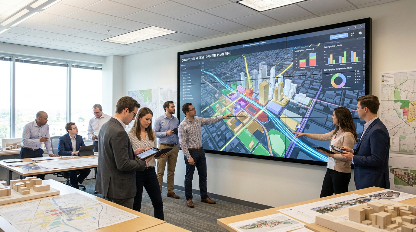
3D GIS tools have been especially influential here. They allow planners to model building massing, street changes, height transitions, shadow impacts, connectivity, and land-use mixes in a way that traditional flat drawings often cannot convey well to non-experts. A proposed corridor intensification plan, for example, becomes much easier to understand when residents can see how building forms relate to sidewalks, trees, transit stops, and adjacent homes. The technical planning logic remains, but the communication barrier becomes lower.
Esri case studies from places such as Boston, Mesa, Kenton County, Fairfield, Forward Pinellas, and Gensler demonstrate how this model works in practice. Shared maps, public-facing dashboards, and 3D views support both internal planning and civic transparency. Officials can review active projects, compare redevelopment options, and coordinate across departments, while residents can explore what those projects may mean at the neighborhood level. The same system serves analysis and engagement, which is one reason these implementations are so effective.
There is also a discipline benefit. Interactive scenario planning makes assumptions easier to challenge. If a redevelopment proposal depends on optimistic transit uptake or underestimated infrastructure costs, those conditions can be surfaced more clearly when models and map layers are integrated. This does not make the process politically neutral, but it does make the logic more inspectable. In planning, that is a major advantage.
Why Scenario Planning Improves Decision Quality
Scenario planning improves decision quality because cities rarely face one obvious path. They face a set of competing options, each with different costs, timeframes, and social effects. Visualization helps compare those options side by side. A city might evaluate whether to prioritize infill housing near transit, expand suburban road capacity, invest in green stormwater infrastructure, or sequence school and utility upgrades differently. Seeing these options spatially often changes the discussion from preference-driven debate to evidence-driven comparison.
It also helps leaders communicate uncertainty honestly. Future population growth, housing demand, climate impacts, and transportation behavior cannot be predicted with perfect accuracy. But those uncertainties can be modeled into scenarios that show ranges of impact instead of pretending to deliver certainty. For a general audience, this is one of the healthiest uses of urban visualization. It does not claim to know the future. It helps people understand how different assumptions shape different futures.
Dashboards as Tools for Accountability and Coordination
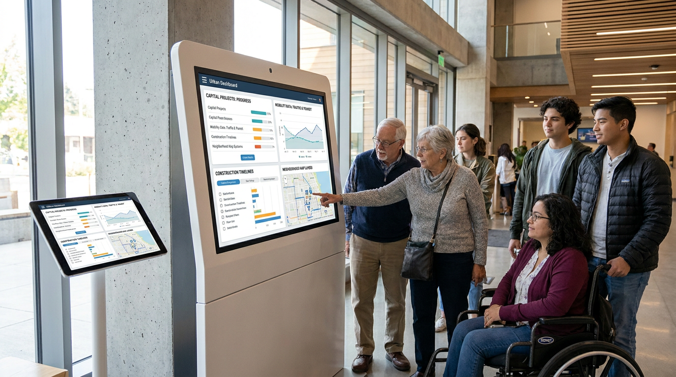
Public dashboards have become one of the most visible forms of urban visualization because they translate complex city operations into clear interfaces. Their importance goes beyond convenience. A good dashboard allows residents to follow progress, compare investment patterns, and understand where public money is going. For internal teams, the same dashboard can align agencies around timelines, spending, dependencies, and performance indicators. That dual use is a major reason dashboards have gained traction in city management.
New York City provides a strong North American example through its Capital Projects Dashboard and mobility reporting tools. These systems help users track infrastructure activity, transportation patterns, and project status in ways that are much easier to interpret than raw spreadsheets or fragmented agency reports. This is a significant evolution in public administration. Visualization is not being used only to publish outcomes after the fact. It is being used to monitor ongoing work, improve transparency, and justify public investment decisions.
There is a planning advantage here as well. Capital planning is inherently spatial. Roads, schools, water systems, parks, transit upgrades, and climate resilience projects all have location-specific impacts. A dashboard tied to geospatial layers can show whether infrastructure investment aligns with stated policy priorities such as underserved neighborhoods, flood resilience, accessibility, or growth management. Without that visual layer, accountability is much weaker because investment patterns remain harder to interpret.
Another benefit is institutional memory. City projects often span political cycles and staff changes. Dashboards create a more durable record of what has been promised, what has been funded, what is underway, and what has slipped. When designed well, they reduce the informational loss that happens when knowledge stays buried in separate departments or individual teams.
The Three-Layer Model of Successful Urban Visualization
The best urban visualization systems tend to connect three essential layers. The first is authoritative data. This includes official records, geospatial boundaries, census indicators, infrastructure inventories, mobility counts, permitting data, and environmental measurements. Without reliable data, even the most elegant visual system becomes misleading. Trust starts with data integrity, update frequency, and clear ownership.
The second layer is scenario modeling. This is where raw information becomes useful for decision making. Planners test redevelopment assumptions, compare transit alternatives, estimate infrastructure demand, or map exposure to future hazards. Scenario tools are especially powerful because they move the conversation from what is happening now to what could happen under different policy choices. That shift is where planning becomes proactive rather than reactive.
The third layer is civic communication. A model that only experts can interpret has limited public value. Successful systems translate technical outputs into forms residents, elected officials, and community groups can understand. This may include public dashboards, map stories, intuitive legends, neighborhood views, or simplified comparison tools. The goal is not to remove complexity. It is to make complexity discussable.
When one of these layers is missing, performance drops quickly. Data without modeling leads to reporting without strategy. Modeling without civic communication produces technically strong but politically fragile plans. Communication without trustworthy data creates glossy storytelling with weak foundations. The most effective city visualization platforms work because they integrate all three.
Urban Visualization and Sustainable Development
The broader policy context for urban visualization is sustainability, resilience, and inclusive growth. UN-Habitat emphasizes data management, policy, planning, governance, and urban prosperity measurement as part of stronger urban futures. The United Nations sustainable cities agenda also places cities at the center of achieving major development goals. In this context, visualization matters because many sustainability challenges are spatial at their core. Heat exposure, flood risk, access to transit, proximity to jobs, tree canopy, air quality, and housing affordability all vary across neighborhoods.
Visualization allows these differences to be seen and compared. A climate resilience map can reveal where vulnerable populations overlap with flood-prone areas. A transit access dashboard can show which communities remain disconnected from employment centers. A housing affordability model can highlight where zoning capacity exists but infrastructure or political barriers prevent delivery. These are not abstract insights. They shape where cities invest, how they regulate land, and how they prioritize support.
UNITAC has similarly emphasized mapping, spatial analysis, data visualization, and people-centered smart city approaches as tools for sustainable urban development. That people-centered framing is especially important. Urban visualization is most effective when it supports human outcomes such as safer mobility, more equitable services, healthier neighborhoods, and better climate readiness. The technology is valuable only when it improves those outcomes.
For planners, sustainability also requires time-based thinking. A city may look functional under current conditions but become highly vulnerable under future rainfall patterns, sea-level change, heat stress, or demographic shifts. Visualization platforms that incorporate future scenarios help make long-term risk visible in the present. That can influence zoning, infrastructure design standards, emergency planning, and capital prioritization long before crisis arrives.
Real-World Use Cases That Show the Value Clearly
Redevelopment and Zoning Decisions
Redevelopment decisions often create tension because they involve visible changes to neighborhood form, density, traffic, and affordability. Urban visualization helps by showing not just what a project looks like, but how it behaves in context. A 3D GIS model can illustrate height transitions, public realm effects, mobility connections, shadowing, and the relationship between proposed buildings and nearby amenities. This allows planning conversations to move beyond generic opposition or support into more specific design and policy questions.
For zoning reform, scenario visualization can also show the cumulative effect of policy changes. Instead of debating text amendments in the abstract, planners can estimate what different rules might permit across a corridor or district. That makes trade-offs more tangible. Residents can see where additional housing might appear, how streets may change, and what infrastructure upgrades might be needed to support growth.
Transit and Mobility Planning
Mobility is one of the most natural applications of urban visualization because transport systems generate abundant spatial and temporal data. Dashboards can track ridership, traffic speeds, safety incidents, route coverage, and accessibility gaps. Mapping these patterns helps cities identify where transit underperforms, where congestion is concentrated, and where redesigns may improve reliability or equity. A route map alone is descriptive. A mobility dashboard tied to demand, service quality, and capital planning is strategic.
New York City’s mobility reporting tools illustrate how this can work at scale. By translating transportation data into more accessible formats, the city supports public understanding while also strengthening operational oversight. The same principle applies in smaller municipalities. Even modestly resourced cities can use interactive mapping to compare travel times, active transportation routes, collision data, and transit access for different neighborhoods.
Climate Adaptation and Risk Reduction
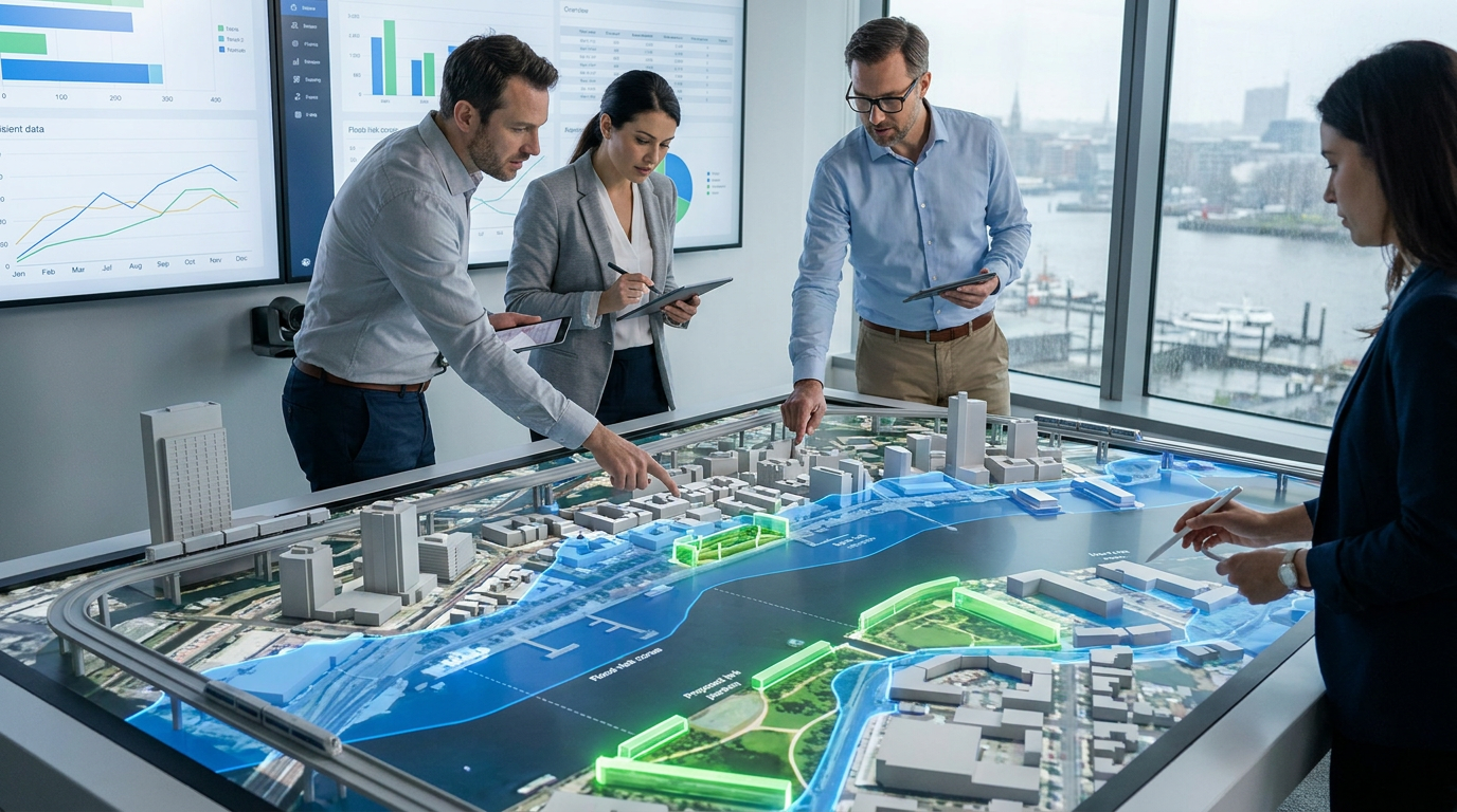
Climate adaptation may be the area where urban visualization becomes most urgent. Risk is uneven, and cities need to know not only where hazards are but who is exposed, which assets are vulnerable, and what interventions are feasible. Flood layers, heat maps, infrastructure condition data, and social vulnerability indicators can be combined to identify high-priority areas for action. This type of analysis is far more persuasive when it is visible and interactive rather than buried in a technical appendix.
Visualization also helps compare adaptation strategies. A city may weigh gray infrastructure against green infrastructure, relocation incentives against protective works, or street redesigns against emergency response upgrades. Seeing these alternatives spatially can reveal costs and benefits that are hard to grasp from text-based analysis alone. In a constrained budget environment, that clarity is extremely valuable.
Common Misconceptions That Need to Be Corrected
One common misconception is that urban visualization is decorative. This is outdated. In its strongest form, visualization functions as decision support for planning, budgeting, engagement, and risk analysis. The map or model is not the end product. It is part of the method by which cities understand and govern themselves.
Another misconception is that more data automatically produces better planning. It does not. Data can be incomplete, biased, outdated, or poorly interpreted. A dashboard filled with indicators can still mislead if definitions are unclear or important populations are undercounted. The value comes from data quality, governance, analytical rigor, and responsible interpretation.
There is also a tendency to equate a smart city dashboard with a smart city. That is too simplistic. Effective implementation requires clear policy goals, interdepartmental coordination, public trust, and the capacity to act on what the data shows. A polished interface cannot compensate for weak institutions or vague objectives.
Finally, 3D visualization should not be mistaken for a replacement for legal review, engineering standards, or community process. It helps people understand options, but it does not eliminate the need for formal planning procedures. The best cities use visualization to strengthen those procedures, not shortcut them.
The Governance Question: Data Quality, Privacy, and Trust
The OECD and other policy organizations have highlighted a critical truth about smart-city systems: governance determines whether data tools improve planning or simply create new risks. Urban visualization depends on the quality and legitimacy of underlying data. If records are inconsistent across agencies, if updates are infrequent, or if methods are opaque, users will eventually lose confidence in the system. In planning, trust is a practical asset. Once it erodes, even valid analysis becomes harder to use.
Privacy and security are equally important. Open data and public dashboards can improve transparency, but they also require careful handling of sensitive information. Mobility traces, service usage, environmental sensors, and neighborhood-level indicators may create re-identification or security concerns if released carelessly. Cities need clear rules on aggregation, anonymization, access controls, and cybersecurity practices. Responsible visualization is not only about clarity. It is also about restraint.
Participation quality matters too. A sophisticated interface does not guarantee inclusive engagement. Some residents may lack digital access, technical confidence, or trust in official systems. That means urban visualization should complement, not replace, in-person dialogue, translated materials, community facilitation, and other participation methods. The strongest planning processes use visualization as an invitation to engage, not as proof that engagement has already been achieved.
Where AI and Digital Twins Are Taking the Field Next
Looking ahead, urban visualization is likely to become more predictive, more interactive, and more tightly connected to real-time urban systems. Digital twins are a major part of that evolution. In planning terms, a digital twin is a dynamic representation of urban conditions that can connect built form, infrastructure, mobility, environmental performance, and operational data. The appeal is obvious. Instead of evaluating projects in isolation, cities can simulate how interventions affect a wider urban system.
Artificial intelligence is also entering the picture, especially in pattern detection, scenario generation, and workflow acceleration. AI can help identify anomalies in service data, cluster neighborhoods by vulnerability, estimate likely development patterns, and support faster exploration of planning alternatives. Generative AI may also help teams create early-stage concept scenarios more efficiently. Still, the same caution applies here as with any other data tool. AI is most useful when it supports professional judgment rather than pretending to replace it.
The next generation of planning platforms will likely blend traditional GIS, live dashboards, predictive models, and narrative interfaces that help non-experts ask better questions. That could make urban planning more transparent and iterative than before. But success will still depend on the fundamentals: reliable data, good governance, and a clear connection between technology and public purpose.
What City Leaders and Planning Teams Should Prioritize
For cities looking to build or improve urban visualization systems, the first priority should be problem definition. Technology works best when it is tied to a concrete planning need such as housing delivery, capital coordination, flood resilience, transit access, or service equity. Starting with the interface before the use case usually leads to weak adoption. Starting with the decision problem leads to stronger design choices and better internal support.
The second priority is integration. Visualization systems become much more valuable when they connect datasets across departments rather than reproducing institutional silos. Land use, infrastructure, mobility, environmental data, and demographic indicators need common standards and shared governance if they are going to support real planning decisions. This is often less glamorous than building a 3D model, but it is far more important for long-term usefulness.
The third priority is public intelligibility. A dashboard or model should not require specialist knowledge to answer basic questions. What is changing here? Why is it changing? What are the trade-offs? Who benefits? What are the timelines? A city that can answer those questions visually is already operating at a higher level of transparency than one that relies only on technical reports.
Finally, cities should measure whether visualization improves outcomes. Did it shorten review times, improve coordination, reduce conflict, target investment more fairly, or help residents understand choices better? Tools should be evaluated by their effect on planning quality, not just by whether they look innovative.
Conclusion: Making Cities More Legible, Participatory, and Evidence-Driven
Urban visualization is transforming city planning because it makes complex urban systems easier to interpret without stripping away their real complexity. It helps planners link evidence to action, helps officials justify priorities, and helps residents see how decisions may affect daily life. In that sense, visualization is not simply about better graphics. It is about better governance through better understanding.
The Canadian Smart Cities Challenge demonstrated how strongly municipalities now view data, geospatial tools, analytics, and connected technologies as central to urban innovation. The more than 225 applications, the four winners announced on May 14, 2019, and the $75 million in prizes all point to the same conclusion: data infrastructure and visualization have become strategic planning assets. Case studies using 3D GIS and scenario planning further show that these tools are reshaping not just communication, but the structure of decision making itself.
At the same time, the field should be approached with maturity. Visualization does not solve governance problems on its own. It depends on data quality, institutional coordination, privacy safeguards, and meaningful public participation. When those conditions are weak, even advanced systems can disappoint. When they are strong, urban visualization becomes one of the most effective ways to make cities more legible, participatory, and evidence-driven.
That is ultimately why this matters. Cities are facing decisions that are larger, faster, and more consequential than before. The better they can see those decisions spatially, socially, and financially, the better they can plan for futures that are not only smarter, but fairer and more resilient as well.



No Comment! Be the first one.