



GIS mapping has moved far beyond the idea of simply placing points on a digital map. Today, it sits at the center of modern geospatial visualization, helping individuals, businesses, researchers, and public institutions connect information to location and turn that connection into practical insight. When you understand where something happens, not just what happens, patterns become easier to detect and decisions become easier to defend. That is why GIS has become such a powerful part of the modern analytics stack.
Table Of Content
- What GIS Mapping Actually Means
- Why Geospatial Visualization Matters in Modern Decision-Making
- The Core Building Blocks of GIS for Beginners
- Layers
- Basemaps
- Features and Attributes
- Projections and Coordinate Reference Systems
- Spatial Relationships
- How to Read and Interpret a GIS Map
- Creating Your First GIS Map: A Practical Beginner Workflow
- How Individuals Can Use GIS Mapping in Everyday Decisions
- How Businesses Use GIS for Operational Efficiency
- Common Business Use Cases for GIS
- GIS, Dashboards, and the Shift to Web-Based Mapping
- Canadian Data Sources Beginners Should Know
- Emerging Trends: 3D GIS, Digital Twins, and Smarter Visualization
- Common Misconceptions and Mistakes to Avoid
- Best Practices for Beginner-Friendly GIS Maps
- Final Thoughts: GIS as the Intelligence Layer Behind Better Decisions
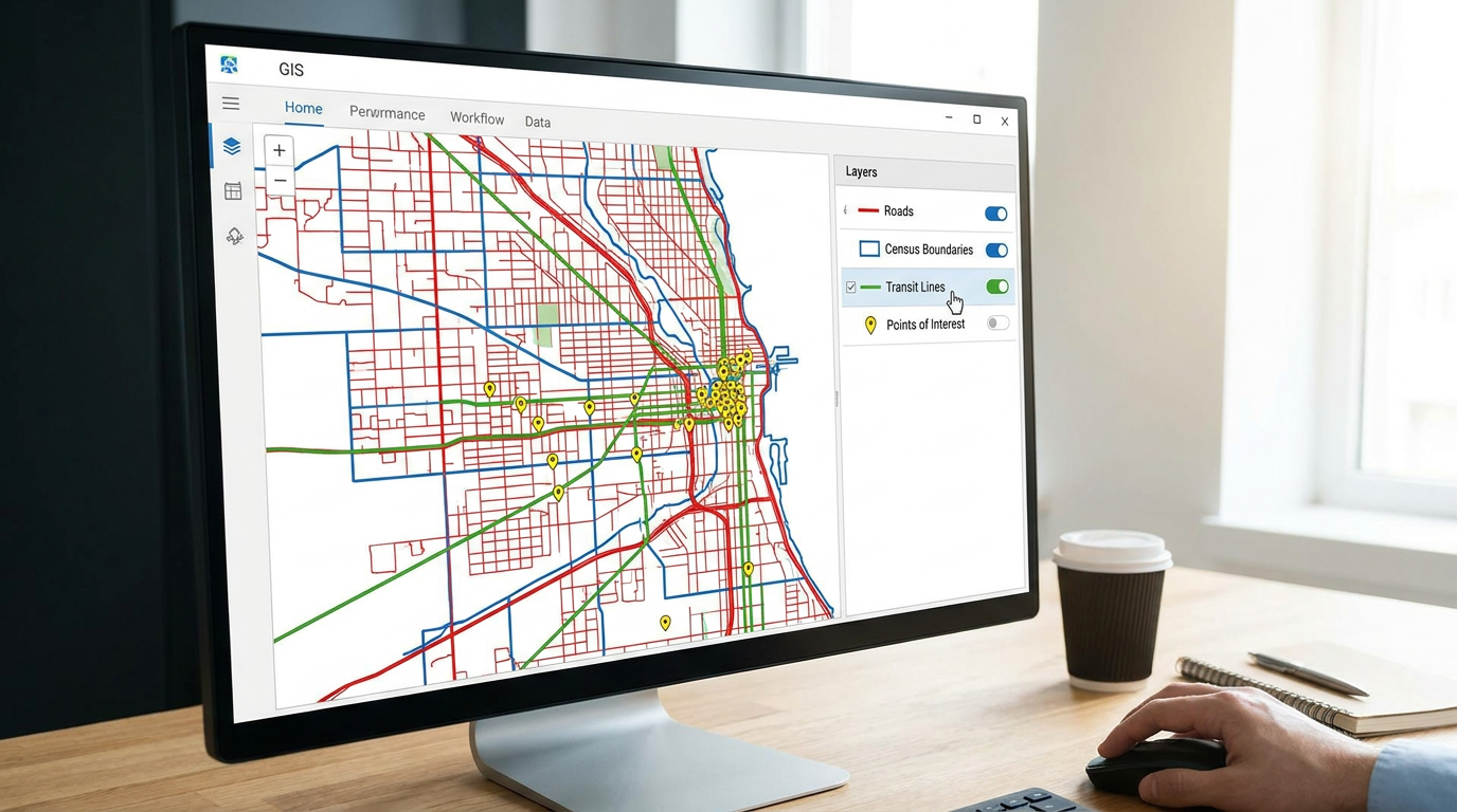
At its core, GIS mapping, or geographic information system mapping, is the process of linking data to geographic coordinates and visualizing that information spatially. ESRI describes GIS as technology used to create, manage, analyze, and map all types of data. That definition matters because it highlights an important shift in thinking: a GIS map is not only a picture, but a decision tool that combines location data with descriptive attributes such as demographics, sales figures, or infrastructure conditions. By organizing information into layers like roads, boundaries, or customer locations, and displaying it against a basemap, GIS allows users to analyze relationships, trends, and operational constraints in one place. This turns raw location data into a framework for asking sharper questions about access, demand, risk, efficiency, and opportunity, rather than simply marking points on a map.
For beginners, GIS can seem technical at first because it introduces new terms such as layers, projections, basemaps, and spatial analysis. Yet the underlying idea is intuitive. Every business, household, neighborhood, and service area exists somewhere. Once data is organized around that fact, maps become much more than visual aids. They become a way to ask smarter questions about access, demand, risk, efficiency, and opportunity.
This guide explains how GIS mapping works, why geospatial visualization matters, and how individuals and businesses can use it to make better decisions. Along the way, we will look at practical examples, core concepts, modern tools, common mistakes, and the growing importance of cloud GIS, dashboards, APIs, and 3D mapping. If you are new to the subject, the goal is not to make you a GIS specialist overnight. It is to give you a clear framework so you can understand what GIS does and why it matters.
What GIS Mapping Actually Means
A geographic information system connects data to place. That place might be a precise coordinate, a postal code, a census tract, a municipality, a parcel of land, a road segment, or an environmental zone. The key idea is that geographic context changes how we interpret information. Sales totals look one way in a spreadsheet, but when those same numbers appear on a map by neighborhood or service area, patterns in concentration, gaps, or overlap become easier to recognize.
GIS mapping allows users to create, manage, analyze, and visualize geospatial data. The visual part often attracts the most attention because maps are naturally engaging, but the real value comes from the analytical layer underneath. GIS lets you compare datasets that share location, test proximity, measure density, identify clusters, assess service coverage, and evaluate how one variable relates to another across space. It transforms location from a background detail into an analytical variable.
That is why GIS matters across so many fields. Retail teams use it for site selection and customer segmentation. Logistics teams use it for route planning and network efficiency. Real estate professionals use it to compare neighborhoods, infrastructure access, and local demand signals. Public agencies use it for hazard mitigation, emergency response, planning, and environmental monitoring. In each case, the map is useful because it reveals relationships that are hard to see in tables alone.
For Canadian users, GIS is also supported by a strong public geospatial ecosystem. Natural Resources Canada describes Canada’s spatial data infrastructure as a combination of geospatial data, standards, policies, governance, and applications that support access, use, integration, and preservation. Public platforms such as GEO.ca and Open Maps help users discover and visualize authoritative geospatial data from across government. According to NRCan, GEO.ca includes over 100,000 datasets from more than 40 contributors, making it a valuable starting point for anyone learning GIS in a Canadian context.
Why Geospatial Visualization Matters in Modern Decision-Making
Most organizations already work with large amounts of data. The problem is not access alone. The problem is interpretation. Dashboards, spreadsheets, and reports can describe performance, but they do not always explain geographic variation. GIS helps by answering a dimension of analysis that other tools often miss. It shows how outcomes differ by place, how proximity shapes behavior, and where operational friction may be building.
For an individual user, this could mean comparing school access, commute times, flood exposure, local amenities, and housing trends before moving to a new area. For a business, it could mean evaluating customer concentration, delivery times, competitor locations, labor access, and zoning conditions before opening a new site. The decision itself may still involve judgment, but GIS gives that judgment a stronger foundation.
Operational efficiency is one of the clearest reasons GIS adoption continues to grow. When teams combine multiple datasets into one geospatial view, they reduce the need to switch between disconnected systems. A single map can show assets, customers, weather risks, road conditions, service zones, maintenance history, and performance metrics at the same time. That kind of integrated decision view is especially valuable in logistics, utilities, field services, infrastructure management, and public safety.
GIS is not just about showing where things are. It is about understanding why those locations matter and how spatial relationships influence outcomes.
The shift toward web GIS and dashboard-driven workflows has made these capabilities much more accessible. Users no longer need to be full-time GIS professionals working in specialized desktop software. Many modern tools allow analysts, managers, and business users to build maps, apply filters, and explore scenarios through intuitive interfaces. That matters because decision speed increasingly depends on making location intelligence available to non-specialists without losing analytical depth.
The Core Building Blocks of GIS for Beginners
To understand GIS mapping, it helps to break it into a few core components. Once these concepts feel familiar, most GIS tools become much easier to navigate. You do not need advanced technical knowledge to grasp them, but you do need to understand what each one contributes to a map.
Layers
Layers are the foundation of GIS. Each layer contains one type of information, such as roads, buildings, rivers, customers, census boundaries, or sales territories. When layers are stacked together, users can compare how those datasets interact. For example, a retailer might place store locations over demographic layers and transit networks to evaluate accessibility and market reach. A city planner might compare road conditions, utility lines, and flood zones to prioritize maintenance.
The power of layers is that they keep information organized while still allowing complex analysis. Instead of crowding every variable into a single visual surface, GIS lets you control what appears and when. That makes the map both analytical and readable. Good GIS work often depends less on adding more layers and more on choosing the right layers for the question at hand.
Basemaps
A basemap provides geographic context for your other layers. It might show streets, terrain, satellite imagery, topography, or administrative boundaries. Basemaps are useful because they help users orient themselves and interpret more specialized datasets against a familiar spatial background. A logistics manager might prefer a street basemap, while an environmental analyst might choose terrain or imagery.
Basemaps should support the analysis, not compete with it. Beginners often pick visually dramatic basemaps that make the map harder to read. In most professional workflows, a cleaner basemap creates better focus. The rule is simple. If the thematic layer contains the real message, the basemap should stay quiet enough to let that message stand out.
Features and Attributes
Features are the individual geographic objects in a GIS layer. They can appear as points, lines, or polygons. A point might represent a hospital, a customer address, or a traffic sensor. A line might represent a road, pipeline, or bus route. A polygon might represent a neighborhood, property parcel, flood zone, or municipal boundary. Each feature has attached attribute data that describes it.
Attributes are the non-spatial details linked to a feature. A store location might have attributes such as revenue, opening hours, floor area, and manager name. A census polygon might include population, income, age profile, and housing characteristics. In GIS, the power comes from combining geometry and attributes in the same system. You can ask questions like where are high-performing stores, which neighborhoods have low service coverage, or which road segments show repeated maintenance issues.
Projections and Coordinate Reference Systems
Because the Earth is curved and maps are flat, every map involves a projection. A coordinate reference system defines how spatial data is positioned on the Earth and displayed on a map. This sounds technical, but it matters for accuracy. Different projections preserve different properties such as area, distance, or shape. If datasets use different coordinate systems and are not aligned properly, the map can become misleading or unusable.
Beginners do not need to master geodesy to work effectively in GIS, but they should understand that projection choices affect results. A distance analysis, for instance, requires an appropriate coordinate system. The same principle applies when combining data from multiple sources. Before comparing layers, users should confirm they are compatible in scale, geography, and projection.
Spatial Relationships
Spatial relationships describe how features interact in space. They can involve proximity, overlap, containment, connectivity, clustering, or direction. This is where GIS becomes analytical rather than merely visual. You can ask which customers live within ten minutes of a store, which properties fall inside a risk zone, which areas are underserved by public transit, or which assets sit near planned infrastructure investments.
Spatial relationships are the backbone of geospatial decision-making. They help explain not just what exists, but how one geographic factor influences another. That makes GIS especially useful when you need to prioritize action rather than just describe conditions.
How to Read and Interpret a GIS Map
Reading a GIS map well requires more than noticing colors and symbols. A good map tells a structured story about data, but that story depends on symbology, classification, scale, and timing. The first question to ask is what the map is trying to show. Is it displaying raw locations, density, change over time, administrative areas, or a modeled risk surface? The answer shapes how every visual choice should be interpreted.
Next, examine the legend carefully. Colors, line thickness, symbol size, and boundary styles all carry meaning. A darker shade might indicate higher population density, stronger sales, greater vulnerability, or more frequent incidents. That meaning is never universal. It depends on the map design. A beginner mistake is to glance at a map and assume a color scale means the same thing in every context.
Scale also matters. A pattern visible at the provincial level may disappear or reverse at the neighborhood level. A route that looks direct on a regional map may become inefficient once local road restrictions are added. Good GIS interpretation requires awareness of geographic granularity. The map is always a model of reality, not reality itself.
Finally, consider the source and freshness of the data. Maps can appear authoritative even when the underlying inputs are outdated, inconsistent, or incomplete. This is especially important when using public datasets or combining information from different providers. A clean interface should never replace critical judgment.
Creating Your First GIS Map: A Practical Beginner Workflow
If you are starting from zero, the easiest way to learn GIS is by building a simple map around a real question. Imagine you want to understand whether a business should expand into a new neighborhood, or whether a community organization should place a service closer to residents. The workflow is manageable if you break it into steps and keep the objective clear.
- Define the decision question. Start with a practical problem such as where customers cluster, where service gaps exist, or how far users travel.
- Collect location-based data. This might include addresses, postal codes, coordinates, administrative boundaries, roads, demographic information, or internal operational data.
- Prepare the data. Clean duplicates, standardize formats, check missing values, and geocode addresses if needed so they can appear on a map.
- Choose a basemap and add layers. Bring in the core context, then add the most relevant thematic layers for your question.
- Style the map carefully. Use colors, symbols, and labels that communicate hierarchy and avoid visual clutter.
- Analyze spatial patterns. Look for concentration, gaps, accessibility, overlap, and risk. Use buffers, drive-time areas, joins, or density tools where appropriate.
- Interpret the result in business terms. A useful map should support a decision, not just produce an image.
For Canadian learners, publicly available data can make this process much easier. Statistics Canada provides geographic boundaries, road network products, thematic maps, and interactive geography tools that support mapping and GIS applications. Census geography is especially useful for beginners because it allows demographic analysis at structured geographic levels. If you want to compare neighborhoods by age profile, household composition, commute mode, or housing characteristics, census-linked mapping is an excellent entry point.
Natural Resources Canada’s Open Maps and GEO.ca are also valuable resources because they make geospatial discovery more approachable. Instead of starting with a blank screen, you can find authoritative layers for land, environment, elevation, infrastructure, and administrative context. This matters because beginners often struggle less with the concept of GIS than with knowing where good data comes from.

How Individuals Can Use GIS Mapping in Everyday Decisions
GIS is often associated with government, engineering, or large enterprises, but individuals can benefit from it as well. In fact, many everyday location decisions already involve simplified forms of GIS, even if users do not label them that way. When someone compares commute times, school access, transit options, and neighborhood amenities on a digital map before renting an apartment, they are engaging with location intelligence.
For homebuyers and renters, GIS can help evaluate lifestyle fit and risk more realistically. A listing may look attractive in isolation, but the surrounding context changes the full picture. Mapping nearby services, traffic patterns, green space, healthcare access, transit reach, and environmental risk adds a deeper layer of understanding. This is especially useful when comparing multiple neighborhoods that appear similar on price alone.
Entrepreneurs and small business owners can also use GIS without building a full enterprise mapping system. A simple web map can reveal where customers live, how far they travel, where competitors cluster, and which districts may be underserved. A café owner might use this to assess delivery zones. A mobile service provider might use it to reduce travel time between appointments. A local retailer might use it to identify more promising pop-up locations.
Community groups and nonprofit organizations can use GIS for outreach planning, service equity analysis, and evidence-based advocacy. Mapping where needs are concentrated and how easily residents can access support services helps organizations allocate resources more effectively. It also strengthens communication with stakeholders because spatial evidence is often easier to understand than a technical spreadsheet.
How Businesses Use GIS for Operational Efficiency
For businesses, GIS becomes most valuable when it reduces friction in day-to-day operations. That value is often more measurable than the map itself. Better route planning can reduce fuel costs and missed appointments. Better site selection can improve revenue potential. Better service-area design can reduce overlap and increase response speed. Better asset visibility can lower downtime and improve maintenance planning.
Consider logistics and delivery. A map that combines customer locations, traffic constraints, road networks, and delivery windows creates a much clearer operational picture than separate systems would. GIS can support route optimization, territory balancing, and last-mile planning, helping teams reduce travel time while improving service reliability. Even modest improvements at the route level can compound into meaningful savings over time.
Retail and real estate teams use GIS to compare opportunity across neighborhoods. Instead of relying only on intuition or headline market trends, they can assess footfall proxies, population growth, competitor presence, income patterns, access routes, parking, and planned infrastructure changes. This is one reason location analytics has become so important in expansion planning. It shifts the process from broad assumption toward evidence-based comparison.
Field service organizations benefit from GIS when they need visibility over technicians, jobs, assets, and travel constraints. Infrastructure and utility providers use it to manage networks, inspect assets, identify service disruptions, and prioritize repairs. Public agencies use similar principles for road maintenance, emergency response, resource management, and climate adaptation planning. Across all of these examples, GIS supports operational efficiency because it unifies spatial context with live or historical performance data.
Common Business Use Cases for GIS
- Site selection for stores, offices, warehouses, clinics, and service hubs
- Route optimization for delivery, sales, inspections, and field service
- Asset tracking across infrastructure, fleets, equipment, and property portfolios
- Risk analysis for flood exposure, wildfire proximity, service vulnerability, and compliance
- Customer segmentation by trade area, demographic profile, and geographic behavior
- Territory design for balanced coverage and improved efficiency
- Network planning for utilities, transportation, and telecommunications
GIS, Dashboards, and the Shift to Web-Based Mapping
One of the biggest changes in GIS over the past decade is the move from traditional desktop systems toward cloud, web, and API-based geospatial platforms. This shift matters because it has made mapping more collaborative, more interoperable, and more relevant to business workflows. Instead of creating a map once and exporting it as a static file, teams now build interactive views that can update in near real time and connect directly to dashboards.
Modern geospatial systems increasingly rely on web-native standards and services. The Open Geospatial Consortium has advanced standards such as OGC API Features, OGC API Maps, and OGC API Tiles, which support easier discovery, access, visualization, and processing of geospatial data using patterns familiar to modern software teams, including JSON and REST. This makes GIS easier to integrate into products, internal apps, operational dashboards, and automated workflows.
In Canada, the growth of geospatial APIs is visible through resources offered by Natural Resources Canada, including map services, geolocation APIs, and elevation APIs. This reflects a broader industry trend. GIS data is no longer locked inside specialist software. It is increasingly available as a service layer that can feed websites, mobile tools, BI platforms, and internal reporting systems. That shift is one reason location intelligence is becoming part of mainstream analytics rather than a niche discipline.
The practical outcome is that maps now function as interface components inside broader decision-support systems. A business dashboard might combine geographic filters, performance charts, alerts, and map-based drill-down in one screen. This is where GIS becomes especially powerful for executives and operational teams. They do not need to open a separate mapping environment to benefit from geospatial context. The map becomes the intelligence layer inside the dashboard itself.
Canadian Data Sources Beginners Should Know
Beginners often ask the same question after learning what GIS can do. Where do I find trustworthy data to build maps? For Canadian users, several public sources are especially valuable because they provide authoritative data, strong metadata, and broad thematic coverage.
GEO.ca is a major discovery portal for geospatial data in Canada. Natural Resources Canada describes it as containing more than 100,000 datasets from over 40 contributors. That makes it one of the best places to search across categories rather than visiting each institution separately. You can use it to find environmental layers, base geography, administrative datasets, and other spatial resources relevant to local analysis.
Open Maps and the Federal Geospatial Platform support evidence-based decision-making by helping users access and visualize integrated geospatial data from multiple departments. These tools are especially useful for understanding how federal data sources can be combined across economic, social, and environmental themes. For anyone building dashboards or spatial analysis workflows, this integrated approach is highly practical.
Statistics Canada is a critical resource for demographic and census-based GIS. Its geography products include boundaries, road networks, thematic products, and interactive data viewers designed for mapping and GIS applications. If your work involves market analysis, community planning, service planning, or neighborhood comparison, StatCan geography is one of the most important beginner-friendly assets available.
Together, these sources show an important reality about modern GIS. Learning the software matters, but learning the data ecosystem matters just as much. High-quality geospatial decision-making depends on understanding source reliability, geographic scale, intended use, and update frequency.

Emerging Trends: 3D GIS, Digital Twins, and Smarter Visualization
The future of GIS is not limited to flatter and cleaner maps. It is becoming more immersive, more connected, and more predictive. One of the clearest trends is the growth of 3D geospatial visualization. The Open Geospatial Consortium’s 3D Portrayal Standard reflects the growing need for interoperable 3D content delivery, especially in urban planning, infrastructure management, environmental modeling, and digital twin applications.
3D GIS is useful when vertical relationships matter. In a city context, that could involve building height, shadowing, line of sight, utility placement, or street-level design. In infrastructure, it could involve terrain interaction, subsurface systems, or asset conflicts. In environmental work, it may involve elevation, watershed behavior, or wildfire modeling. A 2D map still handles many tasks well, but 3D can reveal relationships that would otherwise remain abstract.
Another important trend is the integration of GIS with dashboards, predictive analytics, and machine learning workflows. When historical geospatial data is combined with forecasting models, teams can move from describing patterns to anticipating them. This could involve predicting service demand, identifying maintenance risk, modeling traffic pressure, or estimating the impact of climate-related exposure. The map then becomes both a reporting surface and a forecasting interface.
There is also growing emphasis on open standards and interoperability. As organizations collect more geospatial data from sensors, APIs, public portals, and internal systems, the ability to connect those sources efficiently becomes critical. Standards support consistency, reuse, and wider collaboration. For beginners, this is encouraging. It means the modern GIS ecosystem is becoming easier to enter, not harder.
Common Misconceptions and Mistakes to Avoid
One of the biggest misconceptions about GIS is that it is just digital map drawing. In reality, mapping is only the visible layer. GIS combines data integration, analysis, and spatial modeling. If users focus only on how the map looks, they may miss whether the output actually answers the decision question. A beautiful map that lacks analytical clarity is still a weak deliverable.
Another common misunderstanding is that GIS outputs are automatically objective. They are not. Every map reflects choices about data sources, timing, projections, classification methods, scale, and symbology. A choropleth map can look dramatic because of the way ranges are grouped. A risk map can seem precise even when the source data is incomplete. Users should treat GIS as a powerful analytical framework, not as a guarantee of truth.
Beginners also tend to believe that more layers create more insight. Often the opposite is true. Too many layers can produce clutter, hide the main message, and create false confidence because the map appears rich with information. Strong GIS visualization depends on focus. Add only the layers that support the question, and remove anything that distracts from interpretation.
Finally, many people assume GIS is only for specialists. That was closer to the truth in the desktop era. Today, web GIS, dashboards, no-code mapping tools, and public data portals have made geospatial analysis much more accessible. The barrier is lower than many people think, provided users follow good practices around data quality, governance, and visual clarity.
Best Practices for Beginner-Friendly GIS Maps
If you want your GIS maps to be credible and useful, a few habits make a large difference. Start with the decision question and work backward from there. Good maps are not built by collecting every available layer. They are built by choosing the right data for a specific purpose. That discipline improves clarity from the start.
- Use authoritative data sources whenever possible and check the metadata before analysis.
- Keep the map visually simple so users can identify the main message quickly.
- Match the map type to the data rather than forcing every dataset into the same style.
- Check scale and timing because geography and freshness influence interpretation.
- Document assumptions so decision makers understand the limits of the analysis.
- Test usability with non-specialists if the output will support business or public decisions.
These practices matter because maps often persuade people quickly. That is part of their strength, but it also creates responsibility. A GIS map should clarify uncertainty where possible, not hide it behind polished design. Transparency builds trust, especially when spatial analysis influences spending, planning, or public communication.
Final Thoughts: GIS as the Intelligence Layer Behind Better Decisions
GIS mapping is one of the most practical ways to turn scattered data into action. By linking information to place, it helps people see patterns, relationships, and constraints that remain invisible in rows and columns. That capability matters whether you are choosing a neighborhood, planning a delivery network, locating a new facility, managing infrastructure, or building a smarter dashboard.
For beginners, the most important shift is conceptual. GIS is not just about maps. It is about decision support. A map becomes valuable when it helps you compare options, identify risks, allocate resources, or improve efficiency. The modern geospatial landscape makes this easier than ever, thanks to open data portals, web services, APIs, dashboards, and more intuitive mapping tools.
In Canada, resources such as GEO.ca, Open Maps, the Federal Geospatial Platform, and Statistics Canada geography products make GIS particularly approachable for new users. Combined with broader industry standards and cloud-based workflows, they show how geospatial visualization has evolved into a mainstream analytical capability. It is no longer a specialist side function. It is part of how modern organizations understand the world.
If you are just starting, begin with one clear question and one simple map. Add location, add context, and let the geography reveal what the spreadsheet could not. That is the real promise of GIS mapping. It turns place into insight, and insight into better decisions.



No Comment! Be the first one.