



Real estate has always been a visual business, but for a long time the actual analysis behind decisions remained surprisingly flat. Teams reviewed spreadsheets, static maps, PDF reports, and property photos, then tried to mentally combine those pieces into a market view. That approach still works for simple tasks, yet it struggles when decisions depend on context such as nearby infrastructure, view corridors, zoning constraints, construction progress, or neighborhood level demand patterns. 3D property analytics changes that by placing data into space, allowing professionals to see buildings, parcels, and market signals in the environments where they actually compete.
Table Of Content
- What 3D property analytics actually means
- Why 3D analytics matters more now than it did a few years ago
- The practical benefits of 3D property analytics
- Faster spatial understanding
- Better site selection
- Stronger portfolio oversight
- Clearer development feasibility and design communication
- Improved construction and operations monitoring
- Where 3D property analytics is used in real workflows
- Investment and acquisition analysis
- Brokerage and leasing strategy
- Property management and tenant experience
- Municipal and planning coordination
- The tools available today and why they are more user friendly
- The data behind the model matters more than the model itself
- Common misconceptions that slow adoption
- How to implement 3D property analytics without overcomplicating it
- A practical rollout sequence
- Best practices for making 3D analytics useful, not just impressive
- The future: from visualization to intelligence layer
- Final thoughts
The important point is that 3D analytics is not just about making real estate look more impressive. The practical value comes from faster pattern recognition, stronger communication, and better decision support. When a leasing team can see vacancy around a corridor, when a developer can test how a project fits beside transit and surrounding height restrictions, or when an asset manager can monitor building performance through a dashboard connected to a digital model, the visual layer becomes a working intelligence layer. In that sense, 3D is not replacing real estate analysis. It is making that analysis easier to understand and act on.
Today, the technology is also far more accessible than many people assume. Browser-based scene viewers, packaged dashboards, GIS platforms, market intelligence products, and API-driven data tools have lowered the barrier to entry. You no longer need a specialized visualization lab or a custom software team just to explore a site in three dimensions. Many modern tools are designed for everyday users such as brokers, developers, property managers, investors, municipal teams, and analysts who want practical answers rather than technical complexity.
This guide explains how 3D property analytics works, where it delivers the most value, which tools and data sources matter, and how to start using it without turning your workflow into a science project. The focus is practical throughout. If you are evaluating assets, building dashboards, comparing sites, communicating strategy to stakeholders, or trying to make local market data more actionable, this is where 3D property analytics starts to become essential.
What 3D property analytics actually means
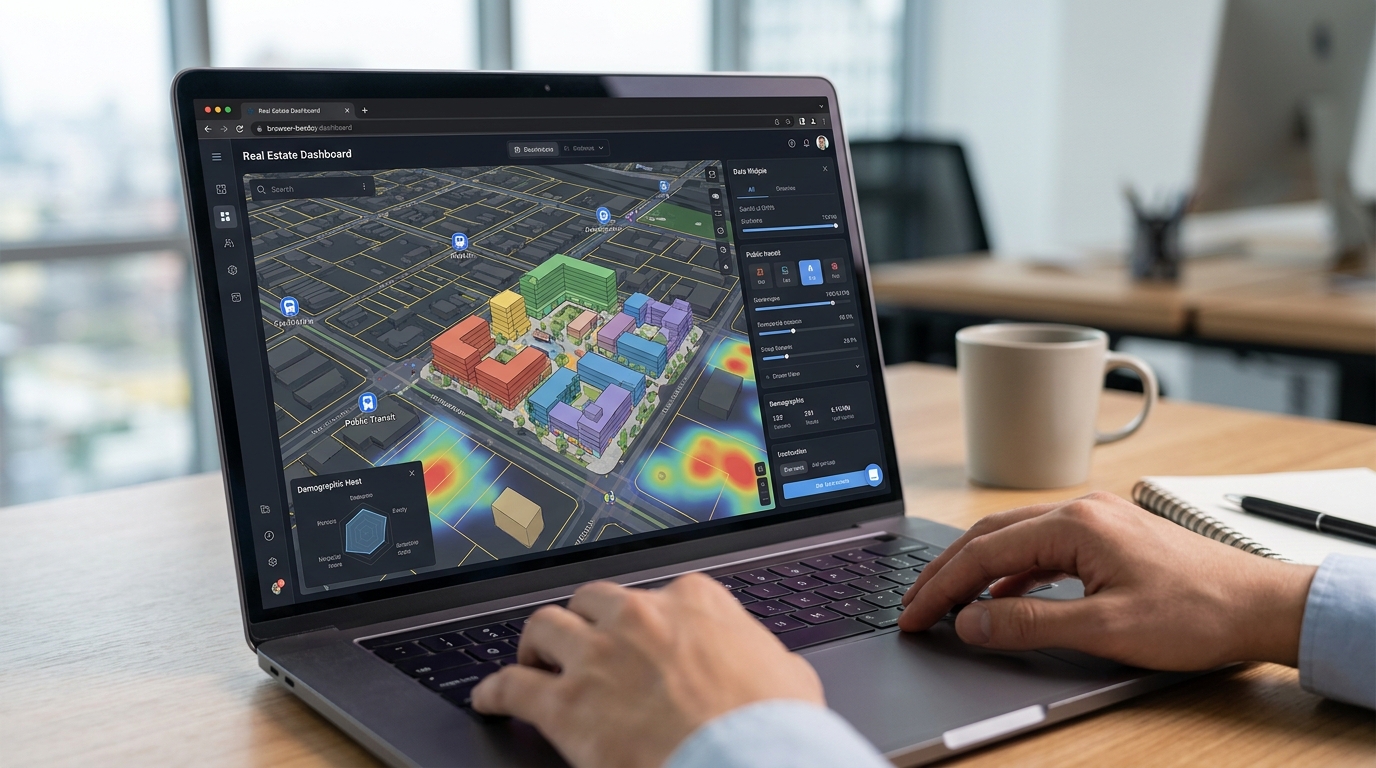
3D property analytics is the practice of combining building geometry, geospatial context, and business data into one visual and analytical environment. Instead of looking at a parcel as a row in a table or a dot on a 2D map, you view it as part of a living built environment. Buildings have height, massing, orientation, adjacency, and relationship to roads, transit, topography, and neighboring uses. That context often influences value more than a flat property record can show.
In real estate practice, the inputs usually come from several domains. One layer may include parcel boundaries, roads, and zoning data from a GIS environment. Another may include building models from BIM or CAD workflows. Additional layers can bring in demographics, rents, vacancy, comparables, sales activity, permitting, utilities, and sometimes live operational signals from sensors or building systems. When these are combined in a 3D scene or dashboard, the result is not simply a model. It becomes a decision environment.
Esri describes 3D real estate visualization as supporting market planning, site selection, customer segmentation, property management, virtual walkthroughs, and IoT-based analysis. That range is worth noting because it shows how broad the use cases really are. 3D property analytics is useful at the front end of a deal when selecting a site, in the middle of a project when tracking development progress, and after completion when monitoring performance and tenant experience. It is a layer that follows the asset through its lifecycle.
Another useful distinction is the difference between a 3D scene, a dashboard, and a digital twin. A 3D scene is the visual environment where buildings and location data are displayed. A dashboard is the interface that combines visuals with charts, metrics, filters, and alerts. A digital twin is a broader data model that may connect the physical asset, its systems, and its historical or live behavior. The terms are often used interchangeably, but they are not the same. Understanding the difference helps organizations choose tools based on actual needs rather than marketing language.
Why 3D analytics matters more now than it did a few years ago
There are two reasons 3D property analytics has moved from niche capability to practical necessity. The first is complexity. Real estate decisions today are shaped by more variables than many legacy workflows can comfortably handle. Investors and operators must think about local affordability pressures, mixed-use density, environmental exposure, mobility patterns, tenant expectations, construction timing, capital costs, and municipal policy. A spreadsheet can store those variables, but it cannot always show how they interact in space.
The second reason is accessibility. North American real estate data is increasingly delivered through connected platforms rather than isolated reports. In Canada, CMHC has emphasized that better, more local housing data is essential for effective housing decisions and affordability responses. Altus Group has built products around Canada-wide market and transaction coverage, including listings, comparables, development applications, and new-home data. In the United States, the National Association of Realtors provides commercial dashboards with metrics such as absorption, vacancy, rents, deliveries, inventory, sales volume, and cap rates. These are exactly the kinds of indicators that become more intuitive when tied to place in a visual environment.
The shift toward browser-based interfaces is equally important. In the past, sophisticated 3D analysis often depended on desktop software that required specialized training and local file management. Now, many teams can use web scenes, hosted dashboards, cloud models, and APIs to bring the same concept into a much lighter workflow. That matters because adoption in real estate is usually constrained by time and workflow friction, not just budget. If a broker or manager can open a secure browser tab and understand the picture within minutes, the tool has a far better chance of being used consistently.
There is also a communication advantage. Senior decision makers, equity partners, municipal reviewers, lenders, and tenants do not all interpret dense analytical tables the same way. A strong 3D view does not replace numbers, but it often makes the numbers easier to trust. If a stakeholder can see the nearby transit stop, adjacent towers, road network, and competing properties while also reviewing rent trends and absorption, the logic behind the recommendation becomes much clearer.
The practical benefits of 3D property analytics
Faster spatial understanding
Most real estate questions have a spatial component, even when they appear financial at first glance. Why is one building underperforming relative to another with similar size and class? Why does one retail node absorb faster than a nearby competitor? Why does a proposed residential project command stronger pricing on one side of a corridor? With 3D analytics, teams can see the physical relationships that often explain those differences, including street access, surrounding density, tower adjacency, slope, visibility, and amenity proximity.
This faster understanding has very practical implications. It reduces the time spent moving back and forth between maps, site photos, planning documents, and separate data exports. It also helps reduce false confidence that can come from looking only at summary averages. Two submarkets may show similar top-line metrics while behaving very differently on the ground. A 3D layer can reveal those differences quickly.
Better site selection
Site selection is one of the strongest applications for 3D property analytics because it depends on both market logic and physical context. A promising parcel on paper may turn out to have poor visibility, limited ingress, overshadowing from nearby structures, difficult grading, or a mismatch with surrounding land use patterns. Conversely, a site that seems average in a spreadsheet may prove strategically strong once transit reach, demographic catchment, development momentum, and neighborhood form are viewed together.
When teams can combine parcel data, zoning, mobility networks, comparable projects, and market indicators in one scene, shortlisting becomes more grounded. This is especially helpful when comparing multiple opportunities across a metro area. Rather than relying on narrative summaries alone, analysts can use a repeatable visual framework that supports more transparent recommendations.
Stronger portfolio oversight
Portfolio management is not just about individual asset performance. It is about understanding where exposure clusters geographically, where operating conditions are improving or weakening, and where local market changes may affect leasing, valuation, or redevelopment options. A 3D portfolio view makes it easier to compare assets in context and identify patterns across cities, corridors, or neighborhoods.
For example, a manager might layer occupancy, rent growth, deferred maintenance indicators, and nearby development pipelines onto a 3D city scene. Properties that look acceptable in isolation may appear more vulnerable once a new supply wave or infrastructure shift is visible nearby. That kind of visual portfolio analysis does not eliminate traditional asset management work, but it improves prioritization.
Clearer development feasibility and design communication
Development teams often need to explain a concept to people with very different technical backgrounds. A pro forma may satisfy internal finance, while a planning officer wants context, and a community stakeholder wants to understand form, shadow, and fit. 3D analytics helps bridge these audiences because it anchors conversation in something observable. The project can be discussed not as an abstract volume but as a proposal within a lived urban fabric.
This is where scenario comparison becomes powerful. Teams can test different massing options, access arrangements, or phasing approaches and compare them against constraints such as view impact, adjacent uses, and transit adjacency. The value is not merely visual polish. It is the ability to ask better questions before expensive commitments are made.
Improved construction and operations monitoring
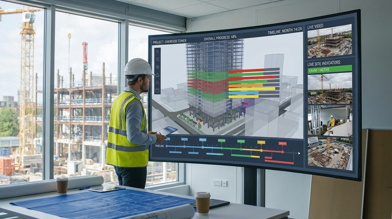
Recent 3D dashboard workflows increasingly connect BIM models and construction progress data into live project views. Esri has shown examples where BIM or Revit-derived content is linked to editable 3D dashboards that track progress over time. For owners, developers, and project managers, that means reporting can become more visual, current, and actionable. Instead of waiting for a static progress deck, teams can inspect progress status directly in relation to the building model.
After completion, similar ideas can support operations. Sensor readings, maintenance events, occupancy levels, energy metrics, and tenant service data can be associated with spaces and systems inside or around the asset. Not every building needs a full digital twin, but even partial operational visualization can help managers identify recurring issues faster and communicate them more effectively.
Where 3D property analytics is used in real workflows
Investment and acquisition analysis
Acquisition teams can use 3D analytics to test whether an asset is supported by its surroundings or merely looks attractive in a brochure. By layering local rent trends, vacancy, nearby transactions, planned deliveries, demographics, and accessibility metrics into the scene, they can move beyond a surface reading of the property. The visual context often sharpens investment committee discussions because assumptions become easier to interrogate.
This is particularly valuable in mixed-use or urban infill situations where asset performance depends heavily on immediate surroundings. The income profile of a building can be influenced by how it relates to adjacent land uses, future supply, station access, street vitality, or topography. A 3D scene makes those dependencies visible in a way a conventional package often does not.
Brokerage and leasing strategy
Brokers can use 3D tools to frame market stories more convincingly. Instead of sending prospects a stack of comps and a static neighborhood map, they can show how an asset sits relative to competitors, transit nodes, daytime population clusters, amenities, and future developments. This helps clients move from generic interest to informed conviction.
Leasing teams also benefit internally. A 3D dashboard can reveal which buildings in a submarket are likely to face competitive pressure, where amenity gaps exist, or how a nearby project could change demand patterns. That makes the tool useful not only for external marketing but for pricing and positioning strategy.
Property management and tenant experience
Property managers often deal with multiple systems that do not naturally speak the same language. Work orders live in one system, occupancy in another, utilities in another, and site context in none of them. A 3D property layer can act as a unifying interface, helping teams see where issues occur and whether they cluster spatially. In campus, industrial, or multi-building environments, that visibility can be especially useful.
For tenants, the benefits may show up in more intuitive communication. Virtual walkthroughs, wayfinding, amenity maps, and digital representations of available space can make a property easier to understand before a visit and more usable after occupancy. Again, the point is not novelty. It is clarity.
Municipal and planning coordination
Although this article focuses on real estate strategy, planning coordination is an area where 3D analytics can save enormous time. Development projects often require interaction with zoning conditions, surrounding built form, public infrastructure, and community expectations. When developers and planning stakeholders can reference the same visual context, meetings become more precise and less speculative.
That shared context is one reason 3D is becoming more decision oriented. It encourages a common language across disciplines that usually work from separate files and assumptions. The result is often not just faster approvals, but better framed conversations about tradeoffs.
The tools available today and why they are more user friendly
One of the biggest misconceptions around 3D property analytics is that it requires a full custom technology stack. In reality, the current market offers a wide range of approachable tools. Many organizations begin with a GIS platform that supports 3D web scenes and dashboards, then connect market datasets, parcel data, and building information as needed. Others start with a business intelligence environment and embed map or scene views into an existing reporting workflow. The right entry point depends on the problem being solved.
Esri remains a central example because its real estate materials explicitly frame 3D in terms of market planning, site selection, property management, virtual walkthroughs, and IoT-linked insight. Modern 3D GIS tools also support formats such as KML, glTF, IFC, CityGML, and COLLADA, which helps teams connect building models with geospatial analysis. That interoperability matters because property data rarely lives in a single ecosystem. Analysts need ways to combine geometry, records, and market layers without rebuilding everything from zero.
Data products are equally important. In Canada, Altus Group offers Data Studio and related CRE tools with market and transaction data, listings, sales comparables, development applications, and new-home information. In the United States, NAR’s Commercial Real Estate Metro Market Dashboard tracks indicators such as absorption, vacancy, rent, deliveries, inventory, sales volume, and cap rates. These datasets become more powerful when placed into a local visual framework rather than reviewed only as detached market tables.
User friendliness today comes from several design shifts. Interfaces are increasingly browser based, which reduces installation friction. Dashboards allow filters, layers, and charts to be controlled with point-and-click interactions rather than code. APIs make it easier to pull market or internal data into scenes automatically. And cloud sharing means teams can collaborate on the same view instead of circulating screenshots. None of this removes the need for careful setup, but it makes adoption far more realistic for nontechnical teams.
The data behind the model matters more than the model itself
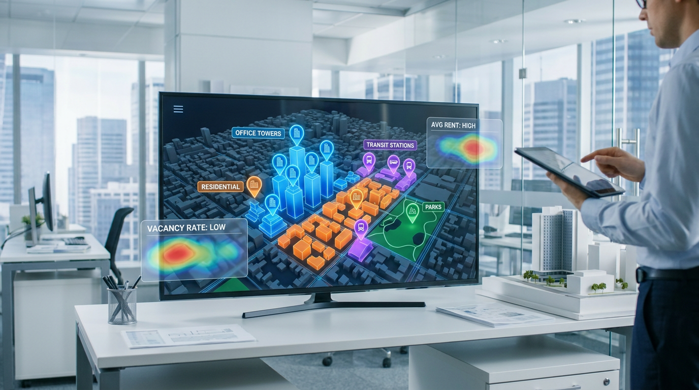
If there is one rule worth repeating, it is this: 3D analytics is only as reliable as the data underneath it. A polished scene can create a false sense of certainty if the building footprints are outdated, the zoning layer is incomplete, or the market data is too coarse for the decision being made. This is why locality matters so much. National averages and broad metro summaries are useful reference points, but many property decisions are shaped by hyperlocal conditions that shift block by block.
CMHC’s emphasis on better and more local housing data is especially relevant here. Housing and commercial real estate markets do not behave evenly across a city, and broad categories can hide important variation. A browser-based 3D dashboard is most valuable when it is fed with timely local sources that reflect the actual submarket being analyzed. This is also why municipal development applications, neighborhood demographics, and recent comparables often matter as much as the core asset data itself.
Data governance should not be treated as an afterthought. Teams need to know where each layer comes from, how often it updates, what level of geography it represents, and what assumptions are embedded in it. A rent metric at the metro level should not be read as a building-level truth, just as a rough building massing should not be mistaken for an engineering-ready model. Good 3D analytics depends on good analytical discipline.
For many organizations, the smartest move is to start with a narrow, well-curated stack. That might include parcel data, building footprints, zoning, comparables, asking rents, vacancy, transit access, and local development pipeline data. If those layers are maintained well and tied to a clear question, they will usually create more value than an overly ambitious model full of weak or outdated inputs.
Common misconceptions that slow adoption
The first misconception is that 3D property analytics is mainly for luxury marketing or architectural presentation. Those use cases exist, but they are not the core strategic value. In practice, the stronger use cases are operational and analytical: portfolio management, site selection, development feasibility, construction monitoring, and cross-team communication. The visual quality helps, but the real advantage is decision support.
The second misconception is that 3D automatically means more accurate. It does not. A scene can be visually sophisticated and analytically weak if source records are incomplete or stale. In fact, the more convincing a model looks, the more careful teams need to be about validating the data. This is particularly true when combining multiple sources with different update cycles and spatial precision.
The third misconception is that only large enterprises can use these tools. That may have been true in earlier phases of the market, but current offerings are much more approachable. Brokers, investors, developers, and asset managers can now use packaged platforms, web-based dashboards, and standard data products without hiring a full software team. A smaller firm may not build a full digital twin program, but it can absolutely use 3D analytics for practical site and asset decisions.
The fourth misconception is that a 3D view replaces market fundamentals. It does not. Vacancy, rent growth, absorption, deliveries, sales volume, and cap rates still matter. NAR’s dashboard metrics are a good reminder that market structure remains essential. The difference is that 3D property analytics helps teams connect those fundamentals to place, competition, and physical context, which often makes the metrics easier to interpret correctly.
How to implement 3D property analytics without overcomplicating it
The best implementations start with one business question, not one technology ambition. For example, a developer may want to compare potential infill sites. An asset manager may want to identify underperforming buildings in relation to new nearby supply. A property operations team may want a visual dashboard for maintenance and occupancy patterns. When the question is clear, the data and tools can be selected with much less waste.
It helps to think in phases rather than in a giant launch. Phase one might involve a single metro area, a small property set, and a lightweight browser dashboard. Phase two could add comparables, pipeline data, and scenario views. Phase three might bring in BIM links, operational metrics, or tenant-facing experiences. This phased approach reduces risk and helps teams prove value before expanding.
A practical rollout sequence
- Define the decision use case. Be specific about whether the goal is site selection, portfolio review, leasing strategy, construction tracking, or another workflow.
- Choose the minimum useful data layers. Start with only the layers required to answer the business question reliably.
- Use a browser-friendly platform. Adoption usually improves when users can access scenes and dashboards without technical setup.
- Design for nontechnical stakeholders. Include filters, plain-language labels, and concise metrics that make the view easy to interpret.
- Establish update rules. Decide which layers refresh weekly, monthly, or quarterly so users know what is current.
- Measure business impact. Track whether the tool shortens analysis time, improves stakeholder alignment, or changes investment outcomes.
What matters here is restraint. Many teams fail not because the idea is wrong, but because they try to build the final vision immediately. A focused 3D dashboard that answers one recurring question well is usually more valuable than a sprawling platform that nobody fully trusts.
In real estate, the best analytics tool is rarely the one with the most layers. It is the one that helps the right people make a better decision faster.
Best practices for making 3D analytics useful, not just impressive
First, always connect visuals to a decision metric. If a scene shows a proposed tower, it should also help the viewer understand something measurable such as comparable pricing, nearby supply, transit reach, or development risk. Visuals without decision relevance often attract attention but not adoption. Real estate teams are busy, and every layer needs to earn its place.
Second, respect scale. A national map can be useful for broad portfolio scanning, but local investment decisions usually need submarket and neighborhood resolution. The best dashboards allow users to move between scales gracefully. A portfolio manager might start with a macro view, then drill into a corridor, then a specific asset, all without losing context.
Third, keep the interface disciplined. Too many filters, too many colors, or too many simultaneous metrics can make 3D scenes harder to interpret than a spreadsheet. Clear legends, sensible defaults, and limited but meaningful interactions usually perform better. Think of the dashboard as an analytical product, not a data dump.
Fourth, involve the eventual users early. The most elegant technical setup can still fail if it does not fit how brokers, analysts, property managers, or executives actually work. Ask what decisions are being delayed, what reports are least trusted, and what context people repeatedly ask for in meetings. Those answers usually point to the most valuable 3D workflows.
The future: from visualization to intelligence layer
The next phase of 3D property analytics is less about prettier models and more about deeper integration. The market is moving toward digital-twin style workflows where GIS, BIM, IoT, and market intelligence inform one another. Construction progress dashboards are becoming more dynamic. In-browser analysis is becoming more capable. And the line between property operations data and market context is starting to blur in useful ways.
That matters because real estate decisions are increasingly continuous rather than episodic. An asset is not evaluated only at acquisition and then ignored until sale. It is monitored, repositioned, benchmarked, and re-explained throughout its life. A strong 3D analytics environment supports that continuity by making data easier to revisit, compare, and share across teams.
In Canada and across North America, the push for better local housing and commercial data will likely make these systems more valuable over time. As datasets improve and become easier to integrate, the visual layer becomes a more dependable operational layer. The winning platforms will probably be those that combine local data depth, flexible integration, and user-friendly delivery rather than those that simply offer the most cinematic rendering.
For everyday real estate professionals, that is good news. It means 3D property analytics is maturing into something practical. You do not need to become a geospatial engineer to benefit from it. You need a clear decision process, trusted local data, and tools that fit how your team already works.
Final thoughts
3D property analytics is most useful when it turns scattered information into context that people can act on. It helps investors see risk and opportunity more clearly, developers compare sites more intelligently, property managers monitor assets more effectively, and stakeholders understand recommendations with less friction. Its real advantage is not novelty. It is alignment between data, place, and decision.
The tools available today make that alignment far easier to achieve than in the past. Browser-based scenes, interactive dashboards, open data connections, and packaged market intelligence have lowered the technical barrier significantly. At the same time, the demand for more local, timely, and integrated housing and commercial data has made visual analytics more relevant than ever. In many cases, the question is no longer whether 3D belongs in real estate strategy. It is where it will deliver the fastest return.
If you are starting from scratch, begin with one use case and one market. Build a view that helps your team answer a recurring question more clearly than a spreadsheet can. Connect it to trusted local data. Keep the interface simple. Then expand as the value becomes obvious. That is how 3D property analytics stops being a concept and becomes part of everyday real estate intelligence.



No Comment! Be the first one.