


Understanding Interactive Reporting: Revolutionizing Data Visualization for Real-Time Decision-Making
In the ever-evolving landscape of data analytics, the need for actionable insights has never been more critical. Traditional static dashboards, while important in their own right, often fall short of meeting the demands of modern businesses that require real-time data for decision-making. Enter interactive reporting—a transformative approach that not only enhances the way we visualize data but also significantly improves user engagement and decision-making processes. This article delves into the fundamentals of interactive reporting, exploring its key benefits, best practices for creating effective dashboards, and how it can revolutionize the way we perceive and interact with data.
Table Of Content
- What is Interactive Reporting?
- Key Benefits of Interactive Reports
- Enhanced Real-Time Decision Making
- Improved User Engagement
- Empowerment through Self-Service Analytics
- Data Governance and Contextual Framing
- Best Practices for Creating Interactive Dashboards
- 1. Understand Your Audience
- 2. Keep It Simple and Intuitive
- 3. Leverage Visual Hierarchies and Interactivity
- 4. Integrate Data from Multiple Sources
- 5. Test and Iterate
- Conclusion
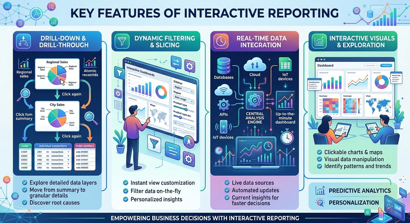
What is Interactive Reporting?
Interactive reporting refers to a shift from conventional dashboards that present data in a fixed, one-size-fits-all manner to more dynamic and responsive visualization environments. These environments are designed to be user-driven, allowing for a more engaging experience where users can explore data on-demand. Rather than simply presenting a static view of data, interactive reports enable users to drill down into details, filter data in real-time, and even manipulate visuals for deeper insights.
At its core, interactive reporting leverages technology to allow users to engage with data in multiple ways—through click-and-drag interfaces, filters, and other interactive features. This autonomy encourages exploration and discovery, empowering users to derive insights that are specifically relevant to their unique contexts. As organizations increasingly expect dashboards that deliver near-instant insights from multiple data sources, the rise of self-service analytics and AI-assisted analytics reflects a growing trend where users can initiate data exploration without waiting for specialized analysts.
Key Benefits of Interactive Reports
The benefits of interactive reporting extend beyond aesthetic improvements to dashboards. Understanding how these benefits manifest can provide organizations with a compelling case for embracing interactive reporting frameworks.
Enhanced Real-Time Decision Making
One of the most significant advantages of interactive reporting is its ability to provide real-time insights. In today’s fast-paced business environment, organizations cannot afford delays in decision-making processes. Static dashboards often present outdated data, which can lead to misguided decisions. Interactive reporting, however, ensures that users are working with the most current data, thereby enhancing their ability to make informed choices quickly. According to research from MIT CISR and MIT Sloan, companies that embed real-time data into their decision-making processes exhibit superior outcomes, demonstrating the tangible impact of timely insights.
Improved User Engagement
Interactive reports inherently engage users more than static reports. By allowing users to interact with the data—whether through filtering, scrolling, or drilling down into specific data points—these reports foster a sense of ownership and involvement. Users are not merely passive recipients of information; they become active participants in the data exploration process. This engagement is crucial, as it often leads to higher retention of information and a better understanding of complex data sets.
Empowerment through Self-Service Analytics
As organizations shift towards self-service analytics, interactive reporting tools become invaluable. They empower users by enabling them to generate their own reports and insights without needing to rely on data specialists. This decrease in reliance on data professionals not only accelerates the decision-making process but also encourages a culture of data literacy within organizations. Users can experiment, ask questions, and seek answers through the interactive features available to them, leading to a more knowledgeable workforce.
Data Governance and Contextual Framing
While the aesthetics and interactivity of reports are important, their value is significantly enhanced when data is both current and governed. Organizations that use interactive reporting can better frame the context of the data presented, ensuring that users understand the implications of what they are analyzing. This ensures that decision-making is not only faster but also based on a solid understanding of the data context, which is essential for deriving meaningful insights.

Best Practices for Creating Interactive Dashboards
Creating effective interactive dashboards requires thoughtful consideration of both design elements and user experience. Here are some best practices to guide the development of engaging interactive reports.
1. Understand Your Audience
The first step in designing an interactive dashboard is understanding your target audience. Different stakeholders may require different insights from the data, and tailoring your dashboard according to their needs will ensure its effectiveness. Engage with potential users during the design process to identify what data is most relevant to them and how they want to visualize that data. This collaboration fosters user buy-in and ensures that the dashboard meets user needs clearly and effectively.
2. Keep It Simple and Intuitive
Simplicity should be a guiding principle in interactive dashboard design. Users should be able to navigate the dashboard intuitively without feeling overwhelmed by too much information or overly complex visuals. Use a clean layout, utilize white space effectively, and prioritize key metrics that align with the objectives of the report. A cluttered dashboard can inhibit user engagement and hinder effective analysis.
3. Leverage Visual Hierarchies and Interactivity
Effective visual hierarchies can guide users’ attention to the most critical aspects of the data. Use size, color, and placement strategically to emphasize important metrics or insights. Furthermore, interactivity components such as filters, drill-through capabilities, and cross-filtering options can enhance user engagement by allowing users to slice and dice the data as they see fit. As reports become more interactive, consider integrating innovative features like natural language querying (NLQ) to enable users to ask questions in everyday language and receive immediate insights.
4. Integrate Data from Multiple Sources
Interactive reporting shines when it integrates data from diverse sources. Organizations today generate vast amounts of data across different platforms, and consolidating this information into one interactive report can provide a comprehensive view of business performance. This integration can reveal correlations and trends that might otherwise go unnoticed when analyzing data in silos. Ensure that data governance practices are in place to maintain the integrity and quality of integrated data.
5. Test and Iterate
The development of interactive dashboards should be an iterative process. Involve users during testing phases to gather feedback and identify areas for improvement. Monitor how users interact with the dashboard to uncover insights into usability and functionality. Regular iteration allows teams to refine and enhance dashboards, ensuring they remain relevant and useful as organizational needs evolve.
Conclusion
Interactive reporting is not just a trend; it is a fundamental shift in how we engage with data. The evolution from static dashboards to dynamic, user-controlled environments has profound implications for real-time decision-making and user engagement in modern businesses. By harnessing the power of interactive reporting, organizations can empower their employees, enhance the quality of decision-making, and achieve operational agility in an increasingly complex marketplace.
As we look toward the future of data analytics, it is clear that investing in interactive reporting technologies will be essential for organizations eager to stay ahead of the curve. By prioritizing user engagement and seamless integration of real-time data, businesses can unlock the transformative potential of their analytics, paving the way for informed decisions and a more data-driven culture.


No Comment! Be the first one.