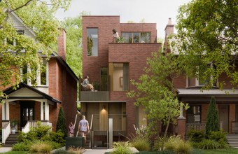


The Narrow Rowhouse as a Study in Restraint and Gesture
In a century-old Cabbagetown rowhouse, design is less about imposing a new identity than learning how to edit an existing one. The Toronto home recently profiled by The Globe and Mail is only 13 feet wide, yet its renovation offers a generous lesson in proportion, patience, and the kind of detail that makes a compact house feel expansive without losing its soul.
The most elegant decision may have been the first one: to wait. Before renovating, the owners lived with the house long enough to understand its winter light, its fireplace, its garden, and its old walls. This is often where sensitive restoration begins. Not with demolition, but with observation. A house that has stood for more than 100 years has already developed its own rhythm, and good design knows when to answer that rhythm rather than silence it.

The renovation’s strength lies in its balance between preservation and intervention. Original floors were restored where possible, keeping the tactile memory of the house intact. Newer finishes were chosen with longevity in mind rather than trend. This is an important distinction. Timelessness is not a style in itself, but a discipline: hardwood with visible grain, painted brick that brightens without erasing texture, slate tile that brings weight to a narrow kitchen, iron doors that frame the garden with architectural clarity.
In the kitchen, the constraints become the design. At only about 9½ feet wide through the main area, the room relies on careful compression. Appliances are tucked into the wall and hallway to free the central space. A long wood shelf becomes an eat-in counter, giving the room the atmosphere of a refined coffee bar. Dark slate in a chevron pattern introduces movement underfoot, drawing the eye lengthwise and giving the narrow passage a deliberate graphic quality.

The most dramatic investment was not hidden in cabinetry, but placed at the back of the house: solid iron doors with rectangular glass panes that open the kitchen to the deck. This is a contemporary move, yet it suits the old rowhouse because it is fundamentally about light and threshold. In dense urban homes, the rear elevation often carries the emotional weight of the plan. It is where daylight enters, where the garden extends the living room, and where a modest footprint begins to feel elastic.
In a narrow house, luxury is not excess. It is the precision of every inch.
There is also a lesson here in budgeting with intention. The owners used accessible cabinet bases, then elevated them with better hardware and finishes, saving for the architectural gesture that would transform daily life. This is a useful principle beyond this specific house. Spend where space changes, where light improves, where movement becomes easier. Save where surfaces can be quietly upgraded through detail.
On the upper floors, the plan continues to privilege openness and personality. A den occupies the middle of the second level, with bedrooms at either end. The third-floor primary suite includes an ensuite tucked behind a vintage frosted-glass and wood door, labelled W.C. with a gentle sense of humour. Wall-mounted reading lamps, graphic prints above the headboard, and small visual jokes become what designer Trish Johnson called “winks,” those moments that prevent a polished room from feeling anonymous.

What this home understands is that character is not only found in original mouldings or old brick. It is built through continuity, restraint, and a few well-placed surprises. For anyone renovating a compact urban house, the message is clear: do not fight the footprint. Study it, sharpen it, and let one or two beautiful gestures do the work.
Source: The Globe and Mail