



Heat is one of the most unevenly distributed risks in a city. Two neighborhoods separated by only a few blocks can experience meaningfully different temperatures because of tree cover, building density, road materials, shade, wind flow, and access to cooling. Urban heat mapping helps make those differences visible. It translates heat from a general weather condition into a location-specific urban pattern that planners, public health teams, and communities can act on.
Table Of Content
- What Urban Heat Mapping Actually Measures
- Why Heat Mapping Matters for Public Health
- The Data Behind an Effective Urban Heat Map
- Satellite and airborne thermal imagery
- Ground stations and mobile traverses
- Land cover, materials, and urban form data
- Vulnerability and equity layers
- From Map to Policy: How Cities Use Heat Data
- Why Layered Maps Outperform Single Metrics
- Urban Heat Mapping and Environmental Justice
- How Urban Heat Mapping Connects to Smart City Systems
- Common Misconceptions About Urban Heat Mapping
- What Better Heat Maps Could Enable Next
- How Communities Can Use Heat Mapping Too
- Conclusion: Turning Heat Into Actionable Urban Intelligence
This matters more now because extreme heat is no longer a rare seasonal inconvenience. Across Canada and North America, cities are confronting hotter summers, longer warm periods, and more frequent heat warnings. Health Canada has emphasized that urban heat islands magnify health risks, especially for people who are already vulnerable, including older adults, low-income households, outdoor workers, and residents without reliable access to air conditioning or shaded public space. When heat is mapped carefully, interventions can be targeted instead of generic.
The most important shift is that urban heat mapping is no longer just an academic exercise. It is becoming part of the operational intelligence of cities. Open datasets, thermal satellite imagery, mobile sensor traverses, GIS platforms, and vulnerability layers now allow governments to decide where to plant trees, where to install shade, where to expand cooling centers, and how to measure whether those actions are actually lowering risk over time.
In practical terms, urban heat mapping sits at the intersection of climate adaptation, environmental justice, and urban analytics. It helps answer a simple but powerful question: where is heat doing the most harm, and what should a city do first? The answer depends on data quality, spatial detail, and the ability to connect temperature readings with how people live, move, and cope with heat on the ground.
Better heat data does not just tell us that cities are warming. It shows exactly where exposure, vulnerability, and urban form combine to create risk.
That is why the conversation around urban heat mapping has expanded. It now includes remote sensing, public health planning, infrastructure design, mobility, digital twins, and neighborhood equity. A city average can hide block-by-block extremes. A map can reveal them.
What Urban Heat Mapping Actually Measures
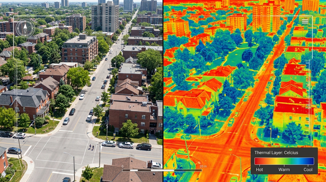
At its core, urban heat mapping is the process of identifying which parts of a city are hotter than others and understanding why. This is closely tied to the urban heat island effect, a phenomenon in which built-up urban areas retain and radiate more heat than surrounding rural or less developed areas. The World Health Organization notes that inland cities may experience temperatures 3 to 5°C higher than nearby rural areas because of this effect. In some contexts, poor urban design can contribute to temperature increases of 5 to 12°C within city environments.
That difference does not come from one source. Heat accumulates when dark roofs absorb solar radiation, asphalt stores warmth through the day, large paved surfaces limit evaporation, and dense building forms restrict airflow. Low tree canopy reduces shade and evapotranspiration, while waste heat from vehicles and buildings adds to the burden. When those conditions overlap, local heat intensity rises sharply.
Urban heat maps are designed to locate those patterns. Some maps show the temperature of surfaces such as roofs, roads, parking lots, and bare ground. Other maps focus on air temperature at the height where people actually walk, wait for transit, work outdoors, and sleep indoors. This distinction sounds technical, but it changes how a city interprets the map and what actions follow.
Surface heat maps are often derived from thermal remote sensing, especially satellite imagery. They are excellent for showing where urban materials are storing heat. Air-temperature maps, by contrast, come from fixed monitoring stations or mobile sensors and are often better for understanding direct human exposure. Both are useful, but they answer different questions.
This is one of the biggest misconceptions in the public conversation. A land surface temperature map is not the same thing as a map of how hot residents feel at street level. A black roof may register extremely hot in a thermal image, but the lived experience in that area will also depend on shade, building height, wind, humidity, and whether people can access cooling nearby. Good urban heat mapping respects that difference instead of flattening it.
Why Heat Mapping Matters for Public Health
Heat is often described as an invisible hazard because it does not damage cities in the dramatic way a flood or wildfire does. It is quieter, more cumulative, and often underestimated until emergency systems are under stress. Yet heat can trigger dehydration, heat exhaustion, cardiovascular strain, respiratory complications, and increased mortality, especially during prolonged heat events. The public health implications are serious, and they are deeply uneven.
Health Canada has highlighted that urban heat islands amplify health risks during heat waves, and it has supported mapping projects to guide targeted interventions such as trees, shaded areas, drinking fountains, and cooling centers. This matters because exposure is not just about where temperatures are high. It is also about who lives there, what condition their housing is in, whether they can cool their home, and whether they can travel safely to a cooler place if needed.
A neighborhood with older apartment stock, little tree cover, high numbers of seniors living alone, and limited access to cooling infrastructure is not simply hot. It is heat-vulnerable. Mapping becomes much more valuable when temperature data is layered with social indicators. This creates a more complete picture of risk and helps move city action from broad awareness to precise intervention.
The World Health Organization has reinforced this wider approach through renewed attention to heat-action planning. Heat mapping is increasingly viewed not only as part of long-term climate adaptation, but also as a tool for emergency preparedness. That shift is important. It means heat maps are being used to support response plans, outreach strategies, and communication systems before and during extreme heat events.
Another common misunderstanding is that urban heat is mainly a daytime issue. In reality, nighttime heat can be especially dangerous because buildings, pavement, and dense urban form release stored heat slowly after sunset. Residents who cannot cool their homes overnight may experience compounding health stress across several days. A city that only looks at midday peaks may miss one of the most important drivers of real-world health outcomes.
The Data Behind an Effective Urban Heat Map
The strongest urban heat maps combine multiple types of data instead of relying on a single source. This is where the topic becomes especially relevant to urban intelligence. Good mapping is not just about collecting information. It is about selecting the right layers, understanding their limits, and combining them in a way that supports clear decisions.
The U.S. Environmental Protection Agency recommends pairing satellite-based surface temperature data with monitoring-station data or mobile traverse-based air temperature measurements. That recommendation exists for a good reason. Each method reveals part of the story, but no single method captures the full urban heat system on its own.
Satellite and airborne thermal imagery
Satellite imagery is one of the most important foundations of modern heat mapping. NASA highlights Landsat as particularly useful for urban planning because of its 30-meter spatial resolution and long historical record. That combination allows analysts to compare heat patterns over time, observe land-use change, and evaluate how urban growth is altering local thermal conditions. NASA also notes that urban heat island temperatures can be as much as 6°C higher than surrounding rural temperatures.
Thermal satellite data is valuable because it provides broad coverage. A city can see where industrial roofs, large parking lots, transport corridors, and low-canopy residential districts are acting as hotspots. It is efficient, repeatable, and increasingly accessible through public platforms. Airborne thermal surveys can add even finer detail for local analysis when available.
But satellite data has limitations. It captures surface temperature rather than direct human exposure, and acquisition times may not align perfectly with the hottest part of a local heat event. Cloud cover can interfere, and the data may not reflect street-level shade conditions between tall buildings. That is why high-quality heat mapping treats satellite imagery as a foundational layer, not a complete answer.
Ground stations and mobile traverses
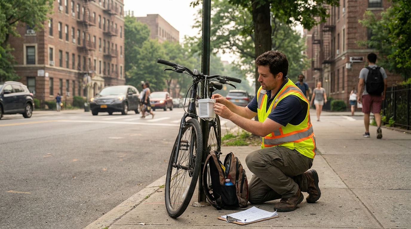
Ground-based air temperature monitoring helps close that gap. Fixed monitoring stations provide validated local readings over time, while mobile traverses collect hyperlocal air temperature data across routes at neighborhood scale. In a mobile traverse, sensors may be mounted on vehicles or bicycles and moved through the city to capture how heat changes street by street.
This method is especially useful for understanding the temperatures residents actually experience in public space. A traverse can reveal how a shaded avenue compares with a nearby arterial road, how a dense block differs from a park edge, or how quickly heat intensifies where tree canopy drops away. For planners and public health teams, that detail is often more actionable than a citywide average.
The tradeoff is coverage and complexity. Monitoring networks are usually sparse, and mobile campaigns require planning, calibration, and careful timing. They are excellent for precision and lived-experience analysis, but they do not always offer the same broad and frequent citywide view as satellites. Again, the best approach is layered rather than singular.
Land cover, materials, and urban form data
Temperature readings become much more useful when paired with explanatory layers. These can include tree canopy, impervious surfaces, land cover classification, building footprints, roof materials, road geometry, population density, and open space distribution. GIS makes it possible to combine these datasets and identify the built-form patterns most associated with local heat accumulation.
For example, a neighborhood may show high surface temperatures because it contains extensive dark roofing, wide paved corridors, and little vegetation. Another area may be relatively warm because airflow is restricted by dense built form even if tree canopy is moderate. Urban heat is spatially complex, and data on the physical city helps decode why hotspots occur where they do.
Vulnerability and equity layers
Perhaps the most important addition to modern heat mapping is the inclusion of vulnerability indicators. These can include age, income, housing type, health conditions, access to cooling, prevalence of outdoor work, language barriers, transit dependence, and proximity to cooling centers. When these layers are combined with thermal data, the result shifts from heat detection to heat-risk intelligence.
Health Canada’s Vancouver case study is a strong example of this approach. Researchers combined heat data with social vulnerability layers, including seniors living alone and cooling center locations, to identify neighborhoods where interventions would have the greatest benefit. This matters because the hottest place is not always the highest-priority place. Risk depends on both exposure and capacity to cope.
From Map to Policy: How Cities Use Heat Data
The practical value of urban heat mapping lies in what happens after the map is created. A heat map that remains a static graphic has limited impact. A heat map that feeds investment decisions, health outreach, zoning priorities, and infrastructure upgrades becomes a decision-support tool. This is where urban analytics starts to shape everyday city life.
More cities are now using heat maps to prioritize tree planting programs. This sounds straightforward, but data makes it smarter. Planting trees in already leafy districts may improve aesthetics, while planting them in low-canopy, high-vulnerability hotspots can reduce exposure where it matters most. Mapping helps identify those priority zones.
Cooling infrastructure is another major use case. Cities can use heat maps to place shaded bus shelters, public misting stations, drinking fountains, and expanded cooling centers in areas where the need is highest. Transportation agencies can assess overheated transit waiting areas. School boards can review playground shade. Housing agencies can identify multi-unit buildings with persistent heat risk.
Material choices also come into focus. Surface maps can reveal where cool roofs, reflective pavements, lighter materials, or redesigned streetscapes may reduce heat absorption. These interventions are especially relevant in industrial areas, commercial corridors, and parking-dense districts. The important point is that heat data turns these from generic sustainability ideas into measurable, locational strategies.
Montréal offers a useful example of urban heat mapping moving into operational policy. Its open data portal includes multiple years of heat-island datasets, including satellite and airborne products. That longitudinal availability supports comparison across time and gives planners a basis for integrating heat analysis into broader climate adaptation and mobility planning. Open data also improves transparency, making it easier for researchers, civic groups, and designers to work from the same spatial evidence.
Health Canada’s guidance similarly makes clear that heat-mapping resources are intended to help health professionals support local government planning and decision-making. That statement may sound administrative, but it points to a larger shift. Heat maps are becoming part of how city systems coordinate, from health departments to parks divisions to emergency management teams.
Why Layered Maps Outperform Single Metrics
One of the easiest mistakes in urban climate analysis is to search for a single definitive heat number. Cities are not that simple. Heat is shaped by surfaces, air, humidity, wind, shade, vegetation, building form, and behavior. A layered map acknowledges that complexity and produces far more useful guidance than a single temperature raster ever could.
Consider the difference between a roof-level hotspot and a neighborhood-level health hotspot. A warehouse district may appear extremely hot in daytime satellite imagery because of expansive roofing and pavement. But if few people live there overnight, public health urgency may differ from a residential area that is slightly cooler on paper but home to many older adults in poorly ventilated apartments. Both places matter, but they matter for different reasons.
Layered mapping also helps correct common misconceptions. Tree planting is valuable, but tree planting alone is not enough. Some corridors need shade structures because underground utilities or constrained sidewalks limit canopy growth. Some buildings need reflective roofs. Some neighborhoods need expanded indoor cooling access. Some streets need redesigned materials and better ventilation. The right intervention depends on what the map reveals about local causes.
Another reason layered maps matter is temporal variation. Heat risk changes by time of day and season. Afternoon surface peaks, evening retained heat, and overnight cooling deficits can produce different risk geographies. A city that uses only one snapshot may miss the periods that matter most for health and energy stress. Better mapping incorporates time as well as space.
Urban Heat Mapping and Environmental Justice
Urban heat is not only a climate problem. It is also an equity problem. Neighborhoods with less tree canopy, more pavement, older housing, and fewer public amenities are often the same places where residents have fewer resources to adapt. That is why heat mapping is increasingly tied to environmental justice and not just environmental monitoring.
Historically, uneven investment patterns have shaped where greenery, shade, and public infrastructure are located. In many cities, lower-income communities experience both higher heat exposure and lower access to cooling. Without spatial analysis, these inequities can remain hidden behind citywide averages and broad climate statistics. Heat maps make them harder to ignore.
This is where the language of vulnerability indices becomes useful. A heat vulnerability index combines environmental and social variables to estimate where populations face elevated risk during heat events. It does not replace local knowledge, but it helps public agencies prioritize support in a structured and transparent way. Used carefully, it can improve fairness in resource allocation.
However, data alone cannot define justice. Community input still matters. Residents often know where sidewalks become unbearable in the afternoon, which apartment buildings trap heat overnight, and which public spaces lack shade despite appearing acceptable on a map. The strongest urban heat strategies combine quantitative mapping with local lived experience.
A precise map can identify a hotspot. A community conversation can explain why that hotspot matters and what kind of intervention will actually help.
That blend of evidence and participation is one of the most promising directions in urban heat policy. It keeps the analysis rigorous while making the response more grounded and humane.
How Urban Heat Mapping Connects to Smart City Systems
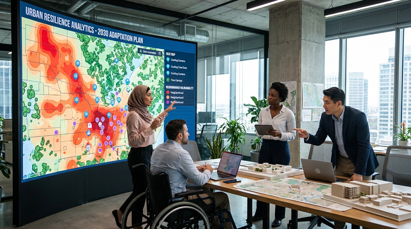
Urban heat mapping is often discussed as a climate tool, but it is equally a smart city data problem. It depends on collecting information from multiple sources, integrating it in spatial systems, and turning it into operational insight. That makes it part of the broader intelligence layer behind modern urban decision-making.
Remote sensing is one input. GIS is another. Sensor networks, land-cover analysis, and historical climate data all contribute. Increasingly, cities are also experimenting with dashboards and digital twins that allow planners to simulate how interventions might affect heat patterns over time. A digital twin can combine building data, vegetation layers, transport networks, and microclimate models to test scenarios before capital projects are built.
For example, a city could model whether a corridor benefits more from street trees, reflective pavement, a bus stop canopy program, or a combination of measures. It could compare intervention costs with projected exposure reduction. Over time, it could evaluate whether completed projects changed measured temperatures or improved nighttime cooling. That is where analytics becomes iterative rather than descriptive.
Open data is also changing the field. When municipalities publish heat-island layers, they enable outside analysis by universities, non-profits, consultants, and community organizations. This broadens the policy conversation and can accelerate innovation. Montréal’s publicly available datasets are a good example of how openness supports longitudinal analysis and wider reuse.
What emerges is a model of urban intelligence that is both technical and civic. The tools may be sophisticated, but the goal is simple: make cities more livable under rising heat stress. In that sense, urban heat mapping is a practical bridge between geospatial science and everyday quality of life.
Common Misconceptions About Urban Heat Mapping
Despite growing attention, several misconceptions still limit how people interpret urban heat maps. The first is the assumption that one map tells the whole story. As noted earlier, surface temperature and air temperature are not interchangeable. A map is only as useful as the question it was designed to answer.
The second misconception is that hotter neighborhoods are hotter for one obvious reason. In reality, heat patterns emerge from interacting variables. Pavement matters, but so do tree cover, building spacing, roof color, humidity, wind, traffic, and even the timing of solar exposure. Heat is a systems problem, not a single-material problem.
The third misconception is that mitigation starts and ends with tree planting. Trees are essential, but they are part of a broader toolkit that includes cool roofs, reflective and permeable materials, shade structures, park design, façade treatments, ventilation corridors, and expanded access to indoor cooling. Good maps help match the intervention to the urban condition.
The fourth misconception is that citywide averages are adequate for planning. They are not. Hyperlocal variation is exactly why urban heat mapping matters. Averages can obscure intense pockets of risk that deserve immediate attention. Neighborhood-scale mapping is where policy becomes precise.
The fifth misconception is that heat mapping is only for long-term planning departments. In reality, it is becoming relevant to emergency management, health communication, transit planning, housing policy, and asset management. As heat events grow more frequent, the map becomes not just a planning document, but part of a city’s response infrastructure.
What Better Heat Maps Could Enable Next
The next phase of urban heat mapping will likely be more dynamic, more granular, and more integrated with city operations. We can expect continued growth in combined satellite and street-sensor approaches, especially as cities seek better neighborhood-level evidence. More agencies will likely connect heat maps to live dashboards, adaptation plans, and public-facing tools.
One promising direction is performance measurement. Instead of asking only where heat is severe today, cities can ask whether interventions are reducing it. If a cool roof program expands in a district, can seasonal comparisons detect a measurable change in surface temperature? If tree canopy increases along a transit corridor, does street-level air temperature improve during afternoon peaks? If a new cooling center opens, does access improve for high-vulnerability blocks within walking distance?
Another direction is better integration with housing and health data. Heat risk is deeply shaped by indoor conditions, building age, insulation quality, and energy affordability. Urban heat maps will become more powerful when paired with building performance data and social service intelligence. That does require careful governance and privacy protection, but the potential value is significant.
There is also a communication opportunity. Heat maps can help residents understand that heat is not evenly shared and that cooling infrastructure is not simply a comfort amenity. It is part of public safety. When maps are published clearly and explained well, they can support community action, neighborhood advocacy, and broader public support for adaptation investments.
How Communities Can Use Heat Mapping Too
Although cities and public agencies are major users of urban heat maps, communities also have a role. Neighborhood associations, advocacy groups, schools, and local researchers can use mapped heat data to push for more equitable investment. A map can strengthen the case for shade in a playground, safer bus stops, greener schoolyards, or better access to public cooling.
Community groups can also contribute observations that improve the maps themselves. Citizen science initiatives, local sensor projects, and resident-led documentation of overheated spaces can reveal conditions that formal systems miss. This is particularly valuable in areas with sparse monitoring coverage.
For residents, the biggest value may be clarity. Heat can feel personal and anecdotal until it is visualized. Once a pattern is mapped, it becomes easier to discuss with institutions, easier to compare over time, and easier to tie to specific interventions. Data does not replace lived experience, but it can amplify it.
In this way, urban heat mapping becomes more than a technical product. It becomes a shared language between climate science, public health, planning, and the public. That shared language is essential if cities want adaptation strategies that are both evidence-based and publicly legitimate.
Conclusion: Turning Heat Into Actionable Urban Intelligence
Urban heat mapping matters because it transforms heat from a broad atmospheric trend into a spatially actionable urban problem. It shows where roads, roofs, sparse canopy, and dense built form trap heat. It also shows where vulnerability is concentrated, where infrastructure falls short, and where policy can have the greatest effect.
The most effective maps combine thermal satellite imagery, street-level air temperature measurements, GIS analysis, and vulnerability indicators. That layered approach reflects a simple truth: heat exposure is physical, social, and infrastructural at the same time. A single dataset can identify hotspots, but a richer system can identify priorities.
For cities, this means better targeting of trees, shade, cool roofs, reflective materials, cooling centers, park investments, and public health outreach. For communities, it means a stronger evidence base for demanding fairer and more resilient urban design. For planners and analysts, it means that climate adaptation can be measured, evaluated, and improved.
As summers get hotter and heat events become more frequent, the cities that respond well will be the ones that treat heat as a data problem as much as a weather problem. Urban heat mapping is the mechanism that makes that possible. It gives cities a clearer picture of where risk lives and a smarter way to decide what to do next.
In the end, the real value of urban heat mapping is not the map itself. It is the chain of decisions that follows, from analysis to intervention to accountability. When done well, heat mapping helps build cities that are not only cooler, but healthier, fairer, and more intelligently designed for the climate ahead.



No Comment! Be the first one.