



Portfolio dashboards have become one of the most useful tools for organizations trying to make sense of growing complexity. Whether the portfolio includes capital projects, product initiatives, grants, digital programs, property assets, or strategic investments, leaders need a way to see what matters without scanning dozens of reports. A well-designed portfolio dashboard solves that problem by bringing the most important metrics into one visual environment that supports faster, better decisions. Instead of forcing people to hunt for updates across spreadsheets and slide decks, it gives them a clear view of status, value, risk, and performance.
Table Of Content
- What Is a Portfolio Dashboard?
- Why Portfolio Dashboards Matter for Decision Making
- Where Portfolio Dashboards Are Used Across Industries
- Different Types of Portfolio Dashboards
- Executive portfolio dashboards
- Operational portfolio dashboards
- Financial and budget dashboards
- Risk dashboards
- Agile portfolio dashboards
- The Core Metrics That Make Portfolio Dashboards Useful
- How to Design a Portfolio Dashboard That People Will Actually Use
- A simple design workflow
- Best Practices for Data Quality, Stewardship, and Trust
- Common Mistakes and Misconceptions
- AI and the Next Generation of Portfolio Dashboards
- A Practical Example of a High-Value Portfolio Dashboard
- How to Keep a Portfolio Dashboard Relevant Over Time
- Final Thoughts
That practical value matters because modern organizations rarely make decisions in a simple, linear context. A public sector team may need to weigh budget constraints against service outcomes. A healthcare network may be balancing capital improvements, staffing pressures, and compliance deadlines. A technology company may need to compare product investments across multiple markets while monitoring burn rate and delivery risk. In each case, the dashboard acts as an intelligence layer that simplifies complexity without erasing important nuance.
Portfolio dashboards are especially relevant in governance because they sit above the project level. The Project Management Institute describes portfolio management as the centralized management of one or more portfolios in order to identify, prioritize, authorize, manage, and control work to achieve strategic business objectives. That definition is useful because it clarifies what a portfolio dashboard is actually for. It is not just a prettier report. It is a decision-support interface designed to help stakeholders compare priorities, understand tradeoffs, and align execution with strategy.
This distinction is important because many teams still confuse dashboards with reporting archives. Reports document what happened. Dashboards should help people decide what to do next. When they are designed with the right audience, metrics, and visual logic, portfolio dashboards can reduce cognitive load and improve information satisfaction, both of which support better decision quality. Research published in 2024 found that dashboard information format, currency, and completeness indirectly improved decision-making quality by lowering perceived task complexity and increasing satisfaction with the information provided. In practical terms, that means good dashboard design is not decoration. It changes how clearly people think.
In this guide, we will look at what portfolio dashboards are, why they matter, how different industries use them, and how to design one that actually improves decisions. We will also cover common dashboard mistakes, the role of data governance, and how AI-assisted analytics is changing the way portfolio views are built and used. The goal is simple: to help stakeholders move from seeing more data to understanding the right data.
What Is a Portfolio Dashboard?
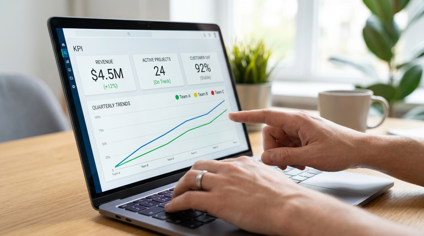
A portfolio dashboard is a visual decision-support tool that consolidates key metrics across multiple initiatives, programs, investments, or projects into a single view. The point is not to represent every operational detail. The point is to show the signals that help stakeholders evaluate performance, compare options, and intervene when necessary. In a good portfolio dashboard, the user should be able to understand current conditions at a glance and then drill deeper if a metric suggests concern or opportunity.
Think of the dashboard as the executive layer above project management software, budget trackers, and operational systems. At the project level, teams may care about tasks, sprint velocity, vendor milestones, and day-to-day blockers. At the portfolio level, leaders are looking for broader answers. Which initiatives are on track? Which are consuming resources without clear value? Where is risk clustering? Which investments are advancing strategic goals, and which may need to be paused, re-scoped, or accelerated?
The most effective portfolio dashboards tend to combine summary indicators with pathways to detail. A top line view might show budget variance, schedule variance, resource utilization, forecast completion, dependency risk, and strategic alignment scores. From there, users can filter by region, business unit, initiative type, or funding stream. This allows the dashboard to remain simple at first glance while still supporting serious analysis.
It also helps to understand what a portfolio dashboard is not. It is not the same as a static monthly report packaged as a PDF. It is not simply a wall of charts with no hierarchy. It is not a one-size-fits-all interface for every stakeholder in the organization. A useful dashboard is shaped by specific decisions, specific users, and specific governance needs. Without that structure, the dashboard may look sophisticated while actually slowing down interpretation.
Why Portfolio Dashboards Matter for Decision Making
The strongest case for portfolio dashboards is not visibility alone. Most organizations already have data. The real issue is whether that data can be interpreted quickly enough to support action. Complex portfolios often create fragmented information environments where finance has one version of performance, project teams have another, and executives are left trying to reconcile inconsistent updates. A dashboard can reduce that fragmentation by creating a shared view of current reality.
Decision quality improves when stakeholders can see patterns instead of isolated facts. A delayed project is one data point. A cluster of delayed projects within the same region, vendor ecosystem, or funding category is a management signal. A budget overrun on its own may be manageable. Budget overruns combined with weak strategic alignment and high dependency risk tell a very different story. Dashboards make these relationships visible by placing indicators in context rather than leaving them scattered across separate systems.
This is where visualization becomes strategic. Good charts and clear layout reduce the effort required to process information. Statistics Canada emphasizes that visualizations should match the audience and purpose, use sound axis conventions, and support interpretation rather than confuse it. That guidance applies directly to portfolio dashboards because leaders often make time-sensitive decisions based on what they see in a few seconds. If the visual design is cluttered, misleading, or inconsistent, the dashboard increases friction instead of reducing it.
Portfolio dashboards also create discipline around prioritization. When all major initiatives are visible in a common framework, it becomes harder for low-value work to hide behind anecdotal updates or isolated success stories. Leaders can compare work using the same metrics and ask better questions about tradeoffs. Which initiatives are under-resourced but highly aligned to strategic goals? Which consume large budgets with weak outcome signals? Where are dependencies threatening multiple programs at once? These are portfolio questions, and they require portfolio visualization.
Insight: The best portfolio dashboards do not just summarize activity. They reduce ambiguity so leaders can allocate attention, money, and people with more confidence.
Where Portfolio Dashboards Are Used Across Industries
Portfolio dashboards are often associated with project management offices, but their use extends far beyond traditional PMO settings. Any environment that manages multiple competing initiatives can benefit from a portfolio view. The exact metrics and visual design will vary, but the underlying need is consistent: too much complexity, too many stakeholders, and too many decisions to rely on disconnected reporting.
In government, portfolio dashboards are used to monitor public programs, capital infrastructure, digital modernization efforts, and service transformation initiatives. Officials need to compare spending, timelines, procurement risk, and policy alignment across a wide range of work. Because public sector portfolios often involve sensitive or citizen-facing information, data stewardship is especially important. The Government of Canada emphasizes accuracy, privacy, security, transparency, and usability across the data lifecycle, all of which should shape dashboard governance.
In healthcare, dashboards help leaders track facility investments, clinical transformation programs, technology rollouts, and operational improvement projects. The challenge in this environment is balancing financial performance with service outcomes and regulatory obligations. A healthcare portfolio dashboard may need to connect capital allocation, staffing risk, implementation progress, and patient impact indicators in one place.
In technology companies, portfolio dashboards often support product development, innovation pipelines, platform investments, and market expansion decisions. These organizations typically move quickly, so dashboards need frequent refresh cycles, strong filtering, and clear exception reporting. Leaders may want to compare expected revenue impact, engineering capacity, delivery confidence, and strategic fit across many concurrent bets.
Construction and real estate organizations also rely on portfolio dashboards to manage property developments, maintenance programs, acquisitions, and capital planning. Here, the dashboard may emphasize schedule exposure, contractor performance, budget variance, leasing assumptions, and location-based comparisons. The portfolio lens is critical because even strong individual projects can create broader risk if too many are concentrated in the same market or resource pool.
Finance and higher education provide additional examples. Financial firms may use dashboards to compare investment initiatives, compliance programs, and operational changes against return, risk, and timing expectations. Universities may use them to govern campus projects, research funding, digital learning programs, and student experience initiatives. In both cases, the dashboard helps decision-makers compare limited resources against competing objectives.
Different Types of Portfolio Dashboards
One of the biggest sources of confusion is the assumption that there is a single standard portfolio dashboard. In practice, several dashboard types exist, each serving a different decision context. Smartsheet and other dashboard guidance sources commonly distinguish among executive, financial, operational, risk, and Agile portfolio views. This distinction matters because dashboard success depends on fit for purpose.
Executive portfolio dashboards
An executive portfolio dashboard is designed for leadership teams that need fast comprehension and strategic context. It usually emphasizes high-level KPIs, trend lines, exceptions, and strategic alignment rather than operational detail. A CEO, deputy minister, board member, or vice president should be able to use this dashboard to identify where intervention is needed and where progress is strongest. Simplicity and narrative clarity matter more here than drill-heavy complexity.
Operational portfolio dashboards
Operational dashboards are built for portfolio managers, PMO leaders, and delivery teams who need more granularity. These users often need thresholds, filters, status changes, and drill-down views to manage issues in real time. They care about bottlenecks, dependencies, resource pressures, and update cadence. This dashboard should be more interactive than an executive dashboard, but it still needs a disciplined structure.
Financial and budget dashboards
Financial portfolio dashboards focus on the movement of money across the portfolio. Common metrics include budget variance, forecast versus actual spend, contingency use, funding source mix, and return expectations. These dashboards are useful for finance teams, executive committees, and sponsors who need to understand whether resources are being deployed effectively.
Risk dashboards
Risk dashboards concentrate attention on uncertainty, exposure, and concentration. They may include heat maps, issue aging, dependency risk, vendor risk, compliance indicators, and scenario forecasts. A strong risk dashboard can be especially valuable when a portfolio spans multiple jurisdictions, systems, or suppliers. It helps leadership move from isolated issue logs to a broader view of systemic exposure.
Agile portfolio dashboards
Agile portfolio dashboards serve organizations managing product streams, epics, roadmaps, and delivery increments. Instead of using only traditional project metrics, these dashboards may include throughput, lead time, value delivered, capacity allocation, and roadmap confidence. They are particularly useful where teams need to connect Agile delivery to strategic outcomes and investment choices.
The Core Metrics That Make Portfolio Dashboards Useful
Metrics are the engine of a dashboard, but they only create value when they are relevant to the decisions at hand. Too many dashboards fail because they display everything that is measurable instead of focusing on what is actionable. The strongest portfolio dashboards choose a compact set of indicators that reveal health, movement, and risk across the portfolio.
Budget variance is one of the most common metrics because it shows whether spending is tracking as expected. On its own, however, budget variance can be misleading. A project that is under budget may actually be stalled, while a project that is over budget may be producing outsized value. That is why financial indicators should usually appear alongside schedule and outcome indicators rather than in isolation.
Schedule variance remains useful because timing affects dependencies, staffing plans, and strategic delivery windows. If a key initiative slips, the impact often extends beyond a single line item. Forecast completion metrics add another layer by showing where timelines are likely heading rather than only where they started. This is especially useful for leadership teams that need to make decisions before delays become visible in final reports.
Resource utilization is another essential metric in multi-project environments. Teams often assume that more funding solves delivery problems, but constrained expertise is frequently the real bottleneck. A dashboard that shows overextended teams, role shortages, or uneven capacity distribution can improve planning far more than one that only tracks spend.
Strategic alignment is harder to measure, but it is one of the most important portfolio indicators. If a dashboard cannot help stakeholders connect work to strategic goals, it risks becoming an activity monitor rather than a prioritization tool. Some organizations use scoring frameworks that rate initiatives against strategic pillars, policy mandates, or expected impact categories. While these scores are not perfect, they support better comparison than narrative descriptions alone.
Dependency risk is also highly valuable because portfolios often fail through interconnected delays rather than single dramatic events. A dashboard that highlights where one initiative is blocking several others gives leaders a chance to intervene earlier. Depending on the sector, other important metrics may include customer impact, compliance readiness, asset condition, revenue contribution, benefits realization, or geographic concentration.

How to Design a Portfolio Dashboard That People Will Actually Use
Design starts with questions, not charts. Before selecting colors or components, it is worth asking what decision the dashboard is meant to support, who will use it, how often they will use it, and what actions should follow from what they see. Tableau’s dashboard guidance strongly aligns with this logic by emphasizing purpose, audience, actual display size, and minimizing clutter. If the decision context is vague, the design will almost always become overloaded.
A practical first step is to define the dashboard’s primary audience. Executives, managers, analysts, and sponsors do not process information the same way. Executives generally need trends, summaries, and exceptions. Portfolio managers need operational movement, drill-down options, and threshold alerts. Analysts may want deeper filtering, methodology notes, and export capability. Trying to satisfy all of them in one screen usually produces a dashboard that satisfies none of them well.
Next, establish a clear visual hierarchy. The most important signals should appear first and be easy to interpret. KPI cards, portfolio health indicators, and a few high-value charts often work better than a dense collage of visuals competing for attention. White space is not wasted space. It is part of how dashboards remain legible under pressure.
Chart choice matters more than many teams realize. A line chart is useful for trends over time. A bar chart is often best for comparing categories. A heat map can reveal concentration or severity when used carefully. Pie charts, 3D effects, and overly decorative visuals tend to weaken interpretation, especially when categories are numerous or differences are small. Nature and other sources have repeatedly highlighted how poor chart practices can distort understanding, which is a serious risk when executives are making funding or governance decisions.
Color should communicate meaning, not decoration. If red indicates critical risk in one section and positive performance in another, the dashboard creates unnecessary confusion. Consistency is essential. Accessibility is essential too. Dashboards should be readable for users with color-vision differences, work across device sizes when necessary, and avoid requiring perfect eyesight or insider knowledge to interpret simple statuses.
Interactivity can be powerful, but only if it supports useful exploration. Filters, drill-down paths, and hover details should help users answer real questions. They should not turn the dashboard into a scavenger hunt. The ideal experience is one where the top layer communicates quickly, and deeper layers reveal context without overwhelming the user.
A simple design workflow
- Define the decision: Clarify whether the dashboard supports prioritization, risk review, budget control, resource planning, or executive oversight.
- Map the audience: Identify who will use it and what they need to know in under thirty seconds.
- Select a metric set: Choose a small group of leading and lagging indicators tied to portfolio goals.
- Sketch the layout: Organize the page into summary, comparison, exception, and drill-down zones.
- Choose visuals deliberately: Match each chart type to the job it needs to do.
- Test with users: Watch how real stakeholders interpret the dashboard and where they hesitate.
- Refine continuously: Update metrics, labels, thresholds, and data sources as portfolio needs evolve.
Best Practices for Data Quality, Stewardship, and Trust
A dashboard is only as reliable as the data behind it. This sounds obvious, but many organizations underestimate how quickly trust collapses when numbers are stale, definitions differ across teams, or sensitive information appears without proper controls. Once leaders doubt the dashboard, they return to private spreadsheets, side conversations, and fragmented reporting. The visual layer cannot compensate for weak data governance.
Responsible data stewardship should be built into the dashboard process from the beginning. The Government of Canada’s guidance on good data stewardship emphasizes accuracy, privacy, security, transparency, and usability, and each of those principles applies directly here. Accuracy means metrics are calculated consistently and validated. Privacy means access is role-based and sensitive information is protected. Security means the environment is governed, auditable, and appropriately controlled. Transparency means users understand what the metrics mean and where the data comes from. Usability means the dashboard is understandable to the people expected to act on it.
Update cadence is another trust factor. If one metric refreshes daily and another updates monthly without clear labeling, users can draw the wrong conclusions. Every major indicator should have a visible definition and refresh logic, especially when the dashboard combines data from multiple systems. A small note explaining source, frequency, and exclusions can prevent major misunderstanding later.
Semantic consistency matters too. Terms like active, delayed, committed spend, forecast completion, and risk severity need shared definitions. Otherwise, teams may interpret the same indicator differently. Many mature organizations solve this through a semantic layer or governed business glossary that ensures dashboard metrics mean the same thing across platforms and reports.
Trust also depends on exception handling. When data is missing, delayed, or estimated, that fact should be visible. Hiding uncertainty does not make the dashboard look stronger. It makes the organization more vulnerable to false confidence. In portfolio management, false confidence is expensive.
Common Mistakes and Misconceptions
One of the most common misconceptions is that more charts automatically produce more insight. In reality, clutter increases cognitive load and can make the dashboard slower to use. A crowded interface often forces people to search for meaning rather than absorb it. The best dashboards are selective. They show the few signals that matter most and provide ways to investigate further only when necessary.
Another misconception is that a dashboard and a report are interchangeable. Reports are useful for documentation, historical review, and formal communication. Dashboards are most valuable when they support live monitoring, prioritization, and intervention. If a so-called dashboard is only reviewed once a month as a static screenshot, it is probably functioning more like a report than a decision tool.
Teams also frequently assume that one dashboard can serve every stakeholder equally. This rarely works. Executives need strategic simplicity. Analysts need depth and traceability. Portfolio managers need operational responsiveness. A layered approach is usually more effective than one overloaded screen built around compromise.
Aesthetics create another trap. Beautiful color palettes and sleek components can make a dashboard feel modern, but visual polish is not the same as clarity. If the metrics are weak, the labels are vague, or the data is outdated, the dashboard will fail no matter how attractive it looks. Good design is not just visual design. It is information design.
Finally, dashboards are not set-and-forget assets. Portfolios change. Strategy shifts. Metrics drift. Thresholds become outdated. New risks emerge. Effective dashboards require regular review to confirm that they still reflect the organization’s decision priorities. If the dashboard never changes, it usually means the portfolio is evolving faster than the governance model around it.
AI and the Next Generation of Portfolio Dashboards
Portfolio dashboards are entering a new phase shaped by AI-assisted analytics, natural-language querying, and faster dashboard generation. Recent product announcements from major platforms such as AWS and Microsoft point toward a broader trend: users increasingly expect to create and explore dashboards through prompts instead of relying entirely on manual configuration. This lowers technical barriers and can accelerate dashboard development, particularly when teams need to combine multiple datasets quickly.
Natural-language interfaces are useful because they allow non-technical stakeholders to ask direct questions like, “Which programs are over budget and behind schedule in the western region?” or “Show projects with high strategic alignment but low staffing confidence.” Instead of navigating layers of filters and joins, the user can start from intent. For organizations with mature data models, this can significantly improve access to insights.
That said, AI does not remove the need for dashboard discipline. It may help generate visuals faster, but it does not automatically choose the right metrics, govern the data, or understand the political and strategic context of a portfolio. In fact, faster generation can make poor dashboards proliferate if teams skip the design and governance work. AI is best viewed as a force multiplier for well-structured data and clear information architecture, not as a replacement for them.
Another emerging pattern is the rise of role-specific analytics. Instead of building one monolithic dashboard, organizations are creating modular dashboard ecosystems where executives, operations teams, risk owners, and finance leaders each get a tailored view linked by shared definitions. This model respects the fact that different users need different levels of detail while preserving consistency across the underlying metrics.
Semantic layers are becoming more important as part of this shift. When the business meaning of metrics is governed centrally, dashboards can query multiple datasets without each team manually rebuilding logic. This makes cross-platform portfolio oversight far more realistic and reduces the risk of contradictory numbers appearing in different tools.
A Practical Example of a High-Value Portfolio Dashboard
Imagine a regional infrastructure organization managing twenty-five active initiatives across transportation, facilities, and digital systems. Leadership needs to decide which projects deserve accelerated funding, which require corrective action, and which should be paused. Without a dashboard, updates arrive through separate status decks, finance reports, and issue logs, each with different timing and terminology.
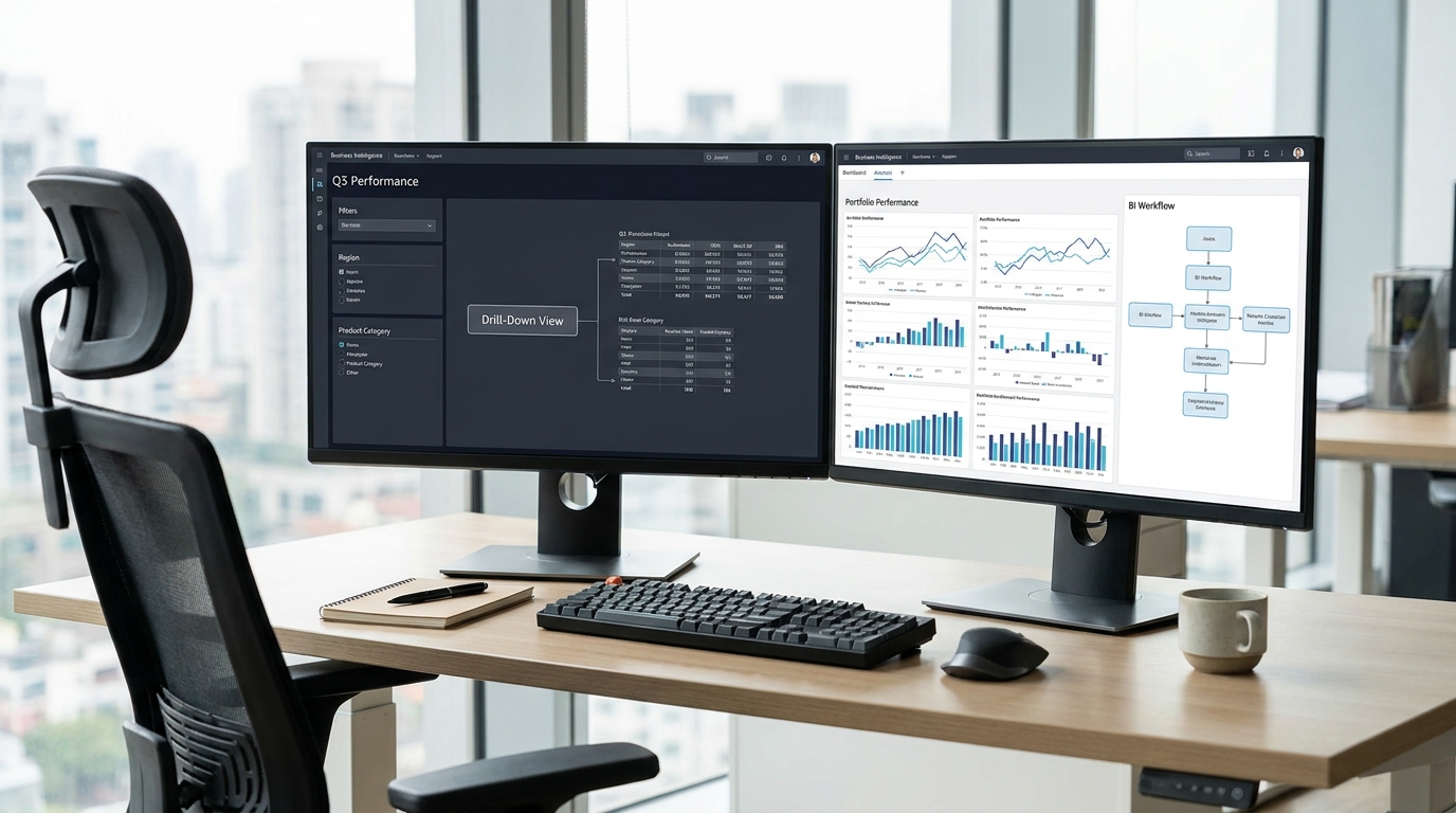
A strong portfolio dashboard for this organization might open with six top-line indicators: total approved budget, forecast variance, percentage of projects on track, projects at risk, average schedule slippage, and strategic alignment score by initiative group. Below that, a comparison chart could rank projects by a composite index combining risk, spend, and strategic importance. A heat map could show where dependency risk is concentrated across vendors and regions. A timeline trend could reveal whether schedule pressure is improving or worsening over the last quarter.
From an executive perspective, this design supports immediate questions. Which projects need intervention now? Where is money being consumed with weak strategic value? Are delays isolated or systemic? If one cluster of initiatives is driving most of the risk, leadership can act earlier instead of waiting for quarterly review cycles.
For the portfolio manager, the same environment could support drill-down into individual projects, filter by sponsor or region, and surface issue aging or milestone confidence. The underlying dashboard remains connected, but the experience is shaped by the user’s job to be done. That is what makes a portfolio dashboard practical rather than merely informative.
How to Keep a Portfolio Dashboard Relevant Over Time
Building the first version of a dashboard is only the beginning. The more difficult challenge is keeping it useful as strategy, systems, and stakeholder needs change. The easiest way to lose relevance is to treat the dashboard as a finished product instead of a living management tool. A dashboard should evolve with the portfolio it represents.
Regular review cycles help prevent metric drift. At set intervals, teams should ask whether each KPI still supports a real decision, whether threshold values are still meaningful, and whether users are interpreting charts correctly. This review should include both data owners and dashboard users, since technical validity and practical usefulness are not always the same thing.
Usage analytics can also reveal whether the dashboard is working. If users rarely interact with certain sections, avoid key filters, or continue requesting manual reports that duplicate the dashboard, those are signals that something in the design or governance model needs to change. A good dashboard should reduce reporting friction, not coexist with it indefinitely.
Training matters more than many teams expect. Even clear dashboards benefit from a short onboarding process that explains metric definitions, color logic, and expected use cases. This is especially important when a dashboard influences funding, risk escalation, or performance review decisions. Shared interpretation is part of dashboard quality.
Finally, relevance depends on ownership. Someone should be accountable for metric quality, visual maintenance, and user feedback. Without ownership, dashboards decay quietly. Labels become outdated, thresholds stop reflecting reality, and trust erodes one inconsistency at a time.
Final Thoughts
Portfolio dashboards are most powerful when they help organizations think clearly under complexity. They consolidate signals from across multiple initiatives and translate them into a form leaders can actually use. Done well, they improve governance, strengthen prioritization, and create a shared basis for strategic decisions. Done poorly, they become another layer of noise.
The difference usually comes down to a few principles. Start with the decision, not the visualization. Design for a specific audience, not everyone at once. Choose metrics for actionability, not volume. Build trust through data quality, transparency, and stewardship. Review the dashboard continuously because the portfolio will not stand still. These are not just design preferences. They are the foundations of dashboard usefulness.
As AI-assisted analytics, semantic layers, and natural-language querying become more common, portfolio dashboards will become easier to build and faster to adapt. That is good news, but it also raises the bar. When dashboards are easier to generate, the real competitive advantage shifts to judgment: knowing what to show, how to show it, and what decision it should unlock.
For stakeholders across government, healthcare, technology, construction, finance, education, and beyond, that is the real promise of portfolio dashboards. They do not remove complexity. They organize it. And in an environment where attention is limited and decisions carry real cost, that clarity is not a nice extra. It is infrastructure for smarter action.



No Comment! Be the first one.